

Did you know that close to 85% of consumers said that colours actually drive their decision to purchase or pick one brand over another?
When you take time to consider what that means, it places an even greater emphasis on having the right visual identity crafted for your brand -- especially if you are still in the infantry stages of choosing brand colours.
Aside from graphics, copywriting and the typography that you choose for your brand’s design, colours make up a good chunk of what makes you memorable to the consumers.
Colours are known for their ability to evoke a psychological interpretation of a concept, which is something that new brands should definitely take note of.
Even if you are already an established brand, it still makes sense to review or reconsider your current brand colours from time to time, just to make sure that they align with your values and certain cultural associations.
So, how do you do this exactly? How do you choose the right colours for your brand?
Let's explore three key areas that can help you form up a brand colour palette template and get you closer to identifying what colours represent your brand best.
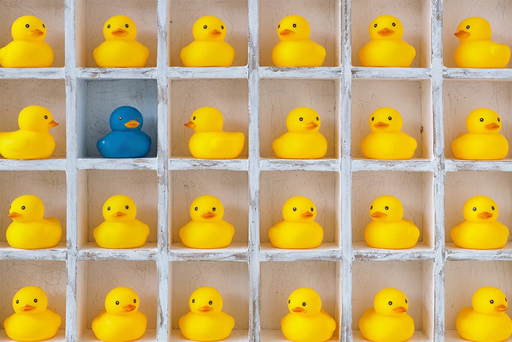
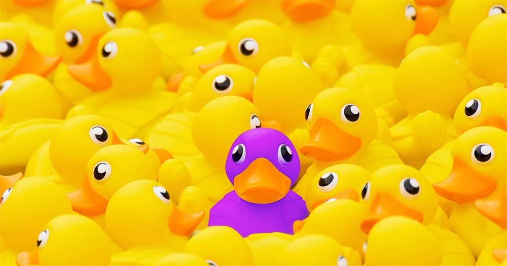 Photo from Search Engine Journal
When it comes to shaping your brand identity, ask yourself: what is the endgame here?
Do you want your brand to be top-of-mind, or do you want to position your brand in a way that is perceived to be on par with similar brands in your chosen industry?
Outlining a clear objective can help you narrow down which end of the colour wheel would be a good fit for your brand. For instance, if your priority is to stand out and make a splash when stacked up against competitors, you can get started by analysing overlapping brand visual elements that are common among your competitors.
More often than not, when delivering similar types of products or services, businesses make the decision to be as explicit about their offerings as possible -- even if that means having another half-bitten red apple as a logo.
So with this logic in mind, if you want to stand out, be sure to pick colours that will attract eyes to your brand and content (and keep them there).
In short, be the splash of yellow in a sea of navy blue and strategically build brand recall! Or, as the image earlier shows, be the purple rubber ducky in a sea of yellow ones.
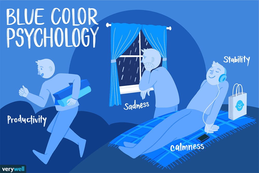 Photo from Verywell Mind
Although different colours carry different meanings, there is one thing they all have in common: they have the power to elicit strong opinions about your brand.
The world's your oyster here, but make sure the brand colours you choose can put the intended perspective in the minds of your audience.
For example, having vibrant and loud colours such as yellow for your brand may not be that favourable with an older or more mature audience. While a bright yellow colour is eye-catching, it does tend to cast an almost playful shadow on the brand, which can either be good or bad -- depending on what your goal is, of course.
The same goes for a pretty shade of pink. If you specialise in outdoor, adventure products that are mostly catered to male consumers, it wouldn’t make sense to create your brand’s visual identity with the colour pink.
Pink may be your favourite colour personally, but professionally it would send out a conflicting message to the audience.
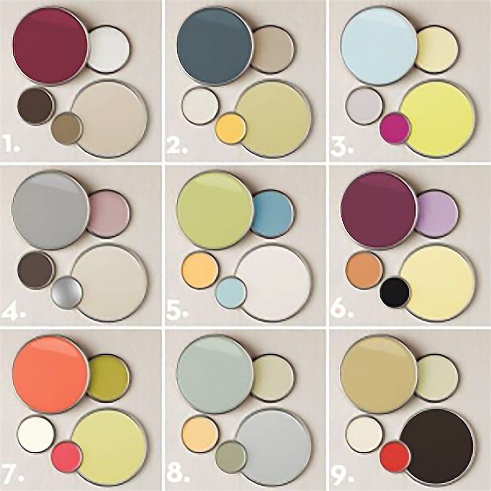 Photo from Pinterest
The process of selecting colours for your brand doesn’t stop at just a couple of key colours. You’re not tied to those few hues forever.
In fact, most brands select the key colours and throw in secondary colours into their brand colour palette templates to help guide future evolution or experiments -- especially where collateral is involved.
These secondary colours provide you with the space to experiment, but take note that secondary colours should be a stark contrast to your primary brand colours. Choose colours that complement each other, so play around with the concept of pairing bold, loud and warm colours with their cool counterparts for a balanced feel.
A fine example of colour and design growth and evolution is Zalora -- a client of Brandripe’s.
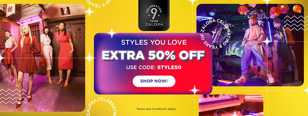
This fashion e-commerce site needs no introduction, being the giant platform that it is. Aside from its reputation for being a shopper’s haven, Zalora is also known for its minimalist black and white logo.
However, that did not deter the brand and its designers from experimenting with colours in its advertisements -- by choosing and collaborating with secondary colours for growth and collaboration.
 Now that you're able to focus on the aforementioned three key areas when it comes to choosing the right colours for your brand, it's time to move on to another important issue: checking if you have the capabilities, skills and resources to piece everything together and translate it across your whole brand visual identity and collateral.
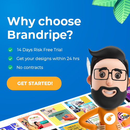
Brandripe has supported various clients (of all sizes and scales) across different graphic design mediums, from social media to display ads and even brand logos, so rest assured that if ever you’re in need of creative support, we’ll be more than happy to take you -- and the work -- on.
There are no rules as to how simple your brief needs to be. It can be something as easy yet important as choosing the right colours for your brand, or something more complex like creating a complete brand collateral.
Whether it is the former or the latter (or both), you can have access to a team of professional and experienced designers that will deliver the best results with unlimited revisions and requests from you for a flat monthly fee.
There are no contracts, hidden costs or surprises at all, and you will have full transparency of how things work here at Brandripe.
Know that you can also opt for a 14-day money-back guarantee -- a risk-free trial, to put things simply -- so that you can have total ease of mind when it comes to working with us.
Curious to find out more? Schedule a 15-minute VIP Demo Call with us today and we’ll talk you through the entire process, answer all of your burning questions and more.
Prefer to type them all out? Feel free to shoot us an email at hi@brandripe.com and we’ll get back to you.