

The famous Russian painter Wassily Kandinsky (who pioneered abstract painting in the early 20th century) once said, “Colour is a power which directly influences the soul.” But this isn’t the only profound quote about colours that we have heard of or know of.For as long as we can remember, it has been drilled into our minds that colours do something to our eyes, minds and moods. We’re completely aware of that; we know for a fact that red can make us more alert, and that blue instantly calms and relaxes us.
But does colour have meaning or does its meaning come solely from our connotation of it? Whatever it is, the world is filled with colours and simply cannot exist without it.
There's more to colours than meets the eye and this could not be truer when a brand and its visuals are involved. The most memorable and impactful brands are always the ones that truly and successfully harness the power of colour to push their creative identities and ideas out there.
When it comes to brand fundamentals, colours do a lot in giving a brand -- your brand -- a personality. So, during your creative conception, it’s important that you remember this fact: your selection of colours plays two crucial parts:
Colours possess different meanings in art and design, so to understand how you can use the power of colour effectively, you first need to familiarise yourself with the categories in the colour wheel.
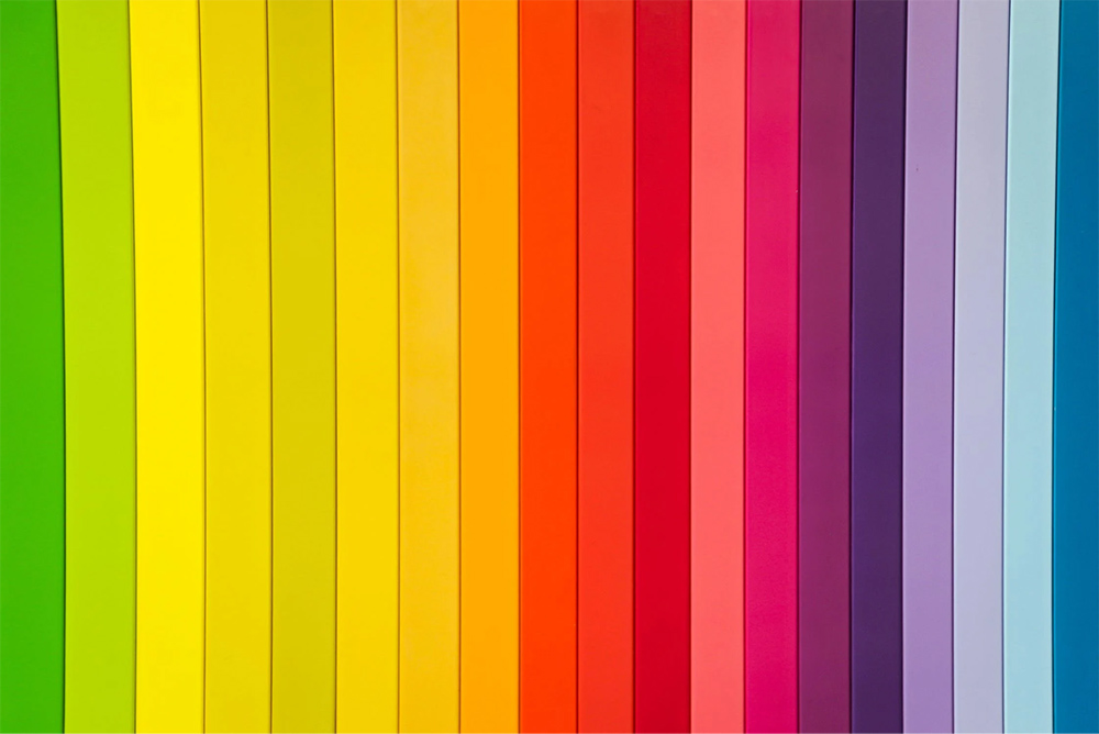
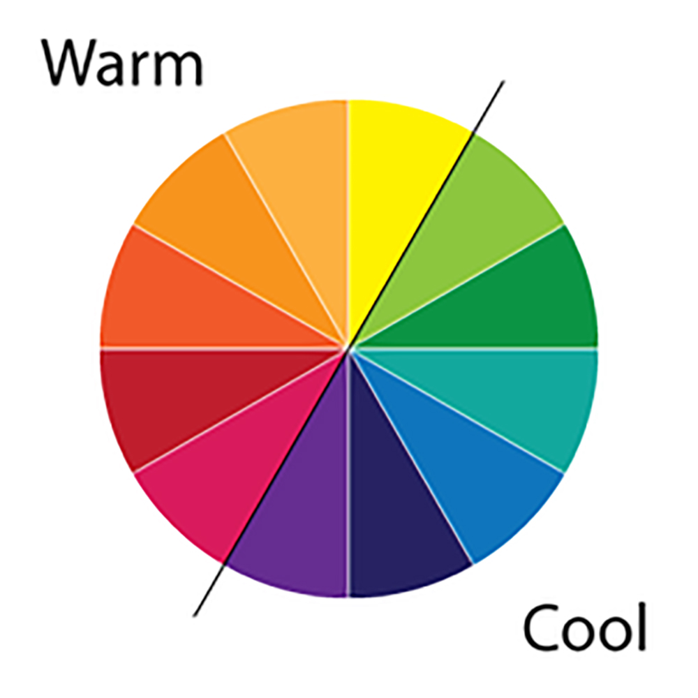 Photo from Medium
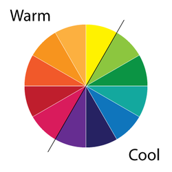
Essentially, all colours are either warm or cool. The theory behind this is that certain colours require the human eye to adjust to different wavelengths when perceiving them.
Based on this same theory, warm colours such as red, yellow and orange have longer wavelengths compared to their cool counterparts, which are typically blue, green and purple.
Refer below for a comprehensive chart that captures the two ends of the colour spectrum as a guide to help you get started:
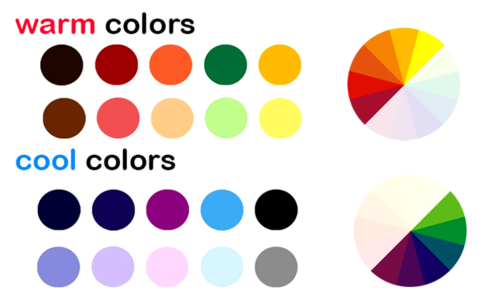 Photo from Ukietech
When choosing primary colour elements for your brand’s graphic designs, you need to consider not just whether one colour requires more focus over another or not, but also the different emotional meanings that certain colours can possibly convey.
If we take yellow, for example, it automatically makes us think of something positive. It is also commonly associated with a childlike mannerism or attitude. We are attuned to interpret yellow as the colour of sunshine -- which makes us immediately think of brightness and a strong presence.
A real-life example would be our local telco, DiGi. With its signature bright yellow, the brand successfully puts forward a persona that is friendly and youthful, and sticks to this colour across all brand messaging. Just to put this to the test, ask any Malaysian to name a memorable telco brand. Chances are, they’d say DiGi.
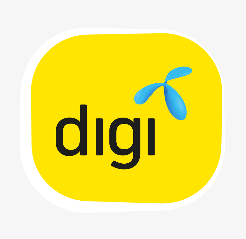 Photo from DiGi
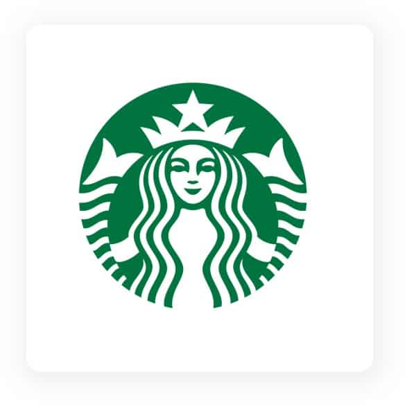
Now let’s analyse a cool colour, like green. This colour instantly resets us, thanks to its soothing, refreshing and calming feel. As we know, green is the beautiful colour of nature and is also a colour that's particularly kind to the eyes.
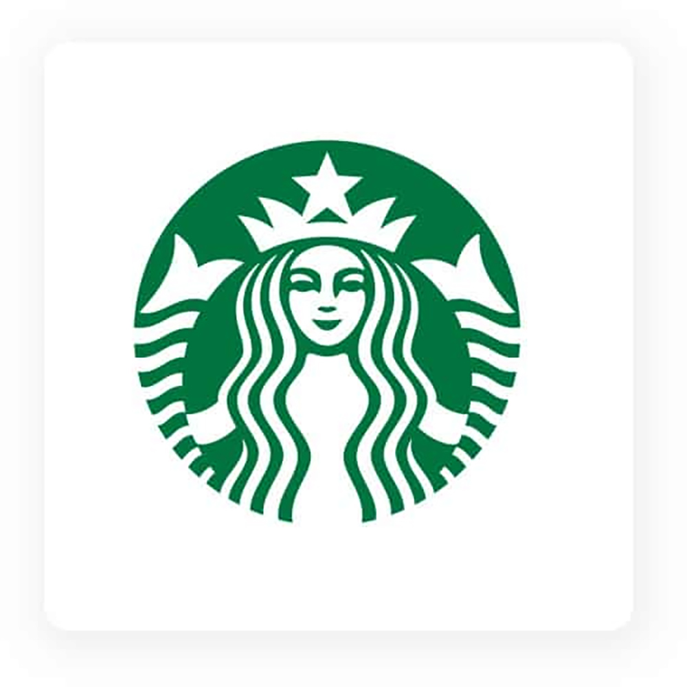 Photo from Starbucks
Starbucks is a prominent example of a brand that harnesses the “power” of green to its advantage. Coupled with the clean, relaxed vibe of its physical stores, the logo fits the “feeling” that it wants consumers to imagine when thinking of the brand.
Here is a great colour chart and their connotative meanings that can help facilitate your thought process when embarking on a brand visual graphic design:
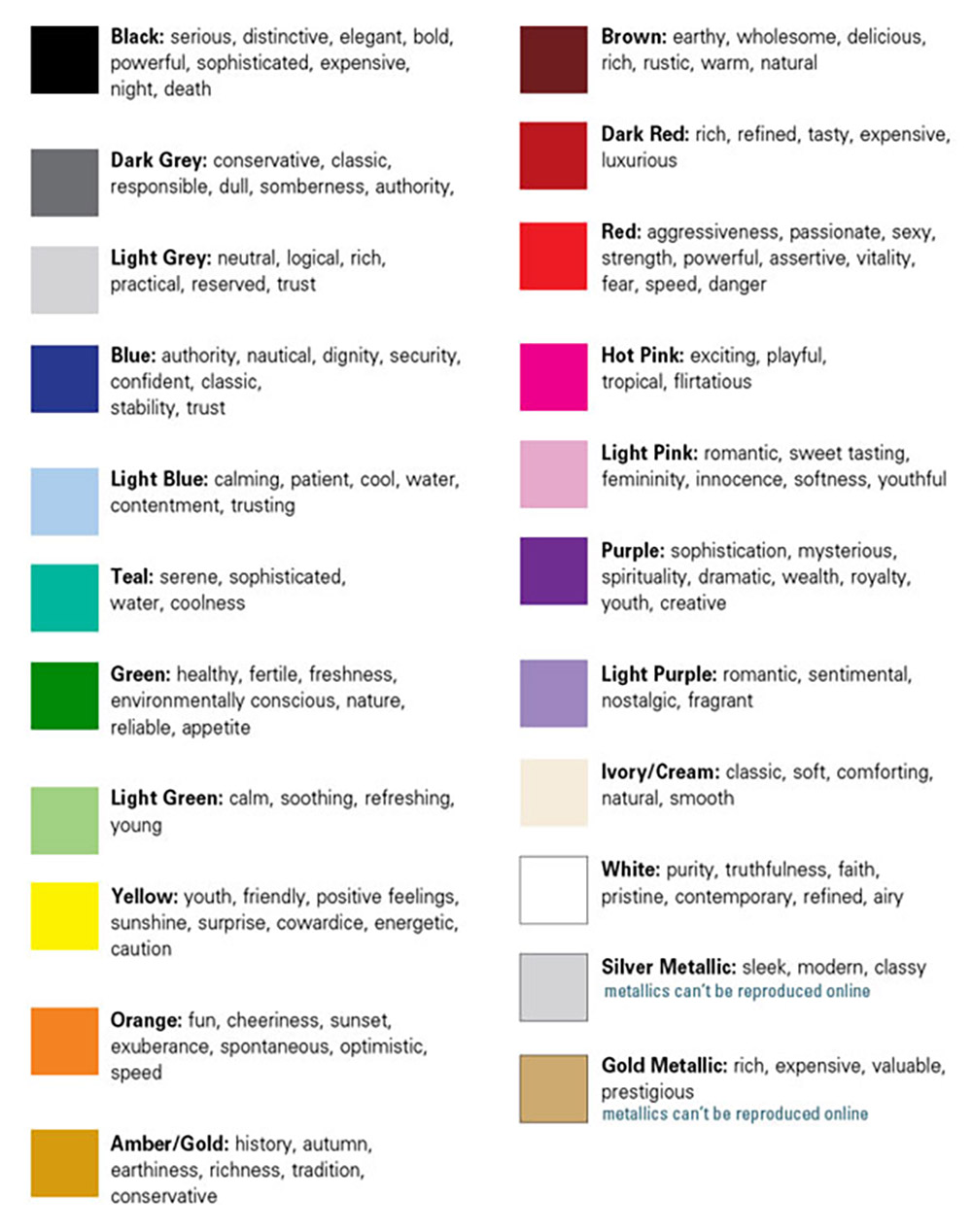 Photo from Xtreme Brand Makeover
At Brandripe, we deliver an array of creative graphic design services to a diverse clientele. From designing a brand logo to delivering whole campaign collaterals, there's more to the design thought process than just mashing bits together -- and that’s where we come in to assist you.
Trust us, different colours can really steer your brand or content! Don’t believe us? Check out some examples of how we harnessed the power of colour to help our clients convey their message or brand effectively.
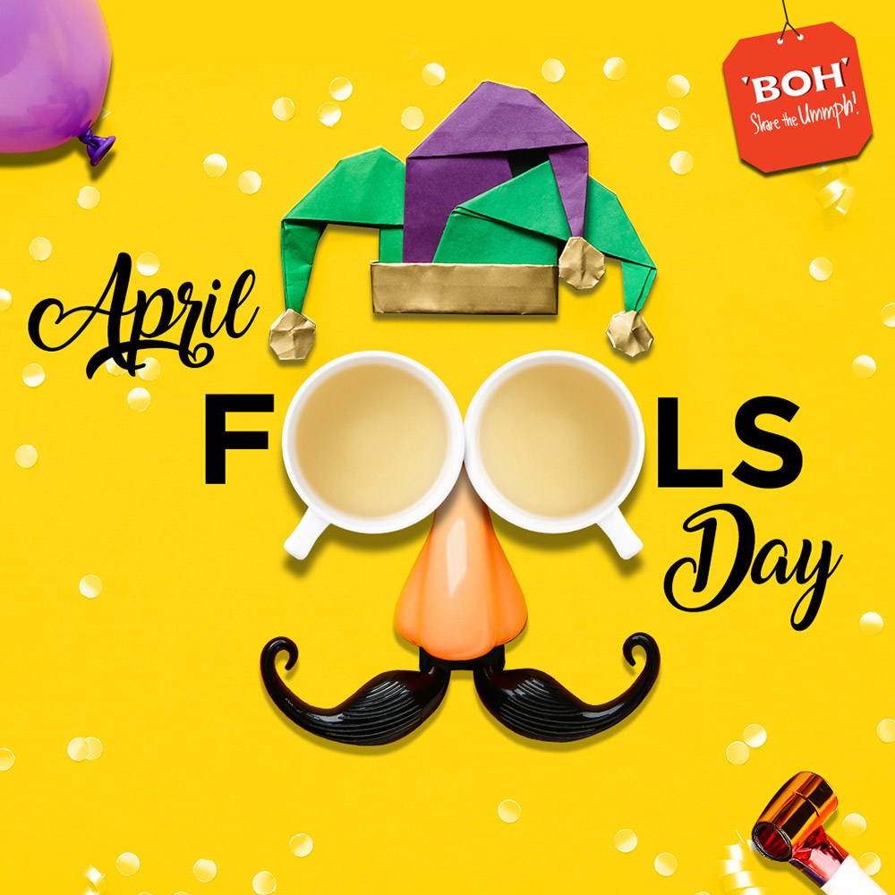
While tea is synonymous with a more relaxed vibe or mood, we chose a vibrant splash of yellow for this graphic design to tie in with the fun spirit of April Fools Day. Eye-catching and minimalist at the same time, it evoked a more friendly side to the brand.
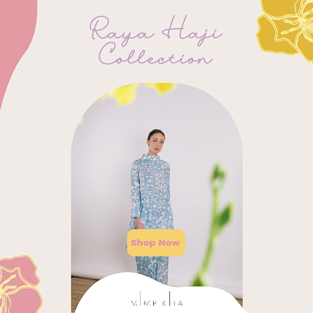
MimipiKita's brand identity is tied very closely to their beautiful and dainty fashion design across their pieces. Brandripe supported the local atelier for its Raya Haji campaign and we chose light, pastel colours that perfectly complemented its whole seasonal collection.
This helped with the overall consumer thought process -- from the time they first see the ad to actually considering the fashion pieces. It was all tied to one, single and seamless journey.
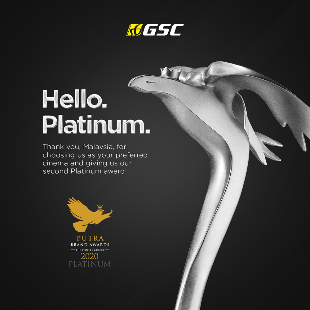
Here’s a little throwback of a visual announcement piece Brandripe did for GSC. Now let’s dissect and analyse together.
Referring to the colour chart earlier on, the main colours and their respective meanings and connotations are:
Black: serious, distinctive, elegant, sophisticated, bold, powerful.
Grey: classic, authority.
So, what do you think? Did that poster convey all of that effectively? We bet it did, as the visual exuded authority, prestige, seriousness and elegance.
After all, GSC did win their second Platinum award at the Putra Brand Award, an important event that recognises the “best-in-class” brands, reaffirming Golden Screen Cinemas’ positioning as a leading cinema exhibitor in Malaysia. Prestigious indeed!

Whether you are an emerging brand or a fully-established business looking to partner with reliable and fast-paced graphic designers, Brandripe's team of diverse and seasoned creatives are ready to take in your brief -- no matter how hard or varied they are -- and work in tandem with how fast you need to scale.
Outsourcing your graphic design needs to us at Brandripe is really simple with no fuss, no hidden costs or any tedious HR work.
All you need to do is submit your brief, and we’ll present a draft to you within 48 hours. Don’t be afraid to send us feedback and revision notes until you’re satisfied, because working with us also entitles you to unlimited revisions and requests.
Did that sound too good to be true? Well, we know first-hand how important it is for your content to be out fast, and a helping hand that can adapt to that and give you picture-perfect content would be a huge bonus, right? You’ll be getting all of that and more with us at Brandripe for just a flat monthly fee.
So, do you have an idea of a visual you’d like to see designed? Or are you in the midst of putting together some brand collateral or a logo but have no idea what colours you should go with?
We’d be happy to work with you on your ideas and plans, and help you come up with the right colour scheme -- no matter the channel -- to properly convey your message and help you reach your goals.
Let’s talk! Schedule a 15-minute VIP Demo Call with us so we can guide you through the whole process and get started.
Prefer to speak to us in visual form? Why not? Send us an email at hi@brandripe.com and we’ll get back to you as soon as we can.


