Launching Soon
Join our VIP list to receive early access and a LIFE-TIME discount on your Graphic
Design subscription.

Most people would say that a brand's logo is its most defining and recognition-building feature.
However, ask any designer and they would hands down tell you that a logo is only about half of the actual brand aesthetics. What's the other half, you ask?
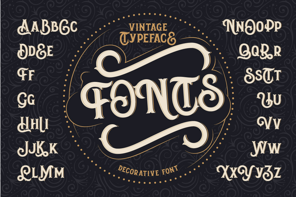
If you stop for a minute to think about a brand -- any brand, for that matter -- you would be able to pinpoint three core things: its logo, the typography it uses and of course, the brand colour palette. Typography is in fact often used in place of a logo itself.
We know what you’re thinking… Do fonts really matter that much? Our answer is yes, absolutely!
One should never underestimate the power of fonts and their ability to communicate, attract the viewers’ attention, and build brand awareness and recognition.
Think of notable fashion brands such as GAP, for example, whose logo is its prominent typography against the understated dark blue background. We bet you can visualise it right now without a single reference -- which proves our point.
The genius behind the GAP logo's typography is that the font stands the test of time, and this is a key decision when you first determine the complete aesthetic of your brand.
You would want to ensure that it will not only stay relevant for many more years to come but that it also is in sync with the more modern types of fonts that are visually consumed today -- especially if you’re thinking about creating for your website, for example.
The same goes for local super app Grab with its own distinctive typography. Not only is it memorable, but Grab's custom typography, which is its own brand logo, was actually created by Malaysian designers!
However, just to illustrate our point, here are some of the popular brands with high visibility in Malaysia, whose fonts you can easily distinguish from the rest:
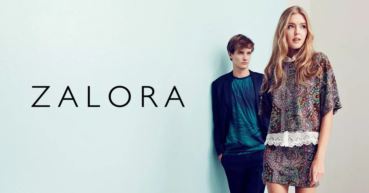
Font used: Futura
Why it works: It is a versatile, high-quality font that combines clean elegance with clarity for just the right balance of classicism and modernity.
Font used: Proxima Nova
Why it works: This font has been the most popular commercial font on the web since the mid-2010s, and it is used by more than 25,000 websites (and counting).
Font used: Serpentin
Why it works: Geometry, simplicity, legibility -- this font has it all. As a font that is full of character, Montserrat lends itself well to headings to effectively capture attention.

Font used: Linotype Didot Pro Bold
Why it works: High-end fashion brands tend to lean towards a strong, elegant font with clear forms that catch the eye, and this certainly has been proven with Zara.
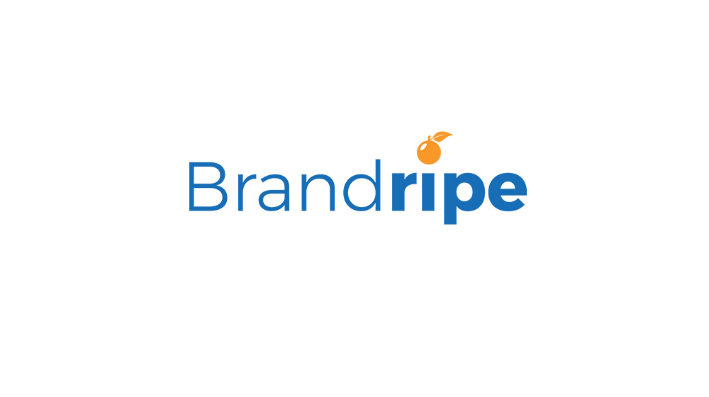
Font used: Pricedown Heavy
Why it works: It’s easy to see why; it’s iconic, memorable and accessible. It almost seems like a mixture of reliability (7Eleven is always open) and a little playfulness (as seen with the lowercase “n”).
As a serif font with well-rounded corners and curves, it’s suitable for both traditional and modern designs.
Below you’ll find a list of 5 cool fonts for logos that are modern and fresh, which you can consider incorporating into your brand identity.
However, this does not mean that you need to stick to these fonts by hook or crook. The word “cool” is subjective, and for some of us, that could mean graffiti, bubble graffiti or even handwritten fonts.
Just remember that whatever font you choose to go with, make sure it resonates with your brand and the message you’re trying to convey.
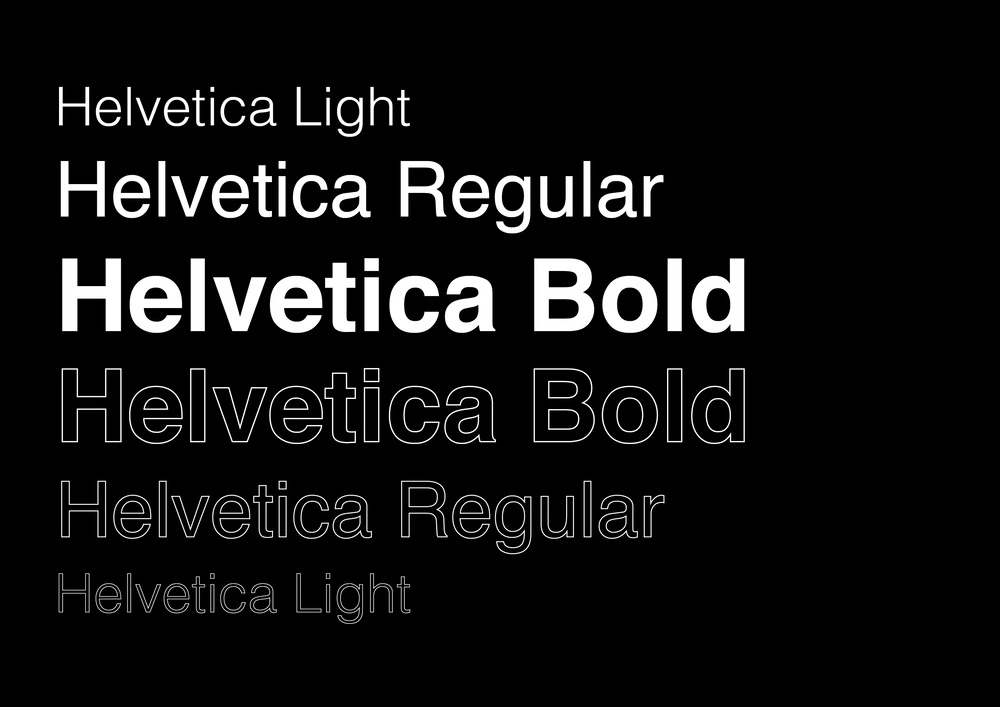
The original Helvetica font family has been present for a rather substantial amount of time now and is used by many global and well-known brands. It has also expanded to include newer versions of the font which have been redesigned for a fresh and minimalist take that can scale quite flexibly across different brands.
To best illustrate its ubiquity, a good range to compare against is how Helvetica has been used for many years now by two very different brands: Subway and Panasonic.
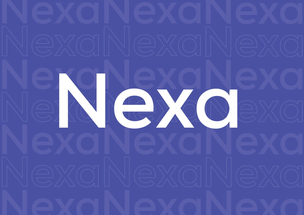
Next on the list is Nexa, a font commonly used by some of the more recent brands or even in editorials.
The story behind Nexa is that it was crafted for better readability when used across mediums such as websites, motion graphics and logos with geometric features.
This you may have seen on certain brands with a more youthful positioning -- or one that centers itself on instant value.
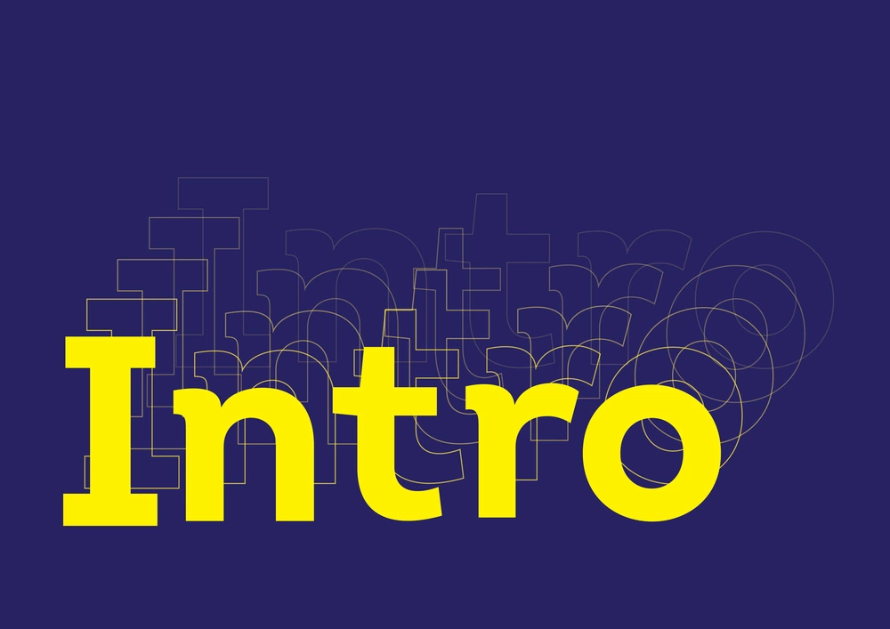
The best way to describe Intro is that it is designed to exude a modern yet playful vibe, or you can think about it as what you get out of the equation when you throw in a serif into a classy sans.
With an astounding total of 72 font styles within the Intro font family, this type of font has been a popular choice for emerging brands that seek a clean, startup feel as opposed to what you may incorporate in more traditional brands or businesses.
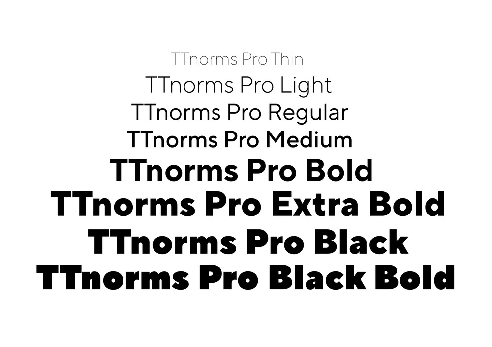
Now the TT Norms Pro is rather a classic. It is also one of the most best-selling geometric sans serif created. It's a fluid one, best suited for both large text arrays and headlines and is often a universal go-to font for brands looking to incorporate it as part of a more elaborate logotype.
The sleek, simple silhouette of its design works well as part of a whole logo without being overbearing or overshadowed by graphic illustrations or elements.
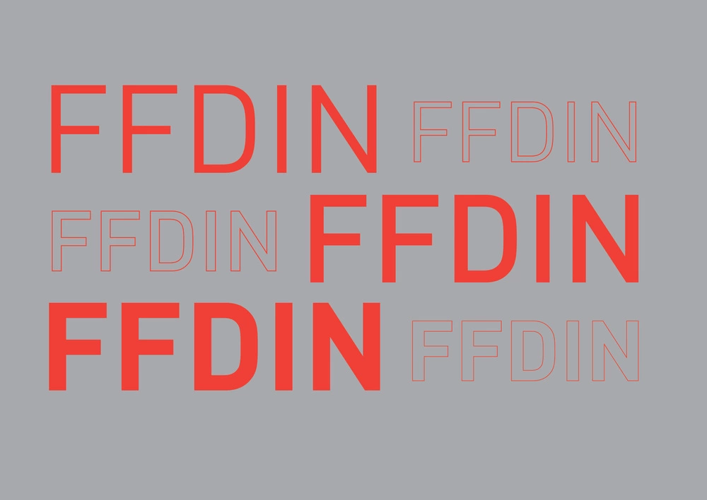
To be completely transparent, FF DIN is not that new to the cool font block. In fact, it has been in use for over two decades now. Having been largely adopted by corporate brands for its technical appearance, the font is particularly popular when it comes to packaging and editorial.
However, don't let its age deter you. FF DIN is as in as ever and is one of those fonts that stayed cool over time but remains at the top of its visual communication game.
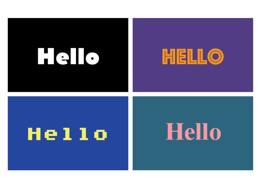
So, you've gone through a list of some cool fonts you might want to include when considering the aesthetics of your brand, but that's where the actual work really comes in.
There's a whole world of cool fonts out there, so how do you decide if one is the right fit for you? Considering that this decision can be a hard yet important one to make, you wouldn’t want to leave it up to a font generator and hope for the best!
This is where you will benefit from having the skilled designers at Brandripe at your service.
We're a creative team that has worked with notable regional and global brands across a wide spectrum; from fast-moving consumer goods to marketing agencies.
Whatever it is you’re focusing on, and wherever it is that you’re coming from, we can help you set up your brand with the right aesthetics and most importantly, the right font to go with it.
We believe in making the complex as simple as it can be but with added value, which is why working with Brandripe is clear-cut with no contracts or hidden fees.
For a flat monthly cost, you can get all your graphic design needs catered to without having to worry about limitations to revision.
If you need to scale quickly, you will rest easy knowing that Brandripe guarantees a 24-48-hour turnaround time, allowing you to focus on more pressing aspects of your brand or business.
We can keep going on and on about how working with us will greatly benefit your brand, SME or agency and tell you about how Brandripe works, the packages we offer and more, but we’re not just a regular graphic design service.
We’d like you to first get familiarised with our dashboard and designs to better understand the ins and outs of the Brandripe work process, and what working with us is going to be like. This way, you know exactly what to expect and get to ask us questions that we’d be more than happy to answer.
So, whenever you’re ready, you’re welcome to schedule a 15-minute VIP Demo Call with us here to talk more.

