Launching Soon
Join our VIP list to receive early access and a LIFE-TIME discount on your Graphic
Design subscription.

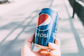
Here's a little quiz for you: name one brand that doesn't have a logo. Take your time. No pressure.
Take a look around and observe the items and things you have around you. Maybe you have an Antabax sanitiser nearby, or a Samsung TV, or an iPhone.
Think about their logos. And before you even question it, yes, logotypes are also considered logos, and yes, we’re actually surrounded by logos.
The idea behind logos is clear-cut; they are visual cues that help consumers remember your brand, and so naturally, you’d want your logo to be as unique and memorable as possible.
If you are reading this, you must be in the process of designing or conceptualising your brand and logo. To help you get started on how to get the best logo design, we've outlined key points you need to consider to get your brand at the top of your audience's minds.
First impressions always matter. It might not occur to you, but when it comes to choosing the best logo design, Malaysia has a rather complex audience.
They engage brands just as how they would engage a romantic interest, in that looks actually do matter.
Your logo is going to be across all your branding materials -- from your official documents to billboards, and posters to packaging -- so make sure it's memorable (for the right reasons!).
It’s important to really nail down your logo to make the right impression, send the right message and be top of mind to your customers and clients.

Your logo should communicate your brand identity, and for that, you need to have an understanding of your own brand's personality.
To help you really narrow it down, ask yourself the following:
Take note of your answers, and you’ll be one step closer to figuring out the perfect logo for your business.

Inspiration doesn’t just come out of nowhere, though sometimes you may be lucky if it strikes in the shower.
But sometimes, inspiration takes a little bit of work. To help get your creative juices flowing, here’s what you can do:
It’s always a good idea to brainstorm because it will help you define what you like and dislike in a logo. Get everyone in your team involved so you can assess things from different perspectives and narrow down what you feel is best aligned with your brand and what it represents.
It's important to keep your audience hat on, so remember to not be too hung up over your own views because, at the end of the day, it's the audience's opinion that matters.
Every great story starts with an outline, every great movie starts with a storyboard and every great photoshoot starts with a mood board. This exact prep of putting together a mood board can help you visualise things more clearly and reflect on how different elements set a different tone to your brand and logo design.
Not sure where to start? Pinterest is a wonderland of inspiration, so be sure to start pinning images that attract your attention.
Now, when it comes to designing a logo, it may be tempting to look at what others have done. It’s completely natural. In fact, it is advisable. Competitor analysis is very important, after all.
But while you can learn from the mistakes (and successes) of others, you don't want to be caught out there looking identical to a competitor or be passed off as a version of a different brand that people remember better.
Once you’ve analysed what worked and what didn’t, it should be fairly easy for you to come up with a concept that is not only unique but will also outshine your competitors.
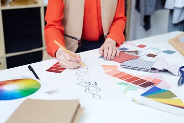
You’ve got the outline, the concept, the mental image and the works. What’s next? It’s time for the most exciting part of creating your logo: translating all your ideas into a proper design, putting all the jigsaws into an aesthetic that works for your brand.
Think about the look and feel of the elements that make up your logo and assess whether it's something that captures your brand well.
Logo designs are typically made up of (but are not limited to) different categories such as:
Of course, there are no hard and fast rules here so feel free to mix and match before finally deciding on one that would be perfect for you and your brand.
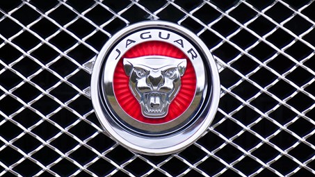
At the beginning of this article, we briefly spoke about logotypes which are indeed part of logos. But did you know there are 7 different types of logo designs altogether?
Consider what would be suitable for your business, and feel free to combine one or two of the below:
The best examples of lettermarks or monograms are Warner Bros (WB), Hennes & Mauritz (H&M) and The British Broadcasting Corporation (BBC). This type of logo is more suitable for brands and businesses that have too hard or too long a name to remember easily.
Thinking of using your company name as your logo? Why not? Disney, Google, Instagram, FedEx and Coca-Cola did it, so you can most certainly do the same.
These are usually the kind of images that pop into our minds when we hear or think of the word “logo”. It’s what you would think of when you hear the word KFC, Twitter, Shell and Apple.
Just remember that if you do decide to go with pictorial marks, make sure that it has a direct relation to your brand and what it represents. You wouldn’t want to use a vegetable as your symbol when your business is all about selling meat, after all!
An abstract logo is made up of geometric shapes and patterns that may not reflect your brand or business immediately but will give you the absolute freedom of creating something truly unique.
If you’d like to explore this type of logo, think about how each geometric shape can evoke different feelings from viewers. For example, circles always represent unity, strength and perfection; whereas squares and rectangles represent stability and reliability.
What do Pringles, Michelin and Monopoly have in common? Well, they all have a certain character representing the brand. There’s no room for second-guessing when encountering these brands without having their names spelled out, because you can always tell!
You don’t have to decide between a logotype or a pictorial mark when it comes to designing your own logo. The world’s your oyster, so don’t be afraid to experiment! Think Starbucks, Burger King, and Red Bull -- if they can make it work, so can you!
Similar to combination mark logos, emblems also incorporate both logotype and pictorial marks in their designs. For some pointers, look to Ducati, Harley Davidson or even the famous Superman emblem.
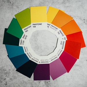
One of the most basic things we learn about colours is their ability to make us feel a certain way or think of a certain thing. Here’s a simple breakdown of some colours and what they convey:
When it comes to choosing the right colours to go with your logo design, have a think about the associated meanings of each colour, as they can help bring your logo to life and help set your brand apart from the rest in the market.
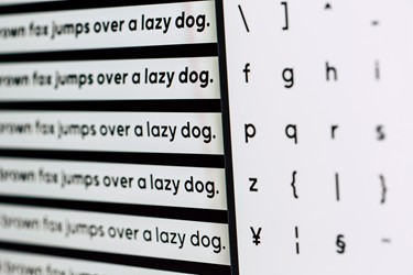
Colours aside, fonts also have the power to send a certain message to your clients and customers.
Plus, fonts are as permanent as your logo design, be sure to pick not just what suits your brand but also to whom it communicates.
Examples of popular font styles and brands that use them include:
Certain fonts have the ability to exude elegance and class, while others may come across as laid back, approachable or even fun. Experiment with different types of fonts before finally settling on one that works with your brand messaging.
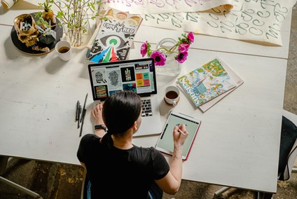
While it's great that you've established an idea of what you want, it's still best to talk to an experienced designer.
Art is their expertise, so they will be able to stitch the elements of a logo for you and make it come to life in the best way possible.
But first, there’s one hurdle you need to overcome before this happens, which is finding the right designer to help execute your idea and project. For this, you’ll need to decide on whether you should hire a freelancer, an agency or a reliable and on-demand graphic design service like Brandripe.
You can take things into your own hands and design your own logo, but remember that your logo will represent your values, beliefs and ideas so it’s best to get it perfected from the beginning with an expert.
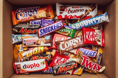
Once you've received a rough sketch or two, take time to really review your options and consider if the logo designs convey the right message effectively.
It needs to represent your wider brand, so think about whether it stands out among the rest and fits well with your overarching brand identity or not.
A good logo is more than just a picture, font or design that looks pretty. It needs to be:
Along with these elements, your logo also needs to be able to answer the following questions:
Just as we mentioned before, put your audience hat on and remember that your logo needs to convey your business or brand’s message to your audience.
Think about the bigger picture, and go beyond personal tastes.
Before you confidently sign off, however, remember this: don't be too complex or too simple, and avoid selecting logos that look generic or too try-hard. Consider if your logo design can stand the test of time, and whether they exude high-quality artistry or not.
It may be tempting to opt for low-quality designs to save on costs, but investing in your logo is possibly the best thing you could ever do for your business.
And hiring the right professional designer to do it will improve your brand and get you a logo that can last and leave an impression on your clients and customers.
But the problem is, you might not know where to find a designer that can bring your logo to life.
Even if you do, there’s no saying as to whether they’d be available, reliable and skillful enough to concentrate on your project and do it justice.
On top of that, perfecting a logo takes a lot of back-and-forth and revision, which they may put a cap on.
This is where our team at Brandripe can be a partner in setting up your brand. Most people are unaware of what goes into branding, let alone how much work it takes to create a logo, but the experienced designers at Brandripe do.
Our approach makes the complex simple; for a flat monthly fee of RM1,695 and no contracts or hidden costs, you’ll have access to:
Book a 15-minute VIP Demo Call with Brandripe here today, and let’s get cracking on your logo! And who knows, it might not just end there as we’ll be more than happy to help you establish other design elements of your up-and-coming brand.

