Launching Soon
Join our VIP list to receive early access and a LIFE-TIME discount on your Graphic
Design subscription.


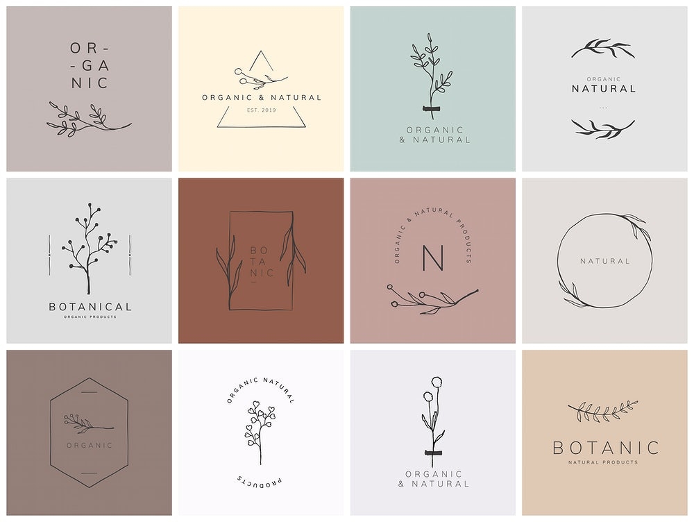
We've heard these phrases many times before and there is a good reason why they never go out of style. It’s because of one simple reason: minimalism is not about having less, it’s about making room for more of what matters.
So if you really think about it, minimalist design really does the trick of captivating the audience because there is beauty in its simplicity.
Regardless of whether you are a businessperson, marketer or someone who works in communications, it is easy to get caught up in the excitement of wanting to communicate all your unique selling points in one go. Even creatives experience the same problem!
It’s only natural; we simply want to translate too many things across our marketing collateral , ads and logos.
But true art actually lies in knowing when to stop, as the best designs actually focus only on the essentials. This is the core idea of a minimalist graphic design style.
In this article, we'll unwrap the concept of minimalism and help you centre yourself on how you can adopt and adapt this for your own brand.
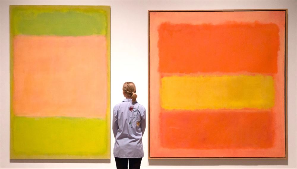 Minimalistic abstract paintings by famous artist Rothko
The emergence of the minimalist graphic design style can be traced back to somewhere between the 1960s to 1970s where it became more and more favoured by American visual art culture.
During this time, visual artists became enraptured with the idea of keeping only the key aspects of design.
These include having the characteristics of simple, clean lines and, many a time, an inclination for a monochromatic palette that is accentuated by splashes of equally muted colours.
The designs also use much lesser visual real estate and offer plenty of white spaces -- or empty canvas space in general.
After all, the goal of a minimalist graphic design is to always be as simple as possible and appear "clean" without distracting the target audience with too much background or supporting visual elements.
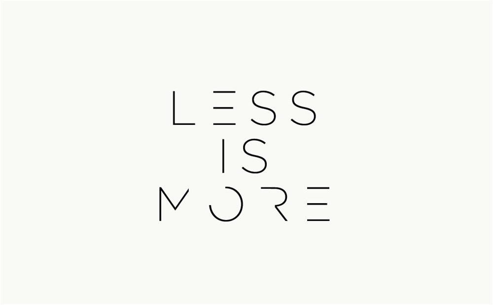
In a world where brands are visually screaming at consumers to get their messages across, you could actually get your own message across in a much better -- and yes, simpler -- way with minimalist graphic design.
Here are three good reasons why:

Cut off the extra bells and whistles and you get a canvas of clear messaging and a key image that people can recognise and recall easily.
Let’s use social media as an example. Whether on TikTok or Instagram, content is kept to less than a minute and visuals remain striking and direct.
Taking the minimalist graphic design route helps put your content out there in the most readily- and easily-digestible way possible for your intended audience.
The more content an audience has to digest, the longer it takes for them to recall it. Plus, the more convoluted and complicated it gets, the more likely you’ll lose your potential customers or clients because they might just end up dropping off halfway.
Opting for a minimalist graphic design style keeps you in check too. It forces you (in a good way) to really identify your core value proposition and the one way or thing that you want your audience to remember you by.
When it comes to creating content, the end channels where users consume the aforementioned content needs to be taken into consideration.
What works on a website may not work as great if viewed on small mobile devices and on different channels, like in-app advertising, for example.
So, if you’re going to go down the minimalist path, you’re not only saving yourself the trouble of creating multiple forms or styles, but you’ll also be able to place your brand in a visual position where it retains only what is essential regardless of where it will eventually land.
Feeling inspired to switch up your creative narrative?
Here are a few visual examples of how brands you know have been embracing minimalism, in the event that you need a mood board to help shape your own minimalist creative design direction and concept.

Aside from static designs, animated gifs, presentations and the like, Brandripe also supports clients with social media posts.
We recently worked with BOH Tea to design social media posts to celebrate Earth Hour, but with the golden rule was that the product needed to be the centrepiece or focus of the post.
With that in mind, we kept the post clean with the usage of tea leaves for a cleaner and minimalistic look, accented by eye-catching headlines and of course, the core product, which was designed to look like our beloved planet.
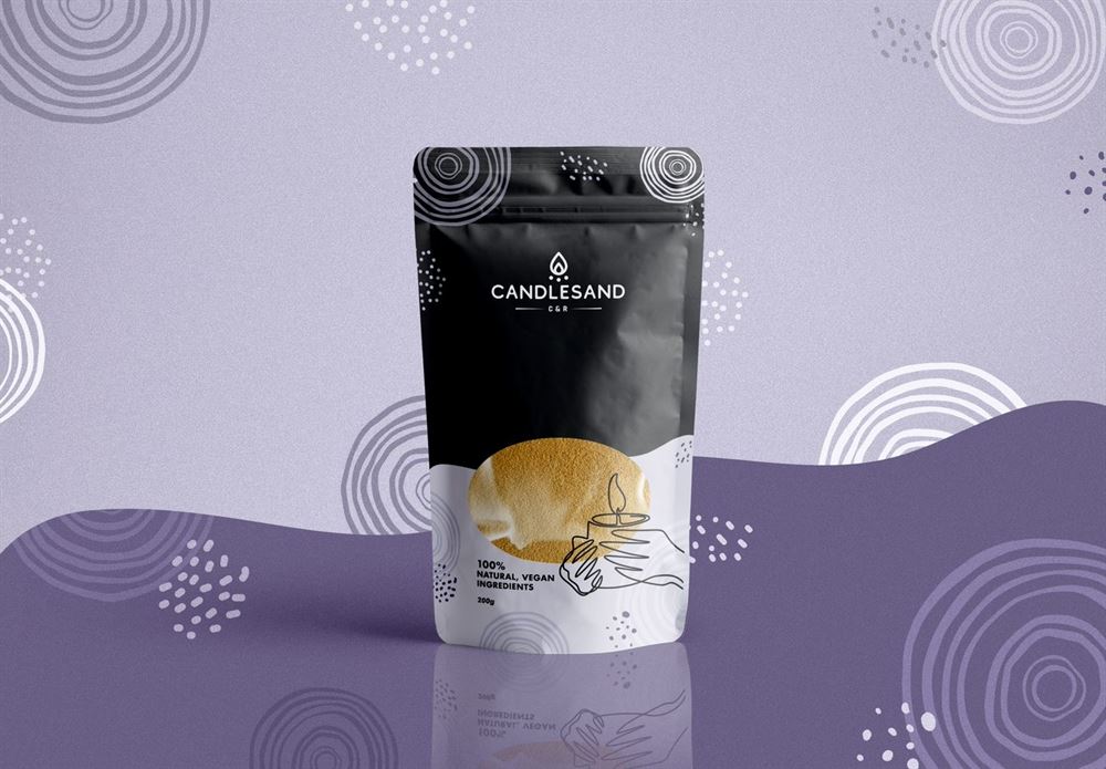
Proudly Malaysian, Candlesand offers its customers the opportunity to create their own uniquely-scented candles in the comfort of their homes.
When it came to working on a packaging concept for the brand, our design team at Brandripe took the more minimalist approach with the usage of a simple, monochromatic background and and thin white line imagery that illustrates the product’s purpose.
The look is further elevated through the see-through “window” that showcases the colour of the sand, making it easier for customers to choose.
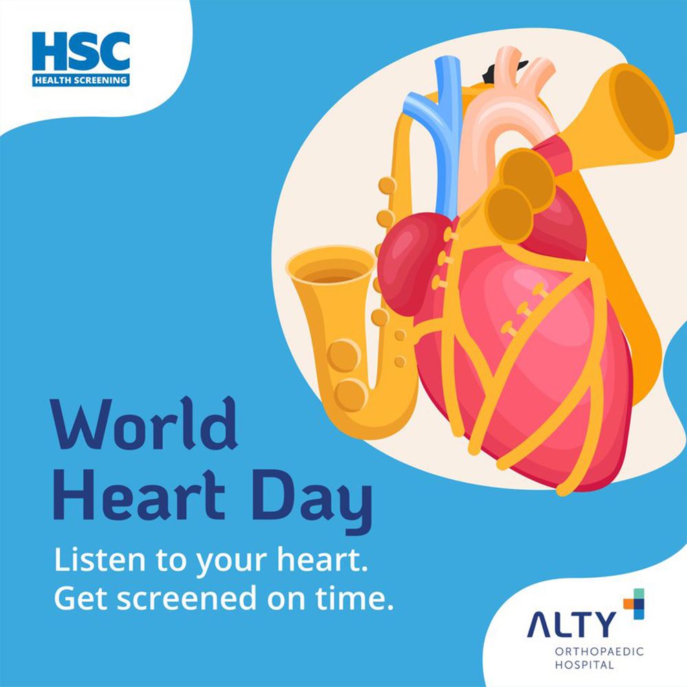
When it comes to medical promotions or ads, most would agree that they tend to be on the dry or boring side. This is why our team decided to challenge the norm and do something different for ALTY Hospital’s shoutout for people to get their hearts screened on World Heart Day.
The illustration of the heart was, naturally, the key focus, so we made sure to pool all the attention there and further affirm the message that ALTY was trying to convey by fusing it with a trumpet.
This way, those who happen to see the post will immediately make the connection between the heart, trumpet and the call to action, which is “Listen to your heart. Get screened on time.” Despite how simple the image is, it got the message across effectively.
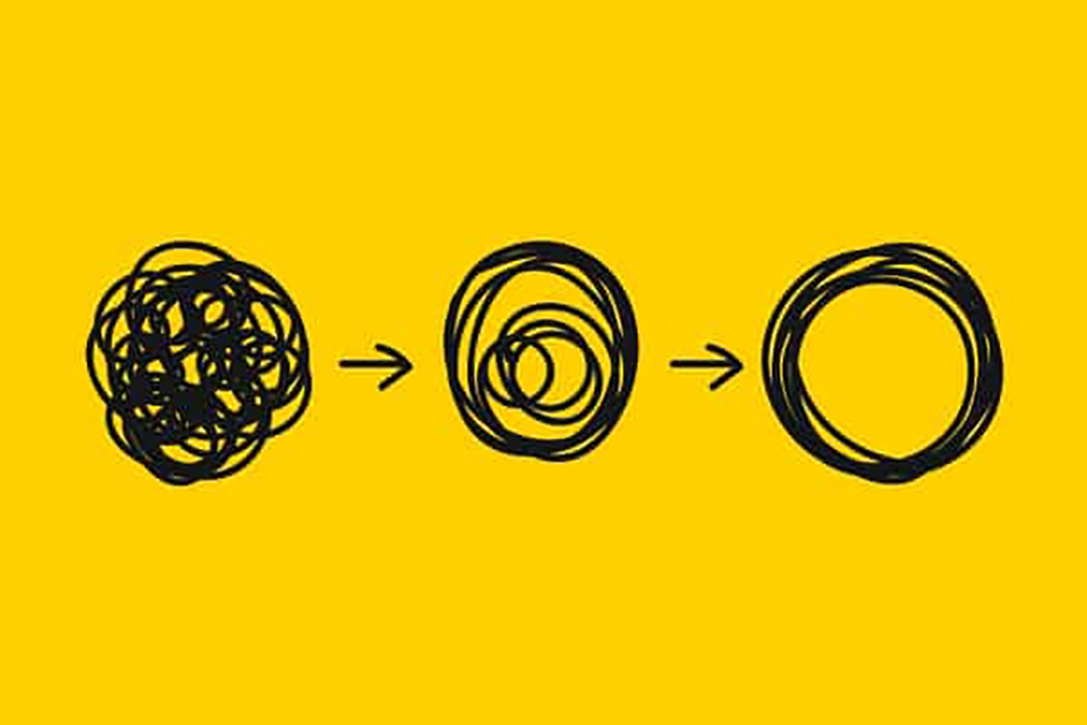
Regardless of whether you’re just starting out in business and thinking first about your logo or an established brand owner looking to cut through the noise in the market and make your next display ad or landing page pop, we just have one key piece of advice: keep it simple.
Of course, we know it is easier said than done. After all, staying simple is one of the hardest things one could ever try to achieve or do, especially when it comes to design.
Don’t let that deter you though, because the talented graphic design team at Brandripe can help you achieve your dream minimalist logo, poster or layout.
Just tell us what’s on your mind and we can definitely make it happen. Plus, you don’t have to stop at just one thing, like a logo for example. We can even discuss how to give your business or brand the visual boost it needs, from text to typography and beyond.
The best part is that you won't be getting multiple invoices for different graphic design pieces, as our service is 100% subscription-based where you pay a flat fee for unlimited design requests and revisions.
If you want to find out more about what graphic design formats we can support, check out some of our latest work here.
That aside, we’d really like to get to know you first and understand what your goals are and where you’re headed with your brand, business or project.
We’re always open to connecting with you so feel free to schedule a 15-minute VIP Demo Call with us whenever you’re free so we can go through the whole engine room of how Brandripe works and how we can help you.
Prefer to keep things simple instead? Drop us a line at hi@brandripe.com, or reach out to us via chat on our main site and we’ll get back to you as soon as we can.

