Launching Soon
Join our VIP list to receive early access and a LIFE-TIME discount on your Graphic
Design subscription.

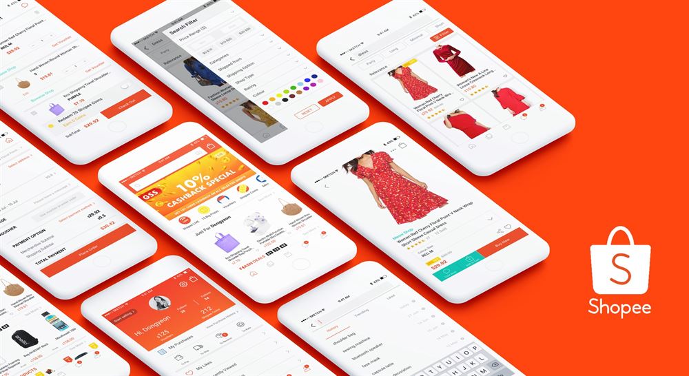
So, you’ve finally decided to take your unique hobby to the next level and start selling your craft online.
Or, it could be that you have decided to double up on your brick-and-mortar business and want to create your brand’s online presence through the region’s biggest and most popular e-commerce platforms, Shopee and Lazada.
Whatever stage you may be in right now, you ought to give yourself a pat on the back and congratulate yourself for taking the plunge.
Despite what people may say, it’s not easy to start an online shop, let alone succeed at it. Sure, it may seem straightforward -- it’s just a matter of taking a bunch of photos, putting them up on your Shopee or Lazada store, listing their prices and waiting for customers to place their orders, right?
Not really. While half of that is true, the reality is that a lot of thought goes into not only what your Shopee or Lazada shop offers to the masses, but also how it looks to the masses.
Yes, we’re talking about designing your Shopee or Lazada shop to make it look so irresistibly scrollable to the point where customers are more than happy to look through your page and eventually, make a purchase.
We’ll explain why.
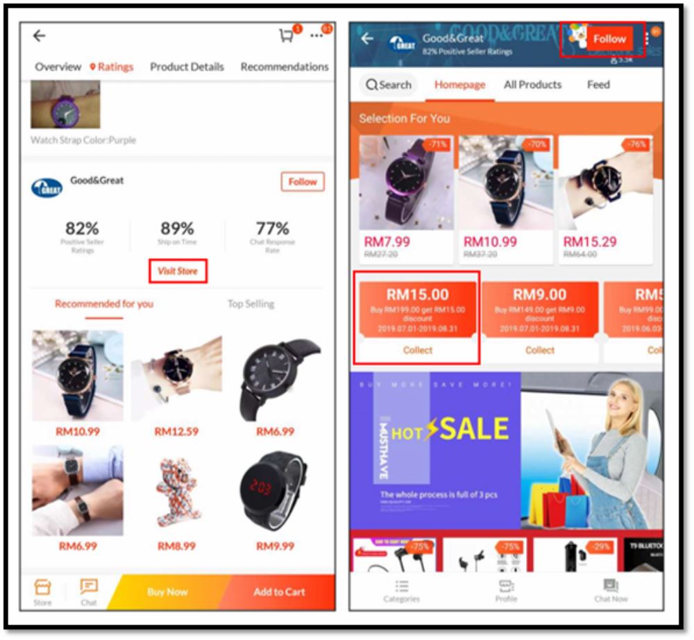 Photo from Lazada
Just like a physical store, how a place looks would make or break your decision to even step foot in it, let alone browse the items in there.
Did you know that 93% of buyers consider visual appearance to be the most important factor when making a purchase? It also takes 90 seconds for customers to make a subconscious judgement about your products.
The same concept applies to even an online store. Let’s face it, humans are highly visual creatures and first impressions do matter, so you ought to make that 1.5-minute mark count!
So, when doing up your Shopee or Lazada store just keep these few things in mind. Taking extra time to perfect your Shopee or Lazada store design will:
In case you were wondering whether design really does make a difference or not, even Lazada itself has proven that using the Lazada Store Decoration leads to a 70% increase in conversion.
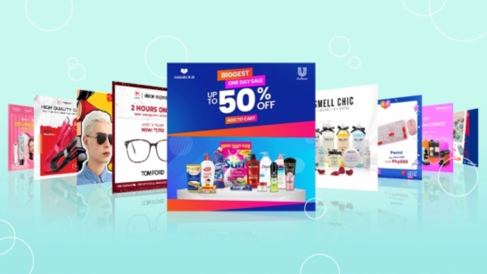 Image from Rappler here
So now that you’re up to speed on the impact an amazing Lazada or Shopee store design would have on your sales and customer retention, let’s go through some of the decorations available on these platforms.
To start designing your Shopee page, head over to the “Shop Decoration” page via the Seller Centre.
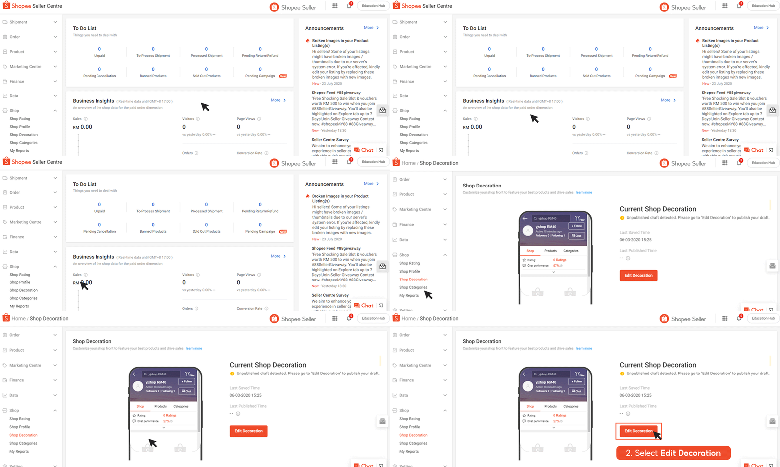 GIF from Shopee
Here are the dimensions for the elements available for your Shopee shop design:
Carousel (your choice of 3 different types of ratios)
2:1 - 2000 x 1000 px
16:9 - 2000 x 1125 px
1:1 - 2000 x 2000 px
Here’s what it would look like:
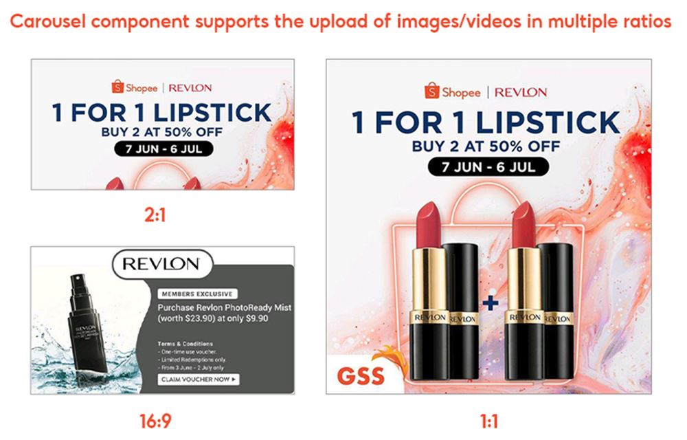 Photo from Shopee
Banner
345 x 345 px
Of course, these are the essential ones you need for the page but you can always add a video and other elements like Products by Category (up to 5) as well as Product Highlights (up to 5) which you can link to a certain page on your shop too.
Note that Shopee also has a Premium decoration function which will offer more options and elements.
There are also tutorials available, which will talk you through Shopee decoration templates, Shopee Decoration Premium and answer frequently-asked questions such as, “How do I add a banner on Shopee?”
To set up your first store design, head over to the “Store Decoration” page in the Seller Center menu.
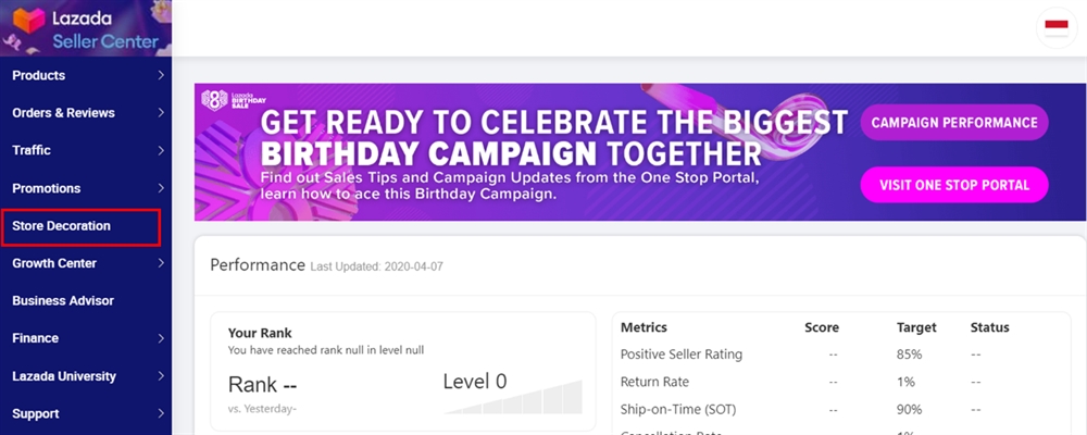 Photo from Lazada
Then, on the Store Homepage, click Edit. Here’s where you’ll be able to upload your preferred designs. According to Lazada, you’ll need to prepare:
2 store header banners
For desktop: 1200 x 128 px
For app: 750 x 180 px
Logo
600 x 600 px
These are the essentials for a basic store design. However, you can go all the way and start adding Hero products (products that are popular or highly recommended by you), photos that showcase your current and ongoing promotions and carousel banners so that visitors know immediately what your product focus is.
Similar to Shopee, there are template design and store decoration tutorials available on Lazada as well.
If you have no idea how to make your banners, logos and other elements pop on Shopee and Lazada, you can always hire professional graphic designers to help you along the way. It’s best if you get professional advice on how you can make your online shops look great, after all.
Just last year, J&T Singapore put together a list of best-selling e-commerce stores around the region that were based on both Shopee and Lazada.
Among those in the list were, of course, Malaysians with online shops that have successfully built a good reputation and a huge customer base.
Product quality, chat performance and reviews aside, one major thing that truly stood out was how well-designed these Shopee and Lazada shops are.
Think attractive product shots that illustrate the item in the best way possible, and promotional posters that get the message across immediately.
Take a leaf out of these Shopee and Lazada store designs and get yours to look as, if not more, fantastic than these:
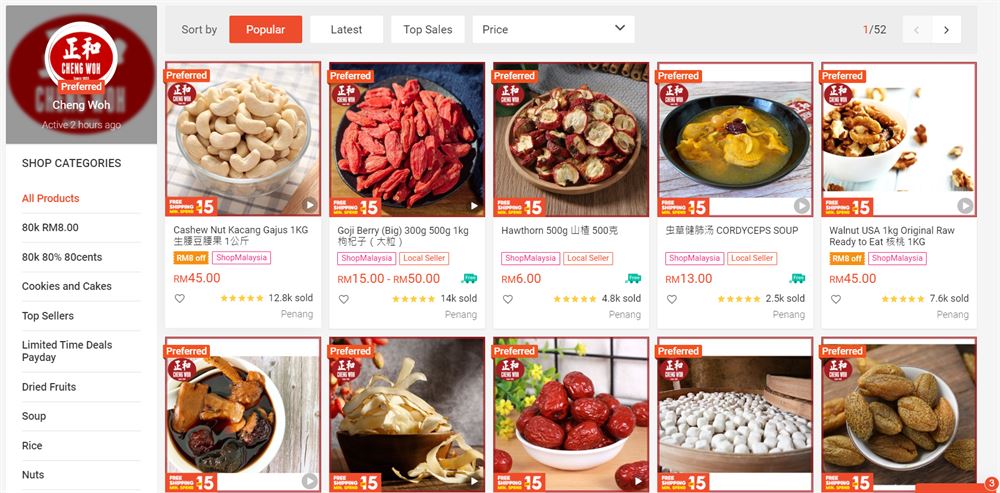 Photo: screenshot of Cheng Woh’s Shopee page
Offline, Cheng Woh is actually still a traditional brick-and-mortar business that has been around since 1933.
If you’re a big fan of herbs or a huge health nut, you’ll find yourself swept away by not only the stunning visuals on the page but by how the products are arranged and highlighted -- not to mention the big, striking posters announcing ongoing promotions.
It’s no wonder why customers keep returning to this shop!
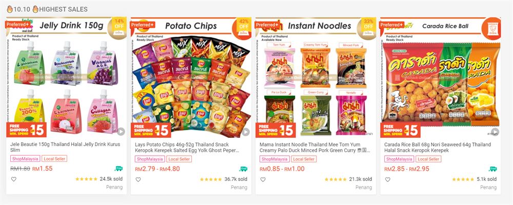 Photo: screenshot of InSnack’s Shopee page
Who doesn’t love snacks, especially ones that you can’t find locally but are now available through e-commerce and e-marketplaces like Shopee?
This is one of the reasons why InSnack has become one of the most popular pages for snackers and shoppers alike, because not only do they specialise in snacks, sweets and drinks from Thailand, Japan and Korea, but they also know how to display what their focus is in a straightforward yet effective manner.
What started as a side project between friends Adam Chong and Gary Lum in 2017 eventually became one of the most popular electronics e-stores in Malaysia.
In fact, the store has become so popular that Lazada reported that Mono Digital made RM1,000 every minute during the platform’s 2018 11.11 campaign! The report also stated that their nett profit of RM1.5 million meant that the shop’s growth rate septupled compared to the previous year.
Design-wise, however, just take a look at how easy it is to navigate Mono Digital’s online storefront -- you’ll find what you’re looking for almost immediately, which shows that the owners and design team truly took the time to think about the user journey and how visuals and arrangements play a huge part in the overall store perception and customer retention.
A clear example of this is their categories page:
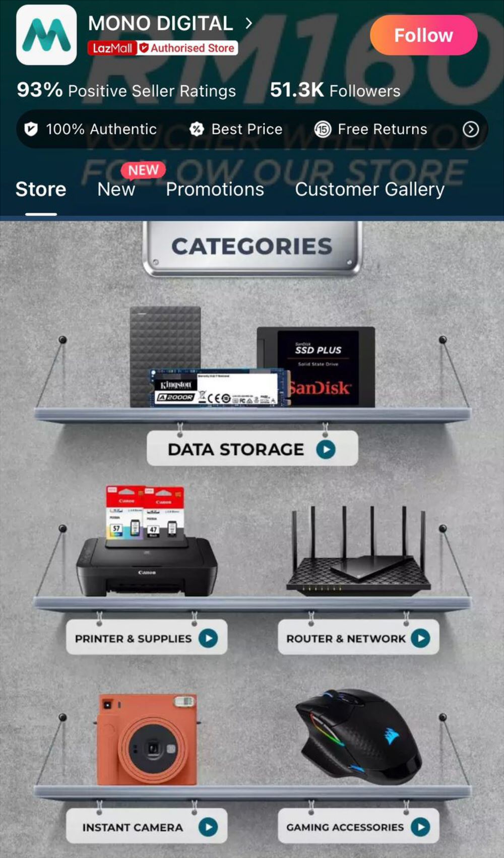 Screenshot of Mono Digital’s Lazada page
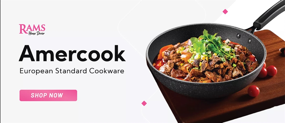 Photo: screenshot of Rams Home Decor promo here
Despite already having an established business, the people behind Rams Home Decor quickly adapted to the online shopping space and made full use of the opportunities that Lazada store designs can offer in terms of vouchers, promotions and more.
The fantastic use of attention- and eye-grabbing posters that display what products are on sale with a clear CTA button, interspersed with bonuses and rewards that are up for grabs easily funnel customers and users to browse through and eventually purchase from the shop.
 If there’s one thing to learn from these online stores -- or any online stores, for that matter -- is that they have complete and total control over their customers’ experiences.
Long gone are the days where one would just have to take plain photographs to upload on a page before sales come through.
These days, competition between e-commerce stores and platforms are tough and what breaks or makes the sale is how effective the store is at capturing the customers’ attention and retaining it.
You could have the best products possible and excellent customer service, but if your store design isn’t up to par, your online business presence could very well diminish.
But where does one even begin?
Don’t worry. If you find yourself asking, “How can I design my Shopee or Lazada shop?” know that Brandripe knows exactly how you can do that so you can take charge and connect with your customers to encourage purchases.
Of course you can always tweak things on your own, but when it comes to making sure that your online store gets the most eyeballs and opportunities to attract customers, hiring competent and experienced graphic designers are the way to go.
Want to know how to create the best Shopee banner or Lazada store design? We know the right elements that can captivate visitors, what images would best showcase your product display and promotions, and how to avoid distraction and more. It’s only the tip of the iceberg here.
We can help you start, or we can help you expand your online store design -- or both, if it comes to that. It’s your call.
Speaking of call, let’s get to know each other better first and help us understand what your business is all about and what your long-term vision is by scheduling a 15-minute VIP Demo Call with us.
In turn, we’ll talk you through how we can help your online store on Shopee or Lazada go above and beyond.
Alternatively, you can always send us a message via chat on our homepage or drop us a line at hi@brandripe.com.
We’ll speak to you soon.
