

Do you have a new item on the menu, which you’d love to introduce at a special introductory price?
Or perhaps you have an upcoming annual sale that will coincide with some of the busiest shopping days of the year?
Well, there’s nothing better than a great, eye-catching and persuasive promotional poster to help you get the word out there.
When done right, promotional posters can be the most impactful piece of advertising content that can be a touchpoint of sale, which is all the more reason to put some thought behind your next promotional poster!
But what makes a good promotional poster -- especially one that can stand above the noise of your competitors and capture the audience’s flighty focus? How can you engage your audience and persuade them to take action in just a couple of seconds?
We’ve got the answers. Here's a quick guide on what goes into a good promotional poster design.
While it can be tempting to put a whole essay on your brand, product or service and just fill it to the brim with a whole list of selling points, promotional posters should focus on literally just the main subject of promotion.
When you add in just a bit too much to the content, you risk overwhelming your audience. Pick a point and stick with it.
A great promotional poster design is simple yet punchy and gives away just enough information to keep the audience interested and intrigued.
Multiple icons, shiny fonts and lots of embellishments often make for an eyesore rather than an eye-catching piece. But if you must, make sure they make sense.
On top of that, when working on your promotional poster design ideas, try not to default immediately to a blaring red, orange or yellow. While these colours are deemed to be highly effective in catching attention, the purpose of your promotional poster needs to be logical and clear.
Therefore, you’ll need to put a little extra thought into the why’s and how’s.
Some questions to ask yourself include: aside from compelling the audience's attention, do the colours you chose for this poster match your actual brand identity? If it's out of your usual colour palette, would it still be complementary? Are the illustrations or accompanying graphic elements relevant to the message?
If you’re just taking a stab at random elements, you might risk creating a “bad ad” (and no one wants to be remembered for that).
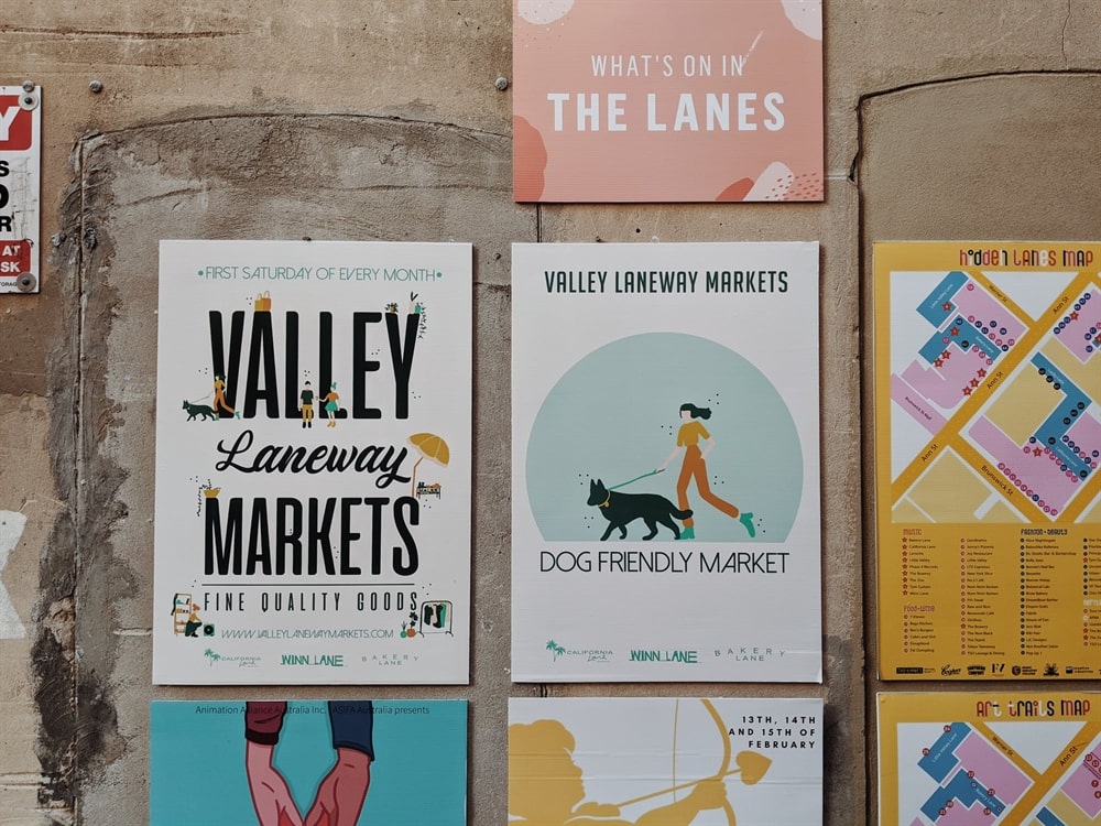 Image source: here
Last but not least, where exactly are you using this promotional poster? Is this a print piece that will be plastered all over the subway walls? Or is this a more personal hand-out?
The reason you need to ask these questions and consider them carefully is that you'd want to also take into account how close or far apart your audience would be to the placement of the promotional poster itself.
This helps with the layout of the whole design; from the font size to the play of white space and length of copy. For instance, if the promotional poster is placed among a wall of sorts then you'd want to think about maybe going on a different path to stand out against a myriad of rainbow-coloured posters from other brands.
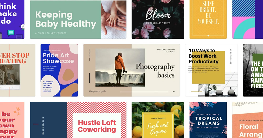
While those are three key pointers to have in mind ahead of design your promotional posters, let's take a look at some examples and ideas to help paint a visual picture of what and how your design can look like:
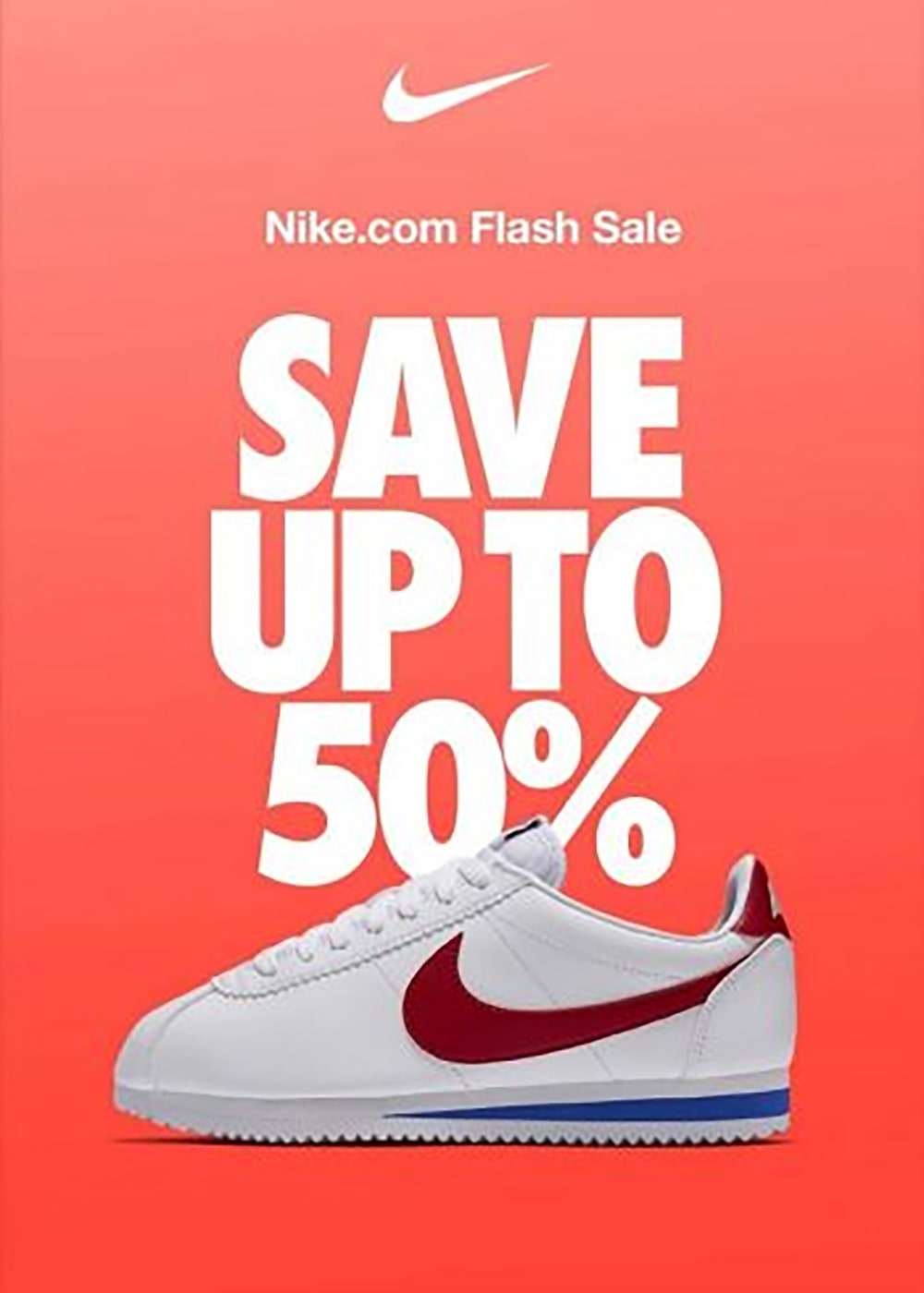 Image source: here
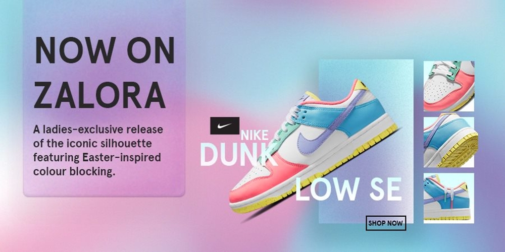
This promotional poster has got the aforementioned key points down pat and wisely makes the most of them.
From the headline to the carefully curated visual elements, it highlights the main message to persuade viewers into taking an action: to save and get a good deal while they’re at it.
Adding a figure in there helps pique the audience's interest because their minds would automatically assume savings or form a more tangible understanding of the texts.
What also helps is that Nike's logo is prominently displayed at the top, and its iconic product line, which is their footwear, is placed in the centre in a big way (literally) to help the audience make that connection immediately and effortlessly.
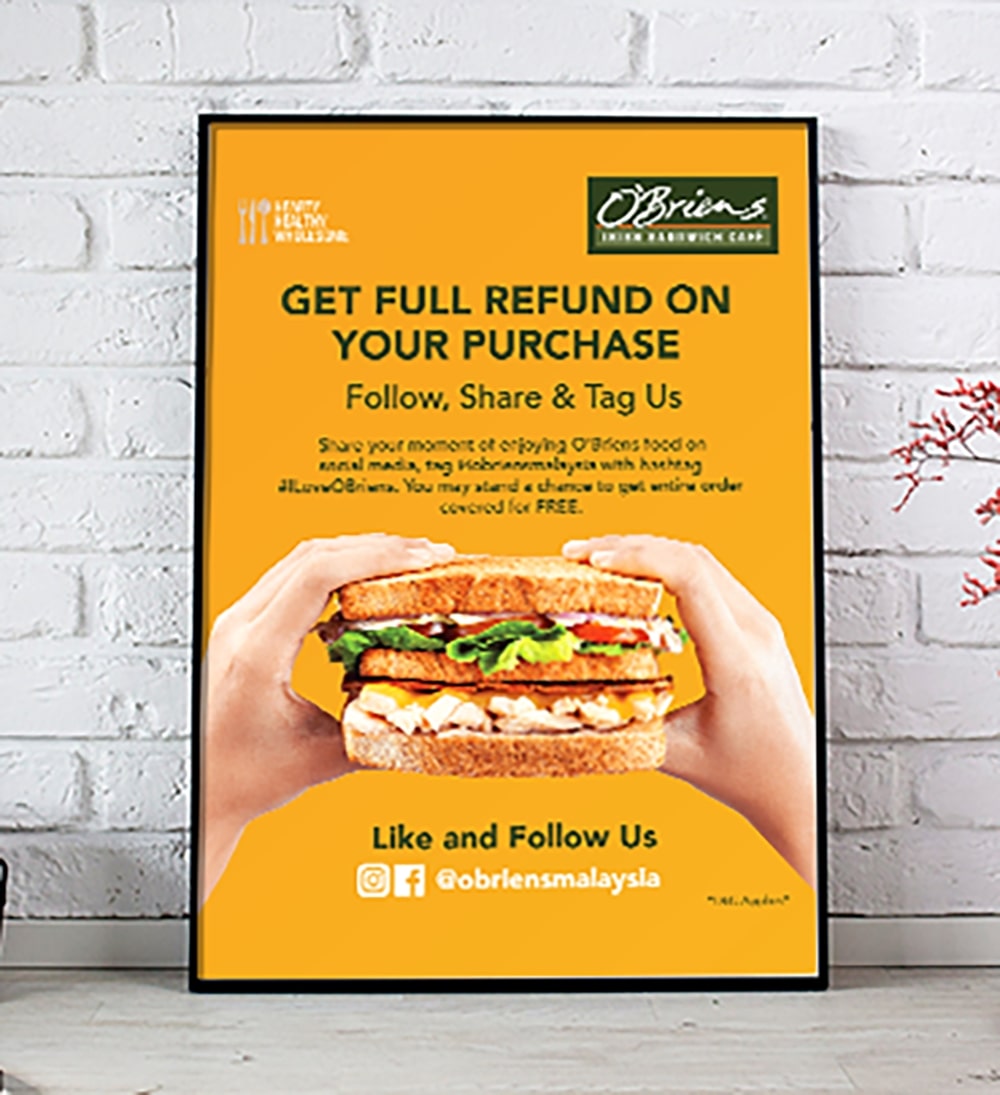
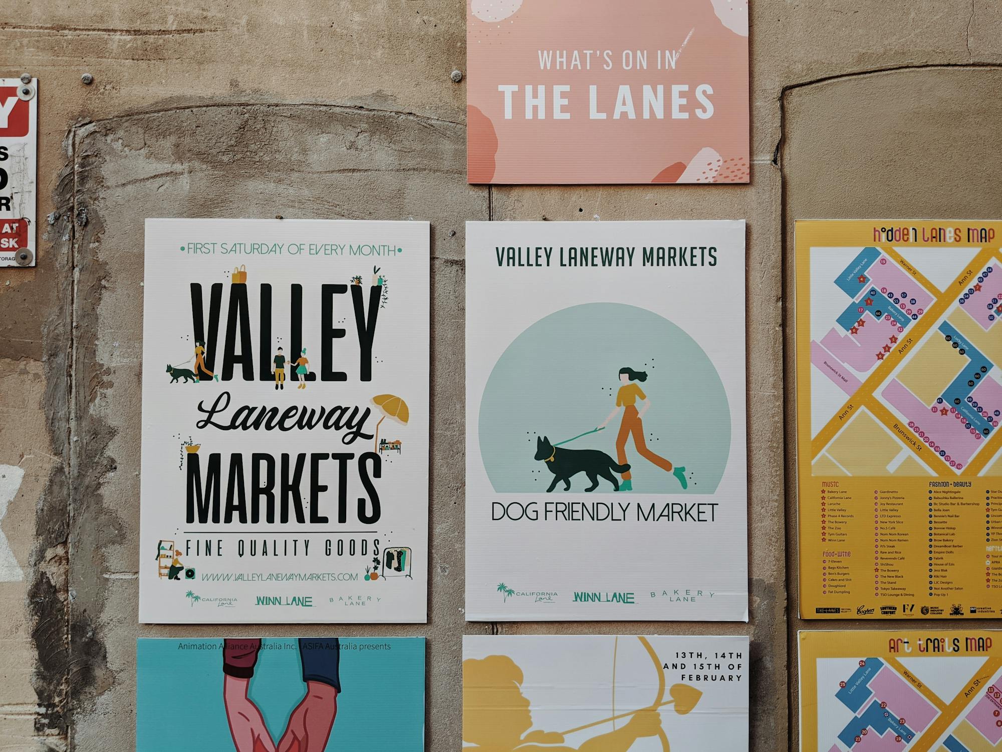
Our team at Brandripe worked closely with popular lifestyle chain cafe O'Briens for several designs. One of them is a promotional poster with several goals: to send a clear message, widen their social media follower base and entice customers to make a purchase.
To that end, we created this piece which boldly placed the key call to action via the copy, but also uses powerful product imagery to establish brand recognition and recall (while making tummies rumble too).
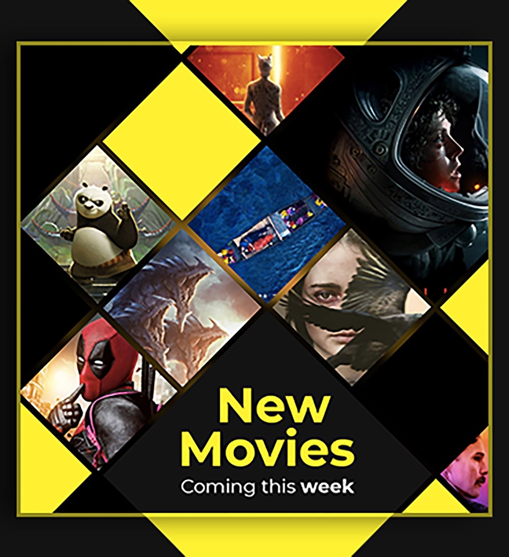
This is a design that we particularly enjoyed designing here at Brandripe. Not only does the promotional poster speak for itself, but it's also successful in placing the brand in there without having to actually mention the brand and place a logo up, front and centre.
As mentioned earlier, it’s important to think about where your ad is going to be displayed, and this particular poster was meant for social media placement.
With that in mind, we didn't feel the need to be elaborate here in the visuals; the message can be supplemented in the broader caption which accompanied the post.
However, even if users did not read the caption, they’ll immediately grasp what the message is (new movies), and who from (GSC, because of the colours and style).

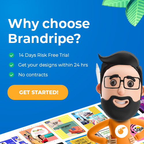
We're a professional team of creatives here at Brandripe, and we can help you not just whip up a good promotional poster, but ensure that your brand is able to scale as a whole.
How do we do this?
While many businesses struggle with things such as turnaround and contracts when engaging freelancers, we guarantee a 24-48 hour turnaround time with unlimited revisions until you are absolutely happy.
Does that sound too good to be true? Wait until you hear about how you actually don’t need to sign a contract and subscribe to any hidden fees or “surprise” charges!
That’s right, you won’t be hit with anything unexpected here at Brandripe, because for a flat monthly fee, you’ll have access to a team of professional designers that will ensure that you receive top-notch quality collateral.
Of course, we’re completely open to any questions you might ask, be it about the pricing, the team and the process itself. We’ll even take you on a virtual tour of our dashboard so you know exactly what goes into designing your potential and future ideas.
Drop us an email at hi@brandripe.com, or ping us via Chat on the main website to get in touch.
Better yet, schedule a 15-minute VIP Demo Call with us today to speak to our representative, and we can walk you through everything -- including all the possible designs we can work on together!


