Launching Soon
Join our VIP list to receive early access and a LIFE-TIME discount on your Graphic
Design subscription.


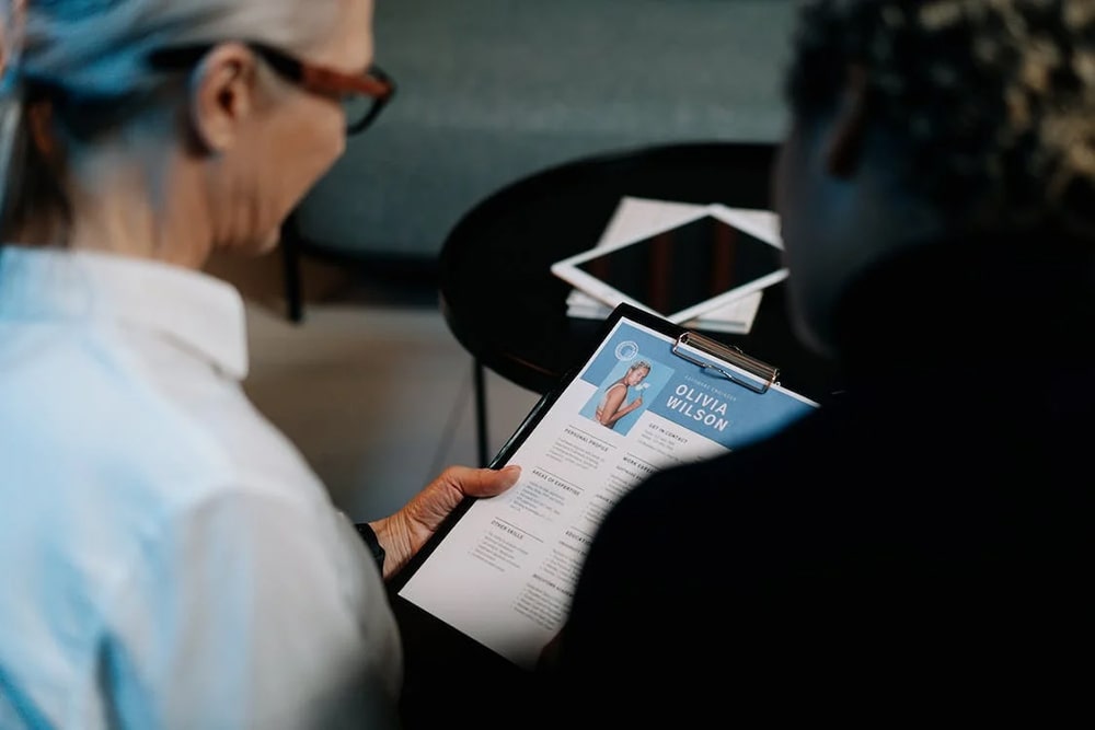
Image: Pexels
Your resume is one of the most important documents of, in and for your career. Not only does it say a lot about you, but it also determines whether you will be called in for an interview or not.
Of course, there may be those who think, “You are not your resume, you are your work” – and while we couldn’t agree more, we’re all for making things a little easier on the eyes through great, coherent design.
Remember, you need to help the recruiters as much as possible, considering that they go through hundreds (if not thousands) of resumes. On that note, we do have another nugget of information to share with you…
Back then, resumes serve to capture the attention of recruiters and hiring managers – this much we know. But did you know, that fast forward to today’s digital age, resumes now have to beat the algorithm – by having all the right keywords and layouts for applicant tracking systems (ATS)?
Whether you knew this or didn’t, consider this a reminder to not only impress actual human beings who will be manually sifting through many resumes in search of the right candidate but also incorporate details that will make you trackable for ATS.
This is why it’s highly recommended that you tailor your resume as much as possible to each job role that you are applying for. Not only does it help position you closer to the job criteria, but it will also help you ‘win’ the ATS filter.
Hence, we cannot stress how important it is for you to get your resume, and at the same time, ensure that it stands out from the crowd.
Now, in order to land that job, you need more than just a blend of keywords and great design. To help you kick-start your job hunt, we have compiled a list of 10 creative resume templates to help you beat other candidates and impress your future employer(s).
1. Landscape resume
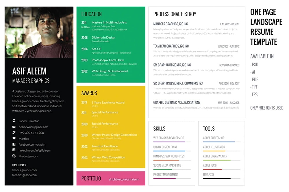 Image: Prosymbols
How many times have you ever seen a resume in landscape orientation? Most, if not all resumes we’ve encountered are all laid out vertically, which makes this template by Prosymbols a very interesting, fresh and unique choice.
The thing about vertical resumes in general is that you would have very often found yourself trying to squeeze in a lot of texts in narrow lines and boxes. Opting for a landscape style for a change would give you plenty of space to fill – making it perfect when you have quite a robust portfolio to show and tell.
Plus, just imagine the recruiter or hiring manager opening your resume and saying, “Well, that’s different!”
2. Chessboard design
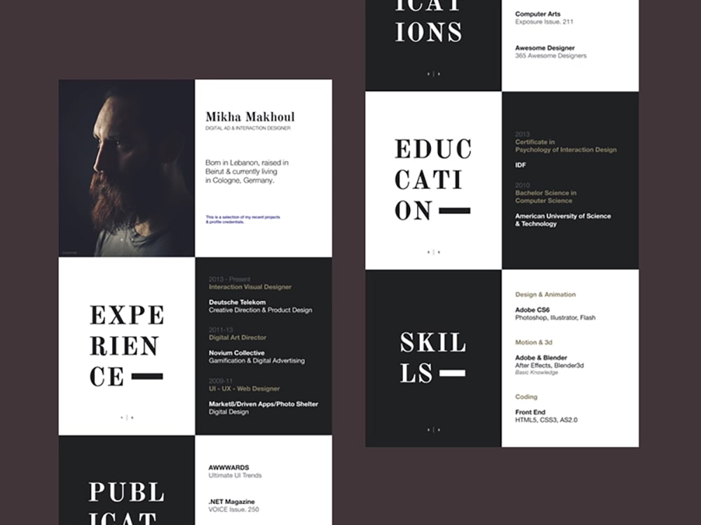 Image: Dribbble
If you are a creative professional, or even someone coming from a sales and marketing background, this chessboard design resume template by Mikha Makhoul is perfect for a very elegant yet unusual aesthetic.
His example demonstrates well how you can utilise the template styling – just add photographic touches, and keep it minimal with key information and focus areas.
3. Go retro
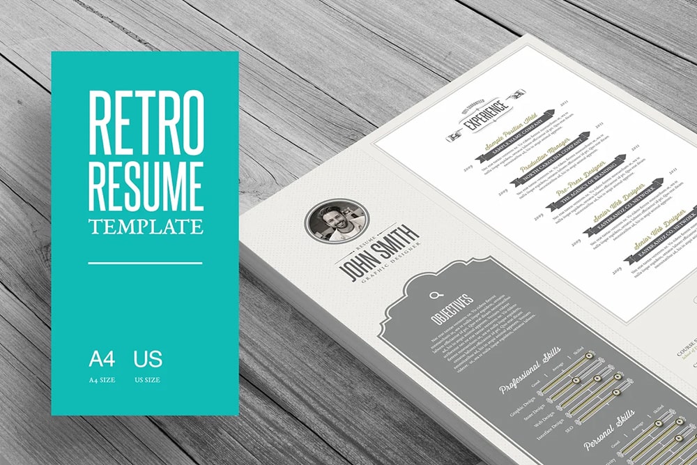 Image: Creative Market
Of course, a retro-style resume is not going to fit every company or job. That’s why it’s important for you to tailor your resume to each role – not only in terms of keywords (as we mentioned earlier) but also in terms of design.
Companies love it when candidates are attuned to their brand, this resume template by Easybrandz would be very suitable indeed for a brand with retro aesthetics.
4. The minimalist
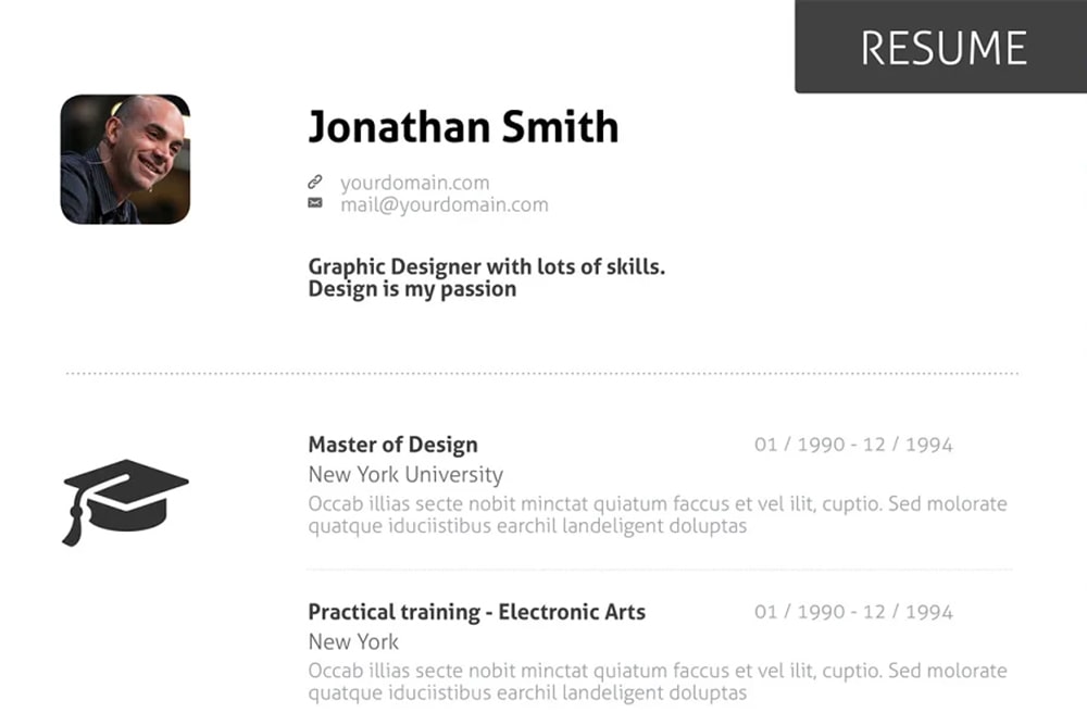 Image: Creative Market
Less can indeed be more, but this doesn’t mean that you should just type out all your experience on a Google Doc and send it off to the hiring manager or platform! If minimalism is your thing, be sure to spend some time and effort on making it snazzy without giving the impression of something rudimentary, or worse, that you’re just lazy!
Your resume should tell enough a story about you to make recruiters or hiring managers interested in finding out more. Having a minimalist resume like this template by OFFI does just that – as it gives key information about you and your career achievements in such a simple yet sophisticated manner.
5. The bold and beautiful (with pops of colour)
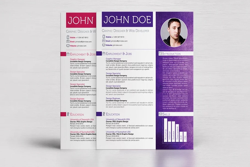 Image: Creative Market
Most times, candidates tend to use monochrome or ‘safer’ corporate colours on their resumes to exude professionalism. But the point of a resume is to also describe you as an individual and tell your story.
You can still be colourful while playing it safe with this colorful template by Dragoș Neagu, adding just a bit of personality to your resume while keeping it corporate-friendly.
6. Blocky, contrasting colour accents
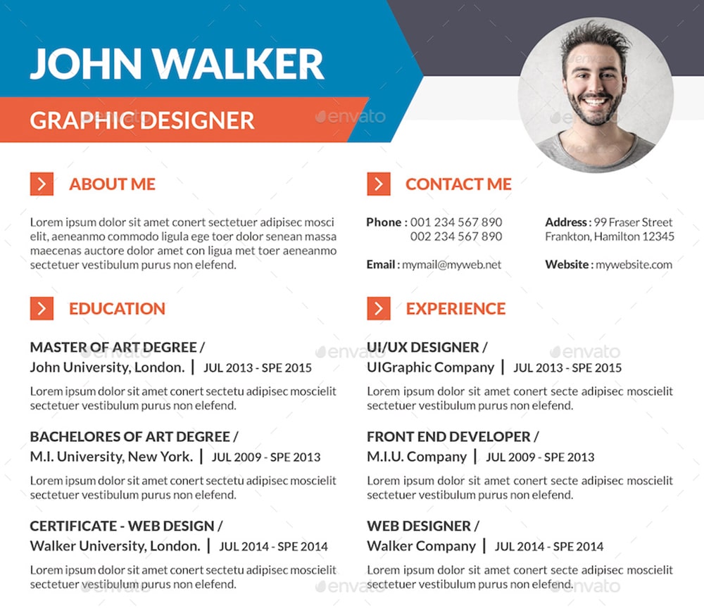 Image: Graphic River
Aside from adding or using dual colour tones in the previous example, you can also use bright colours as accents instead. This example by KhidD is a great way of using bolder, brighter colours for headlines and section breakers while keeping the rest fairly simple and minimal.
To make it really pop, why not use colours that complement each other in the colour wheel to really capture attention? If you’re unsure of what colours to use, take a look at our previous blog post, “3 of the best types of colour combinations and how to apply them to your designs”, by clicking here.
7. Simplicity can be key
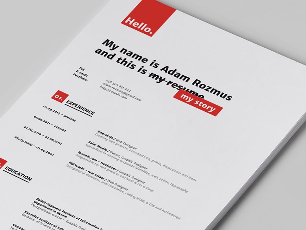 Image: Dribbble
With so many people vying to stand out from the stack, sometimes the best way to stand out is by keeping it direct and simple.
Not to be confused with being minimalist, being simple here just means laying it out as it is – but in an organised and neat way, just like this template by Adam Rozmus. The single pop of bold colour is an excellent way to make it look interesting enough to attract the reader’s eyes and invite them to read through it.
8. Make it an infographic
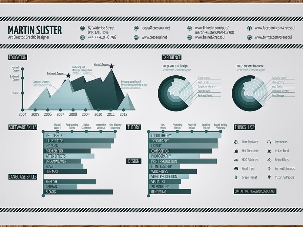 Image: Dribble
If your career portfolio and the role that you’re applying for involve heavy analytical work, it would be impressive if your resume depicts data and analytics based on your key achievement areas. Not only does it stay very on-brand with the role profile, but it’s most probably also going to resonate better with the hiring manager who is looking for a data-driven and analytical mind – like yours!
Do up an infographic-style resume by taking cues from this infographic resume template by Martin Suster.
9. Frame it
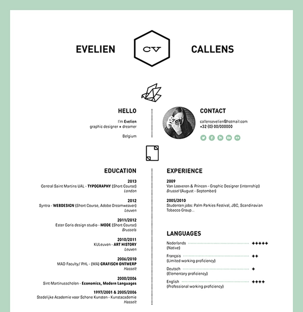 Image: Behance
The thing about most resume templates is that they can get very open-ended; meaning that the layout isn’t always guided once you have full creative access to revise it.
If you’re not someone who’s very patient or keen on designing the smallest details, using a frame design template helps create an orderly feel while still giving your resume a creative nod. Plus, a frame just gives a resume that much-needed finishing touch and flair.
10. Locally inspired design
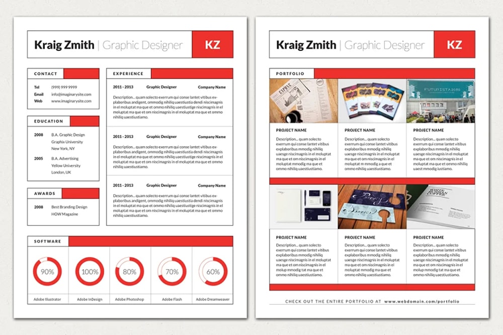 This Swiss-inspired resume template is such a creative way of using localisation to subtly inject a personalised element into what’s usually a very inflexible piece of document.
Get creative and think about how you can use your background to add to your resume – especially if you’re proud of where you’re from!
While there are plenty of resume templates that are readily available out there, imagine trying to tailor each and every one of them to correspond to the job role that you are applying for – that can easily turn into a nightmare, especially if you’re pressed for time or unequipped with the necessary design skills!
Plus, it can be quite expensive to keep purchasing templates and having a go at them each and every time you’re thinking of applying for a job.
This is where Brandripe can help. Yes, we are a creative graphic design solutions provider that caters to big-ticket items like social media, product packaging and website designs, but our approach is scalable to each client's needs – which means that we’re available to help you, possibly, land the job of your dreams by creating the resume of your dreams!
You can get as many resumes done and ready for you as you like – complete with a guaranteed 24- to 48-hour turnaround time and unlimited revisions (we know it’s absolutely crucial to ensure everything in your resume is perfect!).
Find out more by scheduling a 15-minute VIP demo call with our team to get familiarised with how we can help you, beyond resumes even! Otherwise, feel free to sift through our previous work here, and read more about how we operate here.
Not too keen on a call? Don’t worry, you can also drop us a line at hi@brandripe, or chat with us on the main page, and a representative will get back to you as soon as possible.
