

As we have explored in previous articles here and here, choosing the right colour combination for your design is key for various reasons.
First of all, colours evoke different kinds of emotions within people. Colours also have connotative meanings which can be used to strengthen your message further.
While you may be familiar with the colour wheel and the different groups of colours, such as warm or cool hues, there's actually further science that dives deeper into the different types of colour combinations.
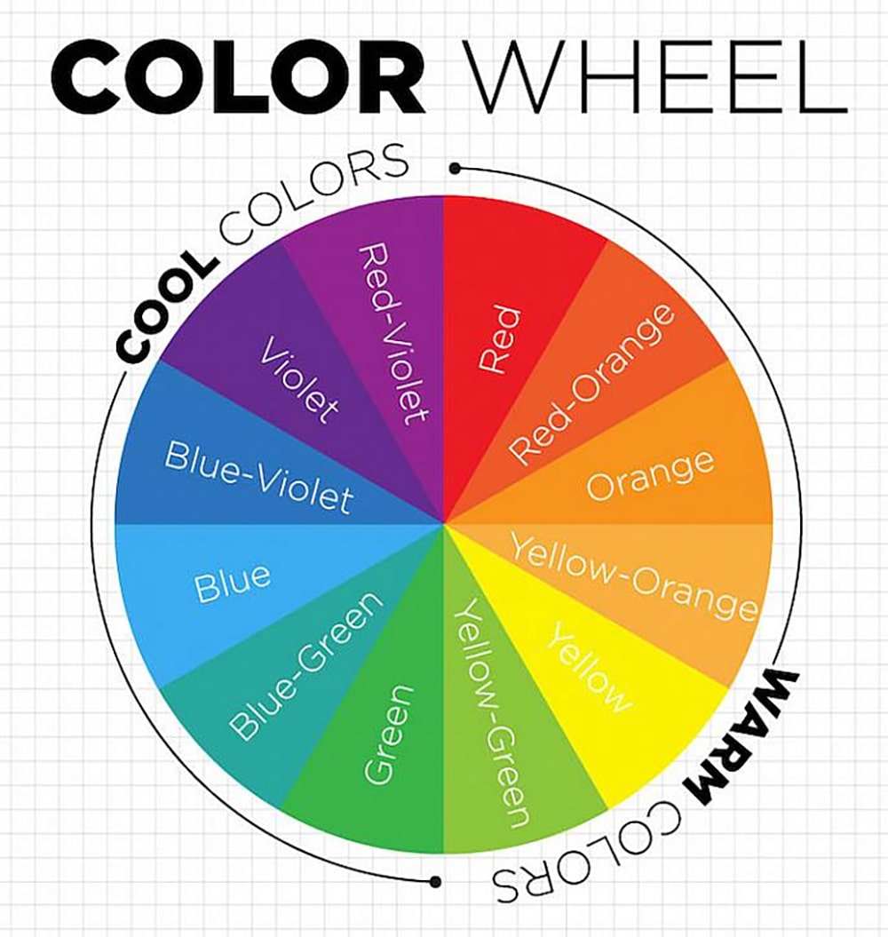 Image from: DecoArt
In this guide, we've narrowed down 3 types of colour combinations (in our opinion) for you to explore and how you can best apply them to your designs.
What are analogous colours, you ask? These are essentially colours that are next to each other on the colour wheel – which is why you would often find any design utilising this colour scheme particularly harmonious on the eyes as they blend together ever so seamlessly.
But how do you pick out an analogous colour scheme? It's actually not as daunting as it may sound. Refer to the colour wheel and select any primary colours to start with before matching it with the next three colours next to it; be it the next three warm or cool ones.
Essentially, the secondary and tertiary selections would serve as accents to the primary colour you have chosen. An example of analogous colour pairings are:
Here’s a visual to help make the picture clearer:
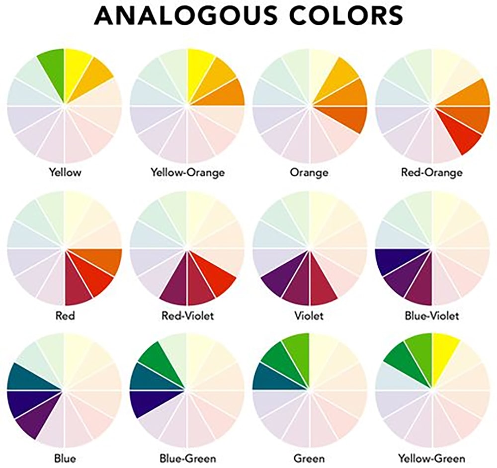 Image from: Elle Decor
Analogous colours are usually favoured by product designers as it helps create a sense of unity with the usage of accent colours that tie back to the main product. If you are considering graphic design work for product packaging, this can work for when you’re introducing sub-products or seasonal designs.
Here are examples of brands that use analogous colours in their designs:
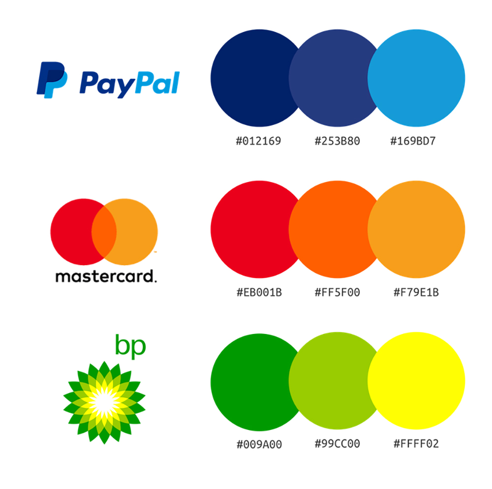 Image from: Venngage
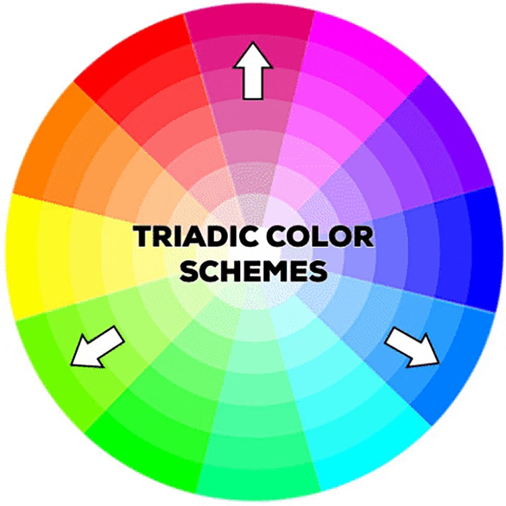
A triadic colour scheme is, as its name suggests, a 3 colour combination. It is a unique variant of the split complementary colour scheme, with an equal distance between all colours.
All three colours are distributed evenly around the colour wheel. Triadic colour combinations are usually selected across more vibrant options, such as:
Refer to this triadic colour wheel to give you an idea of what these colour combinations would look like:
 GIF from: Signature Edits
As the colour combinations within the triadic scheme of warm colours can be quite intense and send a more in-your-face sort of message, its intensity can be reassured by carefully using one colour as the dominant colour with the other two as secondary and accent colours.
An example of a brand that uses triadic colours in its design is none of other than one of the world’s best spots for burgers:
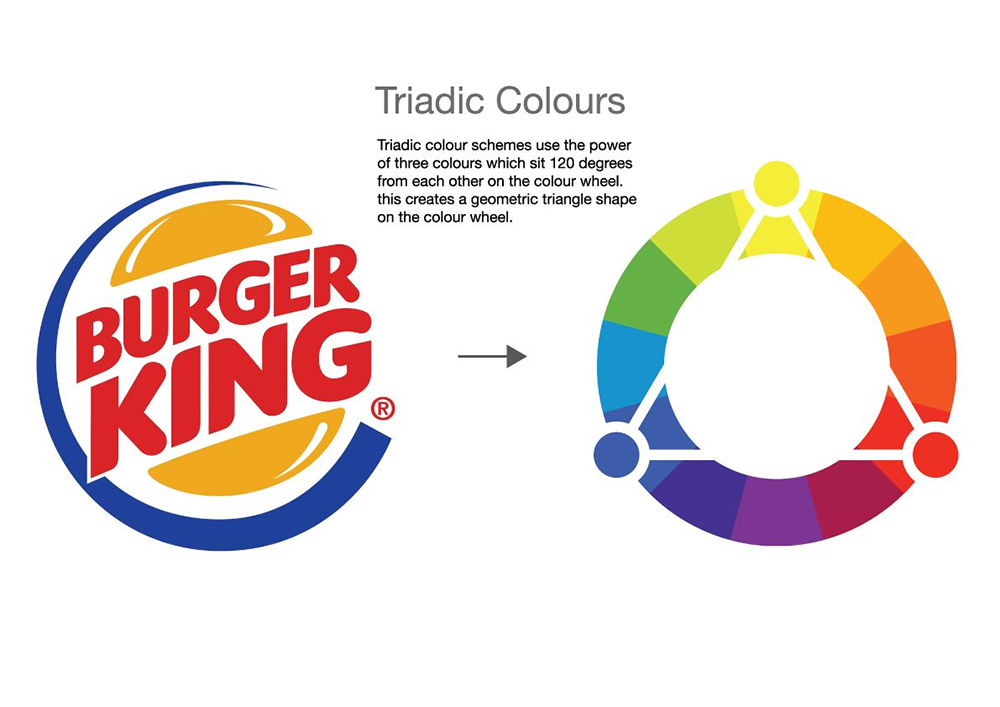 Image from: Pinterest
Complementary colours are more favoured as these are tried and tested selections that always emerge as the best colour combinations to use when it comes to design.
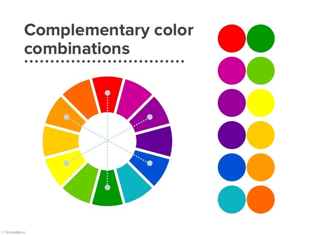
So how do you compose a complementary colour scheme? Select two colours opposite each other on the colour wheel where these two colours are in stark contrast with one another.
When having a stab at it, you might end up with two very unlikely combinations, just like what this image reference below indicates:
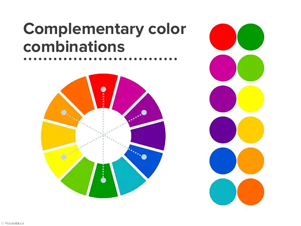 Image from: Presentitude
However, the end result of the complementary colour combination is to put together contrasting colours that create a harmonious blend.
The powerful contrast of complementary colours can be very sharp, especially if you use every colour in its full saturation. One of the ways you can apply it to your graphic design work is by playing around with the saturation of the complementary colours you have chosen.
Reducing the colour saturation helps soften the vibrancy but still allows you to maintain a balanced composition. Bear in mind that using complementary colour combinations are exceptionally useful when you need to highlight a certain object or focus on your design as it redirects the attention towards a specific area.
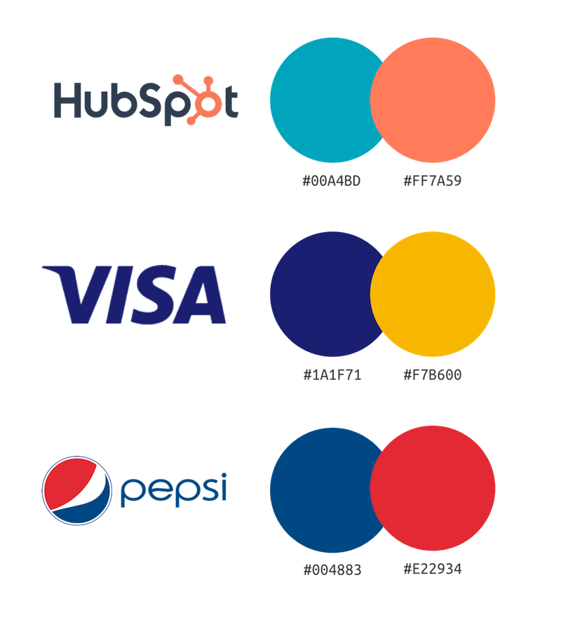
And of course, here are some examples of brands that use complementary colours:
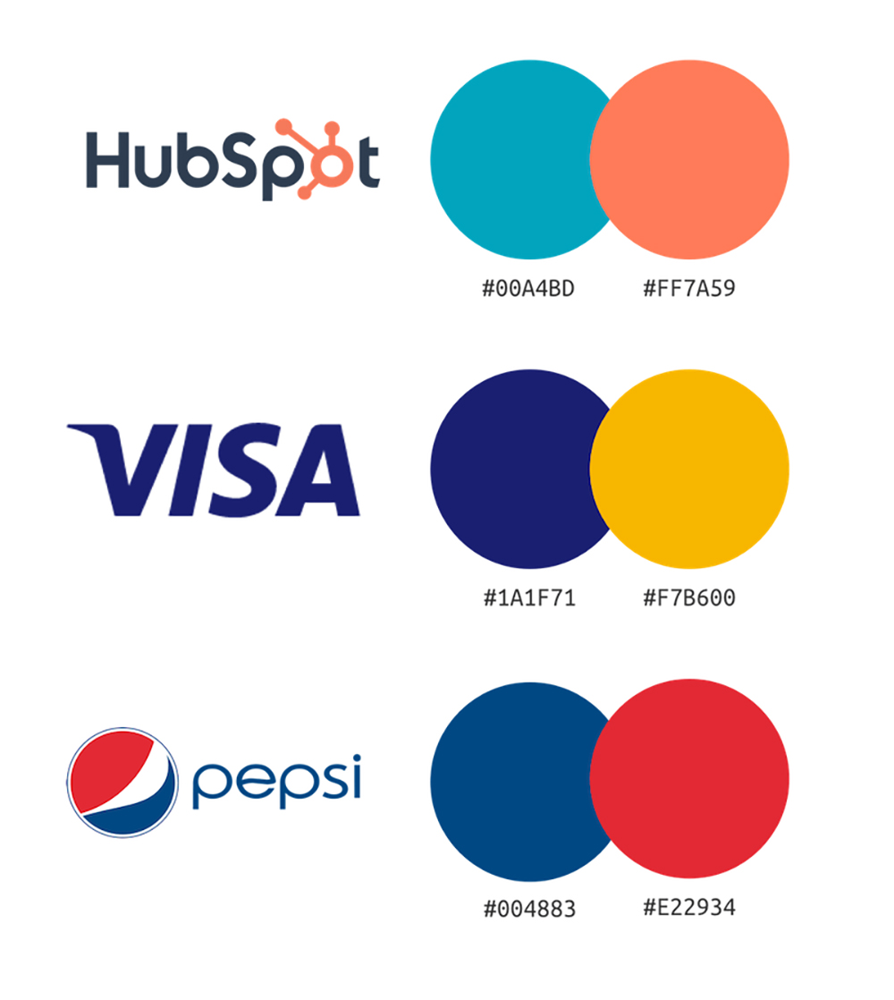
Image from: Venngage

Just a little question, can you tell what colour combination Brandripe uses for its designs? If you thought of “complementary colours”, congratulations! You got it right and you have indeed been paying attention.
Now that you have an idea of the different types of colour combinations available, it's time to start sprucing up your brand's graphic design pieces.
Whether it is for print, digital or even packaging, our team of creative designers at Brandripe can support you with all of that.
We are a trusted graphic design partner to some of the most prominent brands on the marketplace such as Zalora and Golden Screen Cinemas just to name a few, and we have the right tools, experience and expertise to help you build the essential elements of your brand, be it a logo, brand identity, advertisements and more.
It doesn’t just stop there — we can even help you with fonts and advertisements if needed!
The key benefit of outsourcing your graphic design needs to Brandripe is our guaranteed 24-48 hour turnaround time, so regardless of whether you are an established business or a fast-paced startup, you can count on our agility to remain aligned to your business and its needs.
You can find out more about our turnaround time guarantee and how a subscription with Brandripe works by clicking here,
But don’t let the word “subscription” throw you off – there are no hidden fees, surprise costs or even contracts that need to be signed.
Essentially, what we mean by this is that for a flat fee a month, you’ll have access to the best designers in town that will help you put your brand and business out there right down to the details such as selecting the right colours (we know it’s not just about selecting random colours and hoping they’d work.
If you are in need to get started immediately or if you simply wish to speak to someone from our team, reach out to us and schedule a 15-minute VIP demo call with our team so we can guide you through the whole behind-the-scenes of how we can work together.


