


Advertising within the healthcare industry needs to be done with care. Aside from being a heavily-regulated commercial space, healthcare brands operate based on the levels of trust that they build with their target audience.
This is why it’s important that your advertisement designs don’t just sell or convey a particular message, product or service, but also work to convince the audience to choose you or your brand out of all the others.
Wondering what a well-executed healthcare ad looks like? Here are our top 3 selections that will hopefully inspire your next healthcare brand campaign:
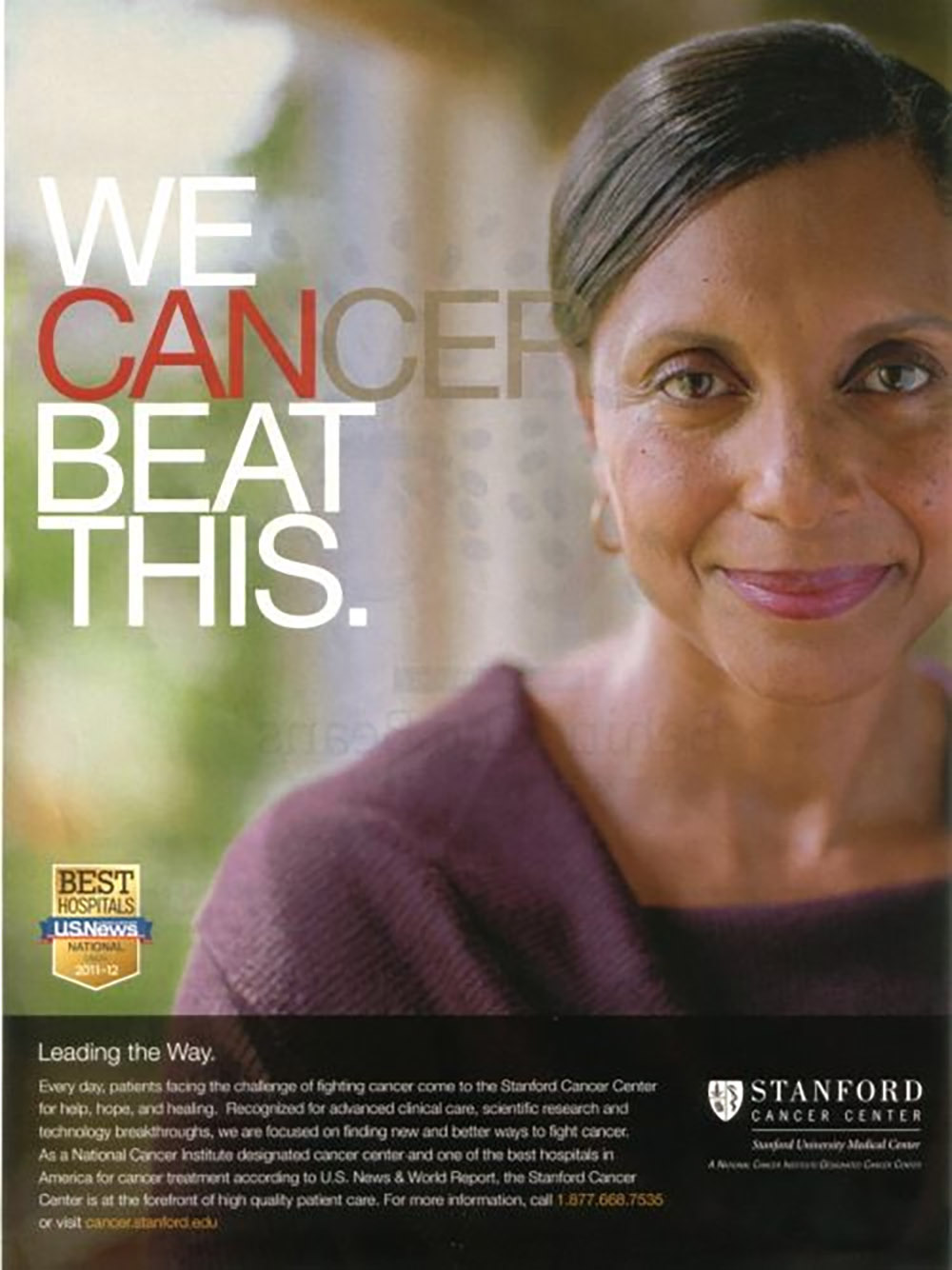 Image: Stanford Cancer Centre (here)
This advertisement brought together a bit of wittiness and a lot of emotions in the most inspirational way. The clever copy and 'hidden' sub-message work well, as it is craftily designed with a play on primary and secondary colours to emphasise one message over the other.
When it comes to healthcare ads, consumers don't respond well to jargon and most certainly not any scare tactics. The Stanford Cancer Centre executed this advertisement well, using a positive message to communicate their way around a sensitive topic.
It also used a single point of focus to capture the audience's attention at first sight: the woman. Putting a human face can be a bit cliché for a healthcare ad, but in this case, it only serves to strengthen the message that cancer fighters are not battling the disease alone.
This famous and highly-coveted hospital needs no introduction. While having a reputable name helps, it also allows the healthcare provider to be more commercial and creative with its advertising.
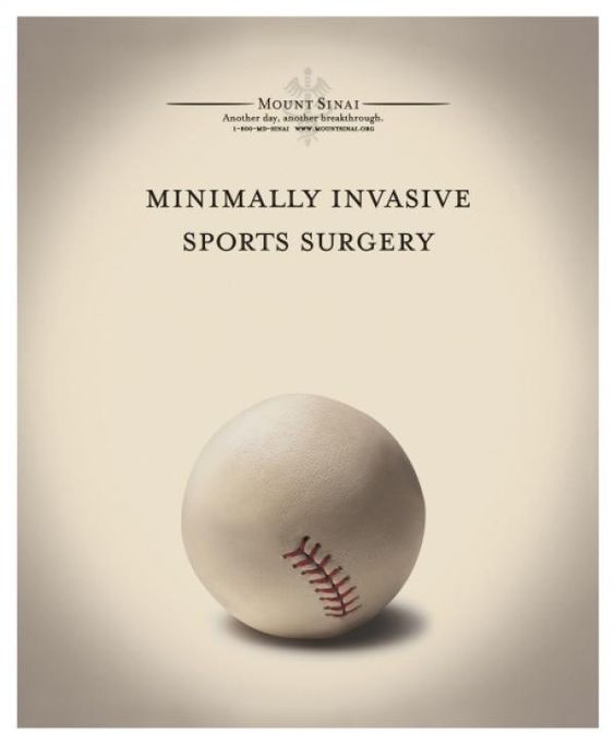
The result is definitely welcomed and completely different from what you would typically expect from a hospital ad: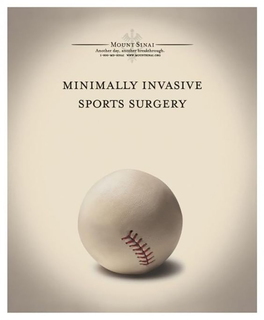 Image: Mount Sinai Hospital (here)
The creative concept is brilliant; a four-word copy that showcases the service they're selling, complemented by the usage of a descriptive object that ties back to the whole concept.
Using a baseball ball as the descriptive object in this instance perfectly alludes to the idea of a safe and less invasive surgical procedure. After all, the ball is known to have a smooth and velvety surface and minor stitchings on its “skin”.
If you're not familiar with this name, Planned Parenthood is a non-profit organisation that provides reproductive healthcare and sexual health education. Though it is more known in the US, it is also present in several other countries as an affiliate partner.
This particular organisation is incredibly passionate about its effort to educate, though they are often surrounded by an air of controversy. Instead of shying away from this, the brand has long embraced (if not welcomed) it and eventually made it a part of their tone of voice and advertisements.
The whole brand is spirited and it understands its target audience well. This is proven through its advertisements that utilise clean and engaging visuals as well as “loud” copy that successfully grab people’s attention.
A good example is this advertisement doing three different jobs at once; promoting Planned Parenthood Direct services, raising awareness on how users can access it (which is via their on-the-go devices such as mobile phones) and displaying what kind of products/services they offer: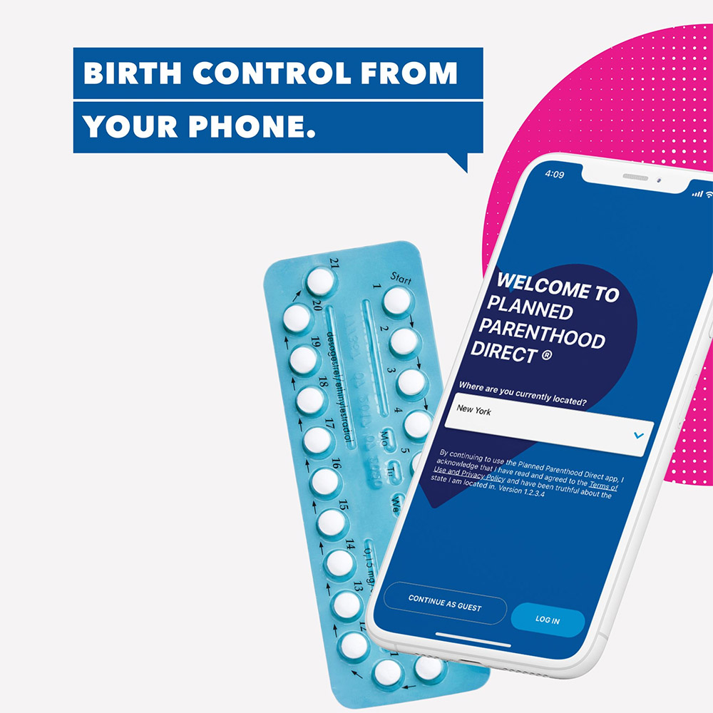 Image: Planned Parenthood (here)
This ad is great to emulate if your brand focuses on mostly millennials or younger folk, as you need to highlight that your product or healthcare services are mobile, accessible and at their fingertips – which is basically the only way anyone operates these days!
Having seen the previous list, you can now draw inspiration from the brand’s unique approaches – be it using the human connection in your advertisement to capture attention, employing the use of connotative objects to symbolise a type of service or result, or opting for a lifestyle approach to match what your audience is used to across other parts of their media consumption.
Brandripe has supported healthcare brands with graphic design work in their marketing campaigns, some of which reflect the elements used in the examples mentioned above.
Here are two of our favourites:
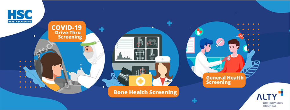 Image: Brandripe
As part of its rebrand, Alty wanted to highlight some of the other key health screening services it provides – aside from what it has always been known for over the years. Its new look is fresher and “friendlier” compared to the corporate feel most healthcare providers opt for.
This is why we incorporated three of its key services in one ad, mainly to spread the good word that there's more to Alty than just orthopaedic healthcare as they also offer sought-after services such as Covid-19 screening and general health screening for patients.
Given that it is famous for its former name – HSC Medical Center – we kept the known and recognised HSC logo on the ad to introduce the new brand while showcasing its connection to the previous brand identity.
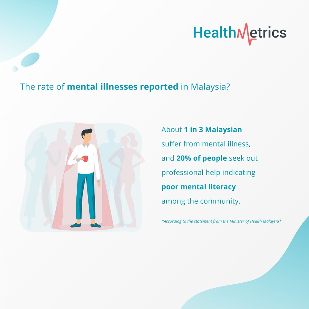 Image: Brandripe
Brandripe supports businesses of all scales, and we care about ensuring that the message is communicated effectively through our graphic design work.
The particular artwork above was done for HealthMetrics, an award-winning, next-generation employee healthcare platform for companies to manage their employee healthcare benefits holistically and seamlessly.
To support their social media campaign on mental illness – which is an issue that’s often overlooked in companies – Brandripe designed a series of posts (otherwise known as a carousel) that are minimalistic in design yet impactful in messaging.
The carousel, which tells the story of the importance of mental health in Malaysia, as well as the repercussions of not addressing it, ends with a solid call to action which prompts viewers to HealthMetric’s free employee health eBook.
We made sure to align our designs with the company’s colour palette and the visuals of the eBook so as to ensure that the end-product and storytelling are as cohesive and seamless as they can be.
If you are a healthcare brand or business looking for a graphic design partner to support you with your marketing collateral, Brandripe is the perfect choice.
With a guaranteed 24- to 48-hour turnaround time as well as unlimited revisions and requests at no extra cost to you, Brandripe can complement your services in creative ways.
Keen to find out more? Schedule a 15-minute VIP demo call with our team for an in-depth tour, and learn how our partnership can boost your healthcare brand or business today.


