Launching Soon
Join our VIP list to receive early access and a LIFE-TIME discount on your Graphic
Design subscription.


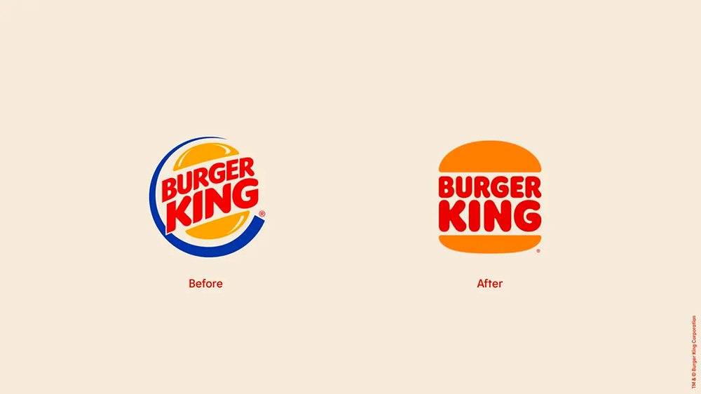
Image: PRINT Magazine
There is a reason even the most iconic logos go through a revamp. As time passes, your company values might have shifted, your customers' visual preferences change, and even new design trends can influence the need for a logo update.
This is not to say there isn’t such a thing as timeless logo designs such as the likes of Shell and Nike.
However, most companies realise that their logos must be tweaked or updated especially to meet the visual needs of their customers which will shift over time.
You might wonder, is this really needed? Here are questions to consider when deciding if your business really needs a logo revamp right now;

A simple and old-fashioned signage for a dentist practice. Image: Pexels
Back in the 1800s, highly detailed logos with loud colours were all the rage. If you were to bring the same concept to the present-day design world, it will be easily overlooked – courtesy of the design disruption caused by notable designer Paul Rand in 1956.
However, this does not mean that you need to completely change your logo. The aim is to redesign it in a unique, simple and clean way so that your present-day customers will appreciate it.
Whether you have existing competition or new ones, a logo revamp is a good way to direct attention to your company. The initiative will help your customers perceive your brand as forward-thinking. This can help with creating a sense of stability and reliability that will work in your favour against your competition.
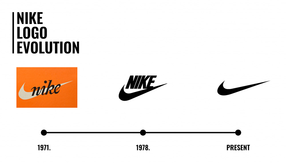
The evolution of the famous Nike swoosh. Image: Kontra Agency
There could be two reasons to consider a logo revamp, your customer base expansion or customer base maturity. For the former, perhaps you are looking to reach a younger customer base so you need to keep your eyes peeled for simplified logos with creative elements to capture their attention. If it's for the latter, you need to consider keeping some existing logo elements and provide better clarity on what your company stands for by simplifying the design to the details that matter.
When the pandemic took place back in 2020, many businesses had to shift their business models to cater to the new norm with a new product or service offering in order to stay afloat. For example, you owned a tuition centre in the middle of the city, but due to the pandemic, you had to shift your tuition classes to take place online. This would have required you to create a logo that is seamlessly visible on digital devices.
Thus, if your business model shifts, you’d definitely need a revamp to align and create a more apt view of your business.
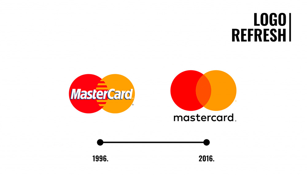
The evolution of Mastercard’s logo. Image: Kontra Agency
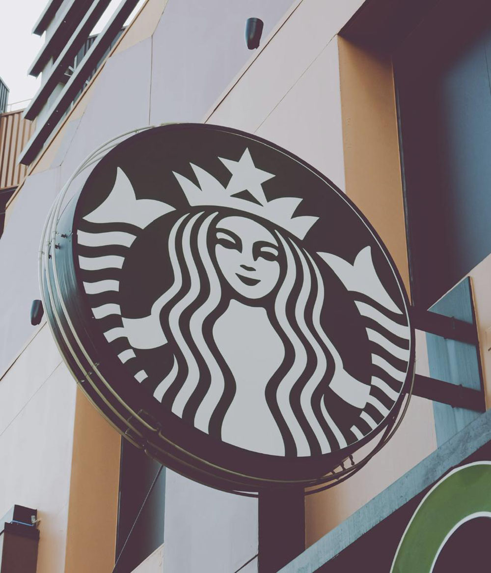
The well-known Starbucks logo. Image: Pexel
Also, if you look at the success of Coca-Cola, Google and Starbucks, you will see there are long-term benefits to a well-executed logo revamp. Those benefits include:
Imagine this, unveiling a spanking new logo makeover to generate buzz over your competition. The initiative will be a great PR opportunity and ignite conversations around your new design.
Let’s take the example of one of the largest global coffee chains, Starbucks, which has changed its logos three times (the last logo revamp was in 2011). The design notably removed the “Starbucks Coffee” text from the emblem and a more prominent usage of the Starbucks siren was used to signify the allure of high-quality coffee.
The design became more minimalist and more welcoming to cater to the younger generation. This strategy is highly effective given that a study has shown that it takes five to seven brand impressions for consumers to remember your brand.
Starbucks understood the assignment; too much detail can get lost in translation, especially with the low attention span world we live in. Clearly, Starbucks didn’t waste any time to create a simple and memorable logo in their latest logo redesign.
We recommend using the psychology of colour when deciding the colour and shape of your logo. You can also read about how our professionals at Brandripe design a monogram for a dose of inspiration.
With the PR opportunity of the buzz generated from your logo redesign announcement, you are giving people a chance to talk about your brand, your products, your services and your company values.
As you acquire new audiences you will be able to connect with more people than you did before.
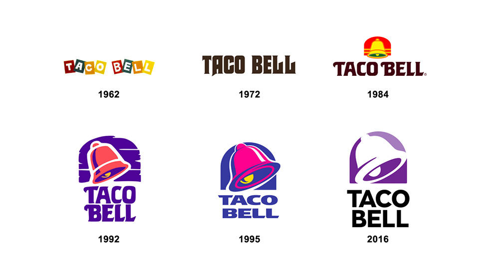
The evolution of Taco Bell’s logo. Image: Baer
A logo revamp can seem like a daunting task, especially if you are going at it alone. Here are some tips from our creative design team to help you along the way.
A good place to start is Behance. Behance is an international social media platform owned by Adobe that focuses on showcasing and discovering creative work. This is the best place to discover new design trends and get inspired for your logo revamp. There are other sites that are similar to Behance such as Dribble, Coroflot, Fabrik, and more.
If you are seeking more localised inspiration, you can check out the work we have done for our clientele.
Once you have all the information you need and have made some decisions on your visual direction, a mood board can help piece all the elements together to see if it works. In your moodboard, you should include your old logo and identify the iconic elements that resonate most with your existing customers.
Let’s review the logo design transition of Maybank, one of the most prominent banks in Malaysia.
From 1993 to 2012, Maybank’s logo was fitted in a long yellow rectangle with the word ‘Maybank’ stretched thin across it. The left section of the logo featured a small emblem of a lion’s head inside a ring.
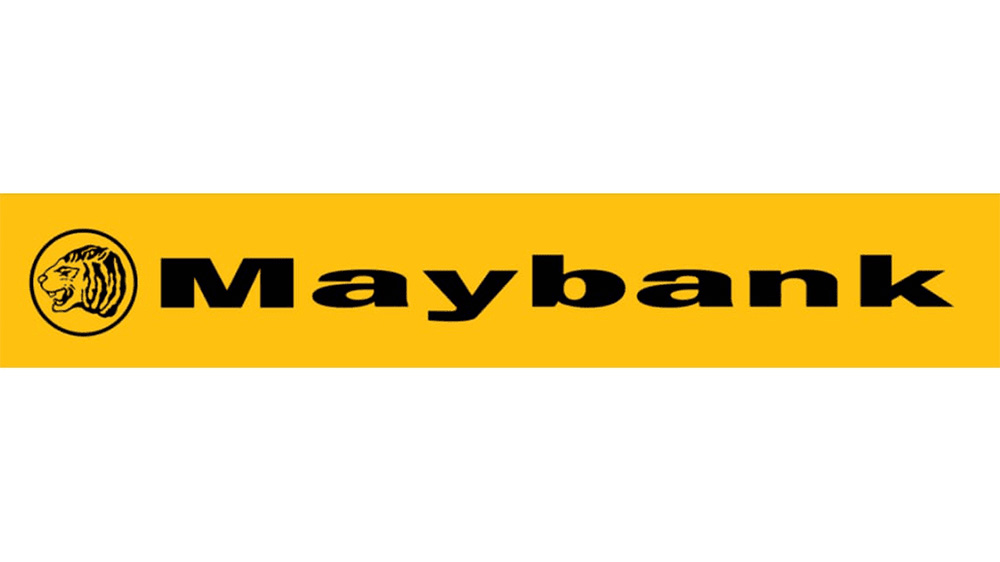
Maybank’s logo from 1993 - 2012. Image: 1000logos
The bank’s logo underwent a revamp in 2012 that kept the important design elements in a more refined and elegant manner befitting the bank’s reputation.
The rectangle was made wider which made the lettering more proportioned. The font was more compressed to produce better visibility. Most notably, the emblem was made more prominent with a transition from a more hyena-looking logo to a more obvious tiger’s head profile.
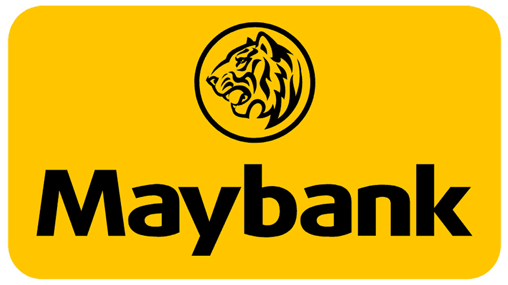
Maybank’s revamped logo design from 2012 - today. Image: LogoLook
Also maintained is their iconic colour scheme of bright yellow and black. So, a redesign doesn’t need to mean a do-over and a moodboard with your iconic elements can help you visualisze what you’d like to keep and what elements that need to be updated.
If you like this example, we have more in our feature of the top banks in Southeast Asia for your reading pleasure.
If you consider a logo design in the 1900s, it was mainly designed to appear on packages or physical door signs. This is why it was designed in a more dramatic and eye-catching manner. In today’s technologically driven world, your logo is competing with the online market and has an opportunity for global exposure. This is why you’d want to avoid putting too many details in your logo while making it more versatile to stand out in the online channels. You can create mock-ups to better see how your logo will fit in a variety of channels.
A logo revamp is not a venture to go about alone and as a beginner. The consequence of a poorly redesigned logo is not only expensive to rectify but it would be a waste of valuable resources.
Don’t settle for a bad logo! We at Brandripe can save you all the trouble with our convenient and professional on-demand graphic design services.
Our monthly subscription includes unlimited requests which means you could have us work on your logo revamp and create mock-ups for your newly designed logo under a single price tag.
We also have a 24-48 hour turnaround time which gives you an opportunity to work in the most efficient way possible.
Brandripe’s industry design experts are more than happy to share our insights and experiences from working with over 100 SMEs, agencies, marketing teams and startups. We’ve worked with brands like Allianz, Zalora, GSC, BOH, MR DIY and more.
Set up a 15-minute VIP Demo Call with us and we’d be happy to give you a glimpse of what our experts can do for you!
If you want us to just answer a few questions before the call, you can drop us an email at hi@brandripe.com or ping us via the Chat toggle on our main page to speak to us today!

