Launching Soon
Join our VIP list to receive early access and a LIFE-TIME discount on your Graphic
Design subscription.


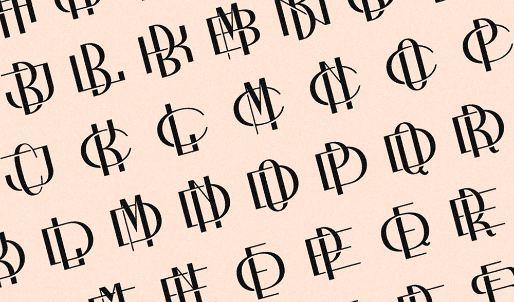
Image: Creative Market
A monogram is a logo which consists of two or more letters to create a single logo. The earliest known monogram in history dates back to the 6th century B.C. on Roman coins where the ruler’s initials are used to authenticate and legitimise them – so it’s actually such an old form of art!
From then till now, monograms have consistently been understood as a symbol to communicate power and dominance across the globe. You can see it today: monograms are largely used by fashion powerhouses such as Louis Vuitton, Yves Saint Laurent, Chanel and Gucci.
If you are a Major League Baseball enthusiast, you might be familiar with the monograms of The Mets, Los Angeles Dodgers, Colorado Rockies, San Diego Padres and San Francisco Giants. That just shows how prevalent monograms are.
It’s quite easy to misunderstand monograms for letterforms so let’s explore what differentiates them. A lone character is not a monogram; this is recognised as a letterform. A row of separate initials doesn’t make up a monogram either.
The condition for a monogram is that two or more letterforms (or graphemes) must come together to create one motif.
Now that you know the difference between lettergrams and monograms, let’s examine some ingenious monogram designs.
1. New York Yankees
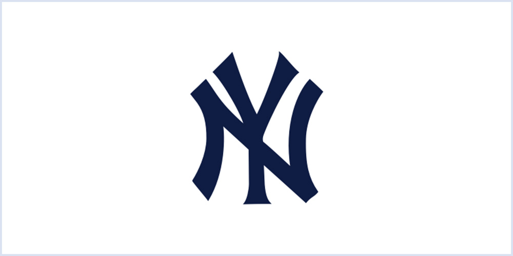 The famous New York Yankees monogram. Image: sports.yahoo.com
The monogram design for the New York Yankees was entrusted to Louis Tiffany – yes, of Tiffany & Co – to design a police medal to honour a police officer. The commission of the monogram came from former New York City Police Chief Big Bill Devery (who was also one of the New York Yankees owners).
The monogram was first used on the NYPD’s Medal of Valor which featured the interlocking “NY” symbol above a silver shield. The imagery was meant to resemble a woman placing a laurel wreath on a policeman’s head.
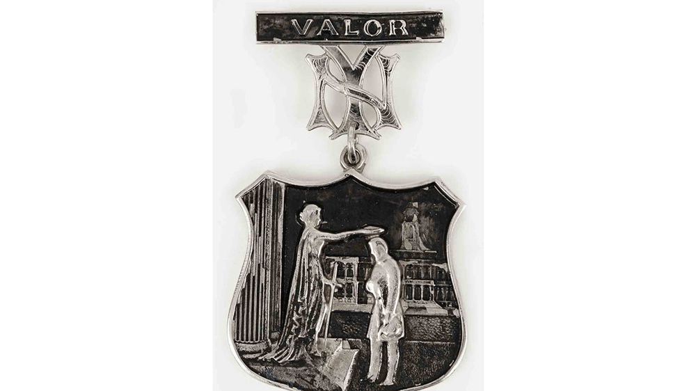 The NYPD’s Medal of Valor. Image: www.mlb.com
Devery soon realised that the ‘NY’ insignia represented the shared spirit of unity between the police force and New York’s beloved sports team. The monogram became a global fashion statement as Yankee fans from around the world wear the shirt and caps with pride.
The monogram was the centrepiece of all Yankee merchandise from 1903 till today. In fact, today, the monogram represents more than just a baseball team, it is a glorified expression of the American dream.
2. Coco Chanel
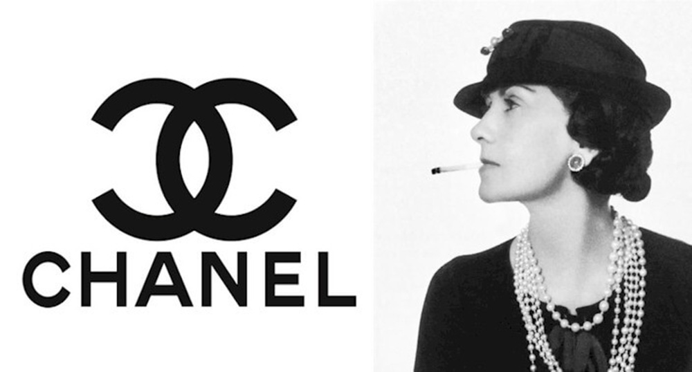 The famous Chanel logo. Image: www.blog.logomyway.com
There is no denying Coco Chanel’s C-shaped monogram does justice to its regal heritage. The brand made waves ever since 1920 as a powerhouse in high-end fashion. The monogram not only became a brand heritage but also a seal for the luxury and style of those who wear and own expensive monogrammed designs.
The monogram was designed by Coco Chanel herself back in 1925. As someone who once said “Simplicity is the keynote of all true elegance”, the monogram she designed certainly held true to her statement. The design is composed of two bold interlaced “C”s that mirror each other. The simple, strong shapes of the letters are the embodiment of Chanel’s authoritative elegance and are a strong reflection of Coco's philosophy of ‘less is more’.
Her selection of using black on the monogram also held crucial significance to the fashion house. During the time when the design was conceived, black was commonly used for mourning or religious vestments. It was considered inappropriate for social or fashion purposes. Coco Chanel revolutionised as the ultimate fashion colour with the introduction of the ‘Little Black Dress’ which resulted in a timeless association of the colour with the brand.
3. CNN
 Cable News Network’s monogram. Image: Wikipedia
The first CNN logo was designed in 1980 by Anthony Guy Bost, a professor at the University of Auburn. The monogram was presented by Communication Trends, an Atlanta-based company as one of a few range of variations, some of which the company liked more than others. The one that stood out was the monogram with a line through the letters which resembled the cables connecting to the characters.
From 1980 to 1984, the channel used the same logo in black and white. The distinctive element of the monogram that made it so widely accepted was the centre line connecting the letters in a way that looked like blips on a heart-rate monitor to demonstrate the channel’s ability to keep its finger on the pulse of world news.
Another interesting fact about this iconic logo was the design cost at merely $2,400 to $2,800, according to the experts. Considering the longevity of the design, it is a real bang for the buck. Add in the worldwide brand recognition, this monogram is priceless. In 1984, there was a slight update on the logo to switch to red and white as the colour scheme to strengthen its connection with the “heart monitor” style design.
In the design world, everything has its place. The monogram is no exception. A monogram should be used in the following circumstances:
It’s also important to consider your industry and the nature of your business. If you are in the tech industry, perhaps you might consider a letterform logo design compared to the monogram which is more traditional in nature. You will also need to consider a monogram if your industry is involved with merchandising or packaging.
1. Start with a brief
It’s important to get an idea of what you’re going for and a good brief can lead you in the right direction. We have elaborated all the tried and tested tips to create a satisfactory logo design brief here, but here are the key takeaways:
 The London Symphony Orchestra logo. Image: Pinterest
2. Letter selection
Choosing the lettering can be a challenging and daunting task especially if you have a family business. Take LG for example, it is actually “Lucky-Goldstar” but because they decided to go with LG, the short abbreviation made for a simplistic and memorable monogram.
Another example is the multinational conglomerate 3M which is short for The Minnesota Mining and Manufacturing Company. If there is a time to cash in a muse, this is it.
3. Sketch
Original ideas come from your mind to your hands. Go offline, use a pencil and paper and get sketching so you can allow your creativity to flow. Don’t get tempted into using a design software as it may limit your imagination. We will get to that in the next step anyway.
While you might find yourself having the urge to research and draw inspiration from other designers, it’s crucial to resist the urge and draw from your heart. You can draw in as many variations as you want and you can select the few you would like to refine.
4. Start drafting into a design software
Once you are happy with your sketches, you can scan them to be digitised. During this step, you can further refine your design. Logos must be created as vector artwork so they can be scaled to any size without loss of quality.
You can skip the paper if you want, all you need to do is find different ways of connecting the letterforms in your monogram. Explore overlays, interlock, join and reflect. Ensure to keep copies of each version across your artboards.
5. Select colours
Coco Chanel demonstrated to us the importance of choosing the right colour for your monogram design. Before you get wild with colours, start your design in black and white first so that you are creating a versatile design. Set a limit of up to two colour combinations to make the letters of your monogram stand strong.
Be sure to study the meaning behind each colour selection and ensure it aligns with your company’s branding strategy. For example, red hues are recognised as being able to evoke feelings of power and excitement while blue communicates a sense of calm and reliability.
6. Test your monogram design
Get your monogram ready for the market by presenting it in a variety of mock-ups. You should also evaluate your monogram design by asking these questions:
We at Brandripe are in the business of creating memorable and distinctive designs for our clientele at an affordable and monthly flat rate.
From RM1,899, we are able to accommodate unlimited requests and revisions, and guarantee a 24-48 hour turnaround time. That’s not all – we also provide a 14-day trial and our flexible plan allows you to start, pause, resume or even terminate your subscription – no questions asked.
Set up a 15-minute VIP Demo Call with us and let us help you create a monogram worthy of making it into history books!

