
Launching Soon
Join our VIP list to receive early access and a LIFE-TIME discount on your Graphic
Design subscription.


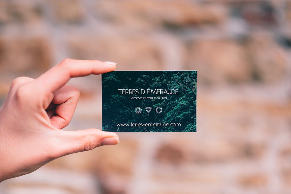
Image: Unsplash
Before the digital revolution took over, business cards were a powerful branding tool for professional and businesses. This is because having a distinctive design coupled with premium printing makes for a very good impression.
But what about now? Are business cards still relevant today? The answer is: absolutely.
You might have noticed that, in a post-pandemic world, there is an uptick in physical gatherings, conferences, and meetings. While technology has definitely done an excellent job in connecting people seamlessly across the globe, life in lockdown left many eager for face-to-face interaction.
Plus, there is also a certain degree of digital fatigue, a phenomenon that prompts people to ditch their digital devices in favour of physical, tangible experiences such as reading an actual book, for example.
This is precisely why business cards are not just still relevant, but important. Digital clutter gave business cards a second life – by being any brand owner or marketeer's most powerful identifying tool.
 Business cards will never go out of fashion. Image: Unsplash
Here are reasons we highly recommend that you get a business card:
All in all, business cards are still a valuable tool in the digital world for networking, branding, and establishing a professional image – so you should definitely get around to doing so!
Before you get to designing your business card, it’s always important to get to know some basics. While there may be slight variations in different regions such as the US, broader Europe, and Asia, standard printed business cards are usually 3.5 x 2 inches with a bleed area of 1/8 inch.
This table by Brandly gives a great overview of the sizes across the world and an indication of the small marginal differences for business cards in various regions.
|
Region |
Inches |
Millimetres |
Centimetres |
Pixels |
Aspect Ratio |
|
US and Canada |
3.5 x 2 |
89 × 51 |
8.9 x 5.1 |
1050 x 600 |
1.75
|
|
UK |
3.35 x 2.17 |
85 x 55 |
8.5 x 5.5 |
1005 x 651 |
1.75
|
|
Japan |
3.58 x 2.17 |
91 x 55 |
9.1 x 5.5 |
1074 x 651 |
1.65
|
|
South America |
3.54 x 1.97 |
90 x 50 |
9 x 5 |
1062 x 591 |
1.8
|
|
China |
3.54 x 2.12 |
90 x 54 |
9 x 5.4 |
1062 x 636 |
1.67
|
|
India |
3.54 x 2.16 |
90 x 55 |
9 x 5.5 |
1062 x 648 |
1.64 |
Whatever size you decide to design, always remember to allocate bleed areas when it comes to printing business cards.
Bleed areas are essentially edges of the paper that are excluded from the printable area or surface. Since printers essentially grab each sheet of paper by the edges to feed it through the printer, it’s not capable of printing all the way to the outer edge of the material.
To help put things into perspective for you, here’s a visual guide:
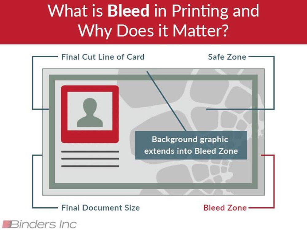 An illustration of what bleed zones/areas are. Image: BindersInc
Aside from getting the sizes and dimensions right, what’s really going to help make your business card memorable is more of the creative design and styling.
It may be a business card, but it does not have to be boring!
Here are the top three ways you can spice it up to have the most unique cards that your customers will hold onto.
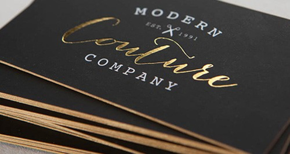 Experiment with a velvety finish or embossed text. Image: Zoum
While your business card doesn’t have to be flashy or premium felt, choosing a distinctive material is always a good idea. After all, people will need to touch your business card and fiddle around with it as they admire it or confirm your name and company name. Hence, they are very likely to remember the way the material feels at their fingertips.
A velvety finish can go a long way!
Who says a business card has to always be a rectangle?
This is the perfect chance to communicate what your brand is all about in a clever way. If you’re in the business of selling flowers, for example, it’s both cute and creative to design your cards in the shape of a flower. We highly recommend going quite literally at it; you have the creative freedom to do so!
One thing’s for sure, it will stand out!
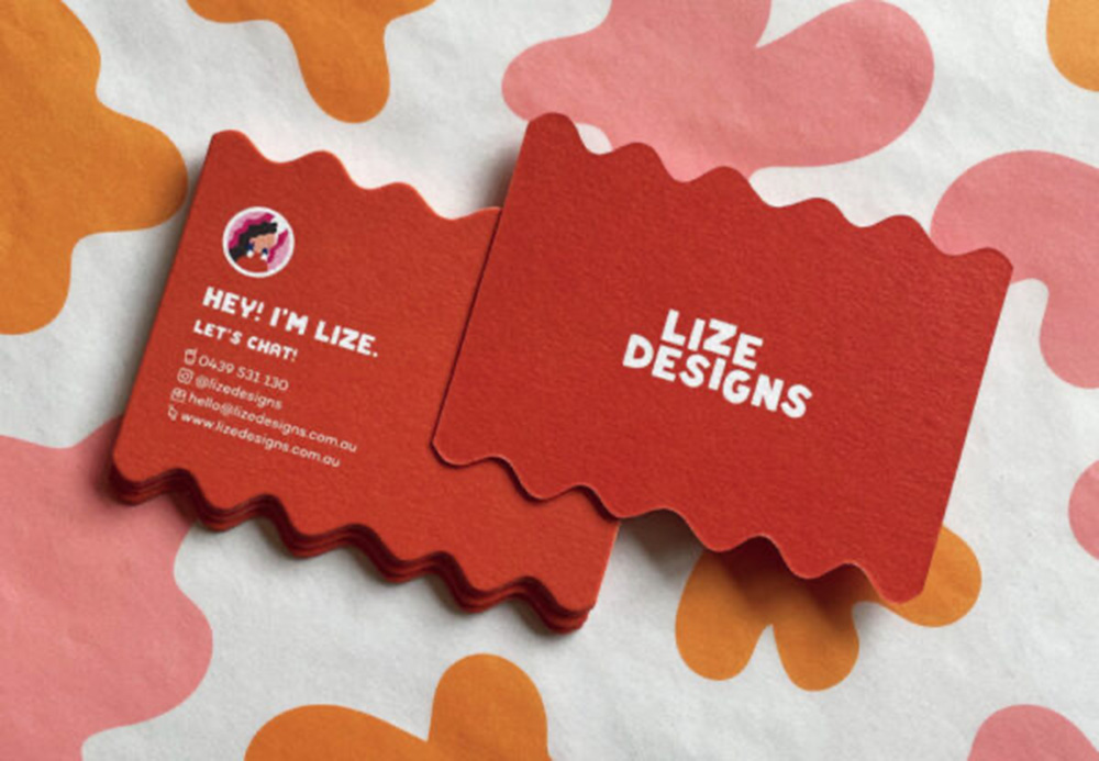 An example of a cute, non-conventional business card. Image: Looka
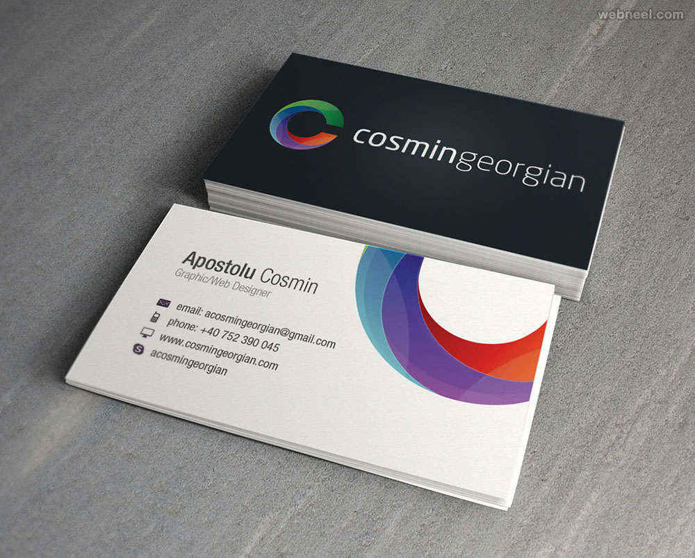 A business card is a perfect opportunity to showcase your brand colours and logo. Image: Webneel
A business card is top-of-the-funnel collateral. Use your brand colours, and ensure your logo and other visual brand elements are clearly displayed on the card.
How else will you stand out if you’re not proudly showing off your brand elements?
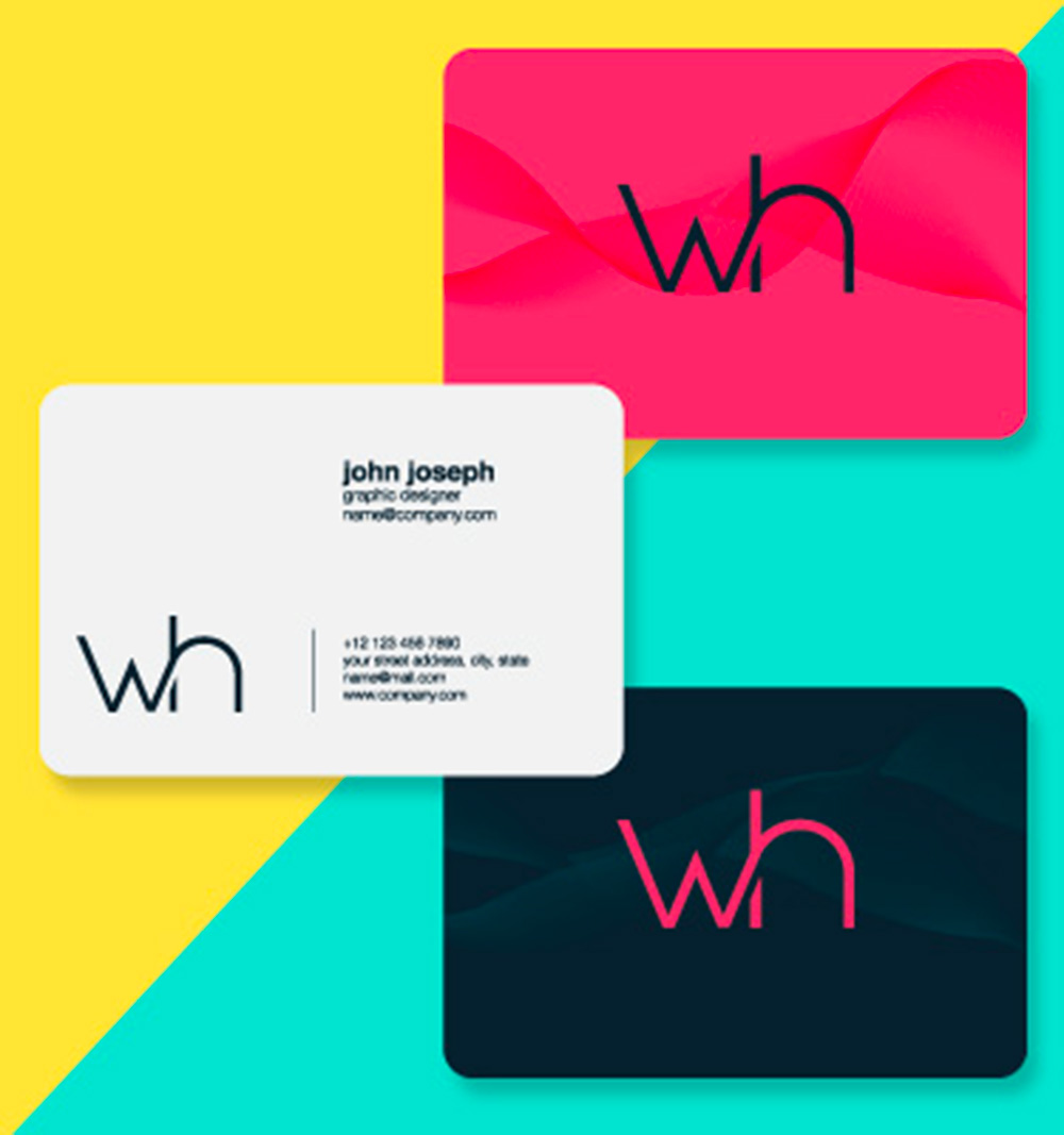 An example of Brandripe’s work. Image: Brandripe
There are plenty of internet applications, software, and even AI generators that would allow you to design your business card easily. You can check out options like Brandly and Moo for ready-made templates that you can customise to your own liking.
While that’s great to help you start, there’s a limit to what it can do.
If you’re truly looking to make business cards a key part of your sales strategy (especially when making that first impression) then working with a creative agency like Brandripe gives you a better bang for your buck.
Your brand is more than just a face, concept, or idea in your customer’s mind. It is the very factor that makes or breaks someone’s decision to either purchase something from you or even engage with you.
That’s why you’d want to ensure that all of your brand collaterals carry the same tone and personality, regardless of the type of item. We can help you with the design of other marketing materials, such as logos, brochures, and websites, to create a cohesive brand identity.
Brandripe has helped both emerging and established brands elevate their brand presence and persona through creative design. By providing a wide spectrum of design services that covers all things digital to packaging and business cards, we can definitely help you in whatever form that is needed to help your business or brand succeed!
Go ahead and schedule a 15-minute VIP Demo Call with us to find out how we can help you, and more importantly, explore how your business card can be part of a broader brand activation as opposed to just an introductory tool!
(Alternatively, feel free to shoot us an email at hi@brandripe.com, or ping us via the Chat toggle on the main page.)

