Launching Soon
Join our VIP list to receive early access and a LIFE-TIME discount on your Graphic
Design subscription.


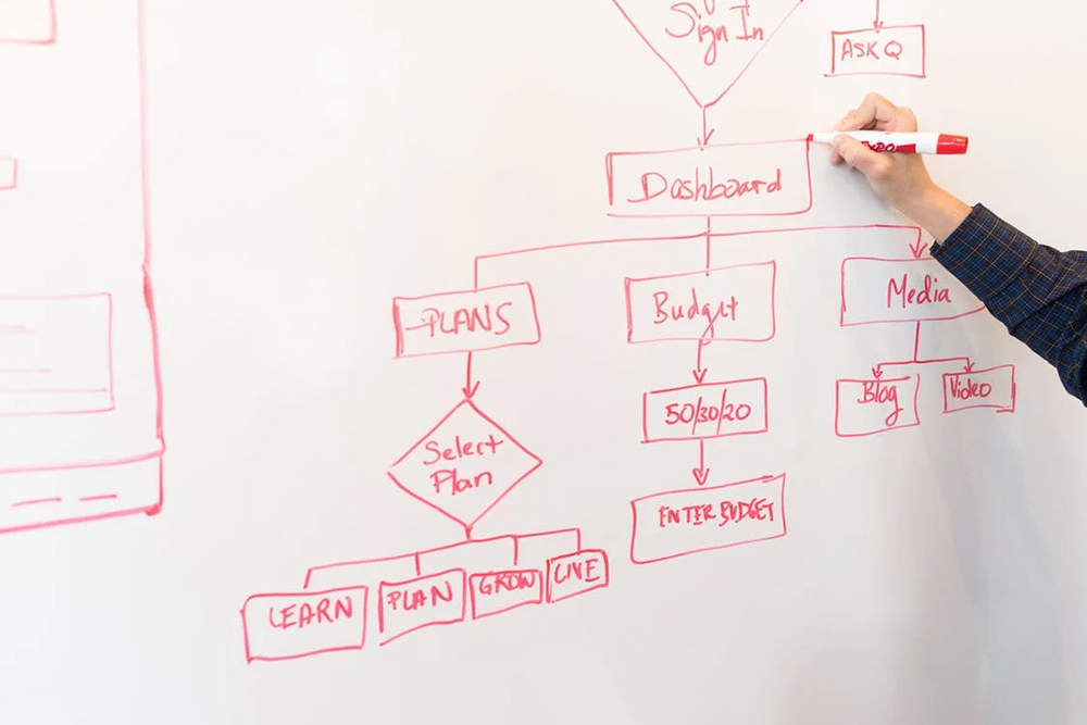
Image: Pexels
In a world of information overload, flowcharts are a proven and effective way to streamline information. Flowcharts are probably the embodiment of what Einstein meant when he said “if you can’t explain something simply, you don’t understand it well enough”.
In theory, flowcharts sound simple enough to do but the reality can be far from it. It’s quite easy to get flowcharts wrong and they might end up further confusing the stakeholders who are meant to understand it.
In this guide, we will take you through some trade secrets in creating a clear, concise and effective flowchart.
It’s easy to fall into the temptation of using a variety of shapes, lines and text when designing a flowchart. However the goal of a flowchart is to be understandable, so consistency is key. Below, we break down some good practices for creating consistent flowcharts:
Start and end - Use the same shape, font style, font size and shape colour to clearly indicate the beginning and ending of a flowchart.
Space between shapes - Ensure the spacing between all the shapes in the flowchart is the same so it doesn’t look too cluttered.
Fonts - If possible, try to keep your flowchart with a minimal amount of font styles and sizes. As a general rule, only use a maximum of three different font styles and sizes so that your flowchart is more digestible. When it comes to the font style selection, keep it straightforward instead of cursive for legibility.
Colours - Just like with the fonts, you’d want to stay consistent with your colours by assigning a definition for each colour. For example:
Brown - Start and end of a flowchart.
Green - To indicate a process
Blue - To indicate multiple choice
Shapes - Ideally, you’d want to avoid complicated shapes such as stars, hexagons and triangles as they may take up more space on your flowchart. Simplicity is key, with shapes like rectangles, squares, rounds and ovals being able to do the trick.
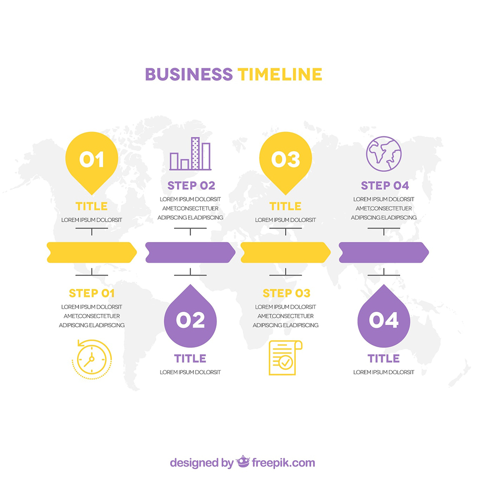
 Image: Freepik
The beauty of flowcharts is in their simplicity, so while the focus is on keeping it legible, it’s also good practice to keep it to a single page.
As you know, the human attention span today averages at only 10-20 seconds. So, unless you are a supercomputer, keeping a single-page flowchart is the most effective way to get the information you want across.
Here are a few things design experts do to keep their flowchart to a single page:
A flow chart is only as good as the flow it takes you. A general well-known rule among designing professionals is arranging the flowchart from left to right.
You could also go from top to bottom but that depends on the information you are working with and the purpose of the flowchart.
Say for example that you are using the flowchart to present in a meeting. You would go with the left-to-right format, right? But if you would like to print out the flowchart for the whole office to see, you might opt for the top-to-bottom format.
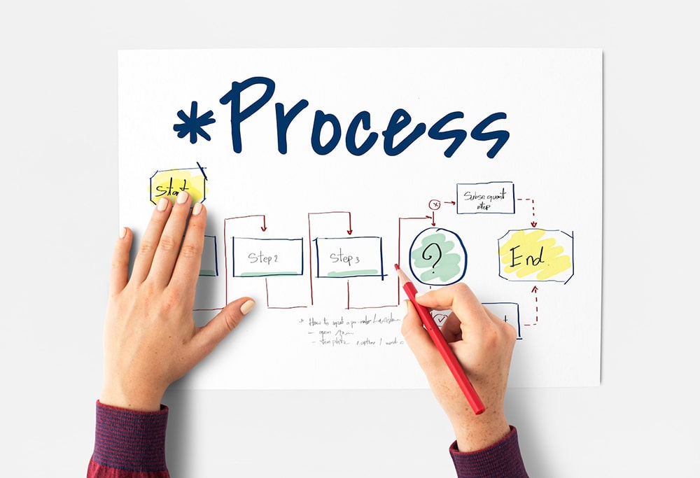
 Image: Pexels
It might come as a surprise to know that there are already designated functions for each shape in a flowchart. Here are some of the most common symbols:
Diamond shape - Used to show decision making such as (Yes) or (No)
Rectangles - Mainly used to show processes
Ovals - Used for the start and end of a flow chart
If you are dealing with a big flowchart and struggle to make it all fit on one page, perhaps using a split path might make a difference, because here are the problems associated with using the traditional diamond shape:
Instead of putting return lines on the top of the flowchart which may create unease for the reader, placing them below the flowchart creates a more natural flow since we read texts from top to bottom.
Should you need two lines or more, they should not overlap and you can arrange them based on the line length (shorter to longer).
 Image: Freepik
It might look interesting when you first put it on paper but believe us, the reader of this flowchart would have a greater appreciation for simple straight lines that get straight to the point.
 Image: Freepik
As you can see in this example, it’s hard to tell the start or finish of this flowchart since they are consistent but there are no distinguishing shapes or colours assigned to a specific purpose. This can lead to confusion in the flow of the chart.
Brevity is your friend when it comes to flowcharts. If it's meant to convey an important piece of information, try to turn it into a subtask or subprocess and hyperlink it to the main flowchart.
When creating a flowchart, it's very important to put yourself in the shoes of the person who is seeing and trying to understand the chart for the first time. So, try to avoid any information gap or expect the reader to fill in the blanks.
As you spend enough time on flowcharts, you can easily make mistakes in creating loops where there aren’t meant to be. Just be sure to review your flowchart as thoroughly as possible and maybe get a second opinion.
 Image: Brandripe
Just like any profession, the art of designing can’t be gained just by reading one article. That being said, it is important to understand what your hired professionals do and how they do it.
Your business doesn’t have time to wait for your in-house designer to upskill or your freelancer to keep making revisions (and be charged for it). This is why Brandripe is really the smartest choice to design flowcharts (and more!) for your business, brand or company.
Here are more reasons why:
Brandripe is a company that has its fair share of experience dealing with corporate needs. In creating an effective and understandable flowchart, this is absolutely crucial.
Choosing an in-house designer or freelancer that you need to keep meeting to reiterate your needs is not only time-consuming but is also an opportunity cost. Brandripe understands the value of getting work done right quickly and that is the quality of service you can rely on.
Plus, Brandripe also promises a turnaround time of 1-2 days. If efficiency is what you’re after, it's quite clear why Brandripe is the partner for you.
Find out more about what Brandripe can offer by taking a quick 15-minute VIP Demo Call. You can also drop us an email at hi@brandripe.com or ping us via the Chat toggle on the main page.

