Launching Soon
Join our VIP list to receive early access and a LIFE-TIME discount on your Graphic
Design subscription.

Image: Unsplash
Aside from the visual imagery, composition and layout of a graphic design, the colour scheme with which it is filled is what brings it to life. After all, we know that colours can make an audience feel or perceive a piece of content or even a product in different ways.
In fact, research that was conducted by the Seoul International Colour Expo documented that 84.7% of the total respondents expressed that colour accounts for more than half of the various factors important for choosing products.
The same goes for how an audience makes a mental image of a brand or content that they’ve seen. A survey of over 2,500 participating consumers revealed insights into the psychology of colour in marketing where 67% of those questioned were able to recognise the Swedish furniture retailer from a depiction of the iconic colours alone.
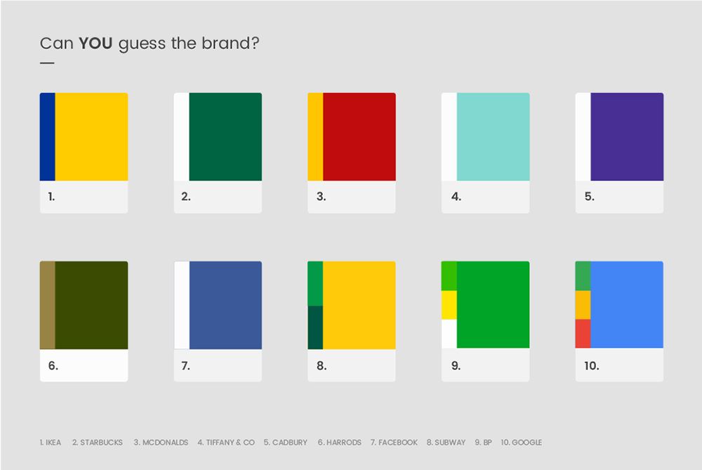 Image: Reboot Online
So, based on the data and research done on colours, it’s clear as day and safe to say that they play a huge part in boosting your brand in general. But did you know that there is an art behind the use and selections in graphic design?
We’ll spill the beans on that in this article with our list of 10 colour inspiration secrets that only designers know about.
A colour wheel is an illustrative tool used to help us define colours and their relationships to one another. It segments colours into six different quadrants that outline the primary, secondary and tertiary colours. Colour wheels also let us see colour matches that are complementary to one another – making it easier for you to figure out the best colour matches for your visual.
So, the next time you’re unsure about whether certain colours would mesh well with one another, just remember the trusted colour wheel and be guided accordingly.
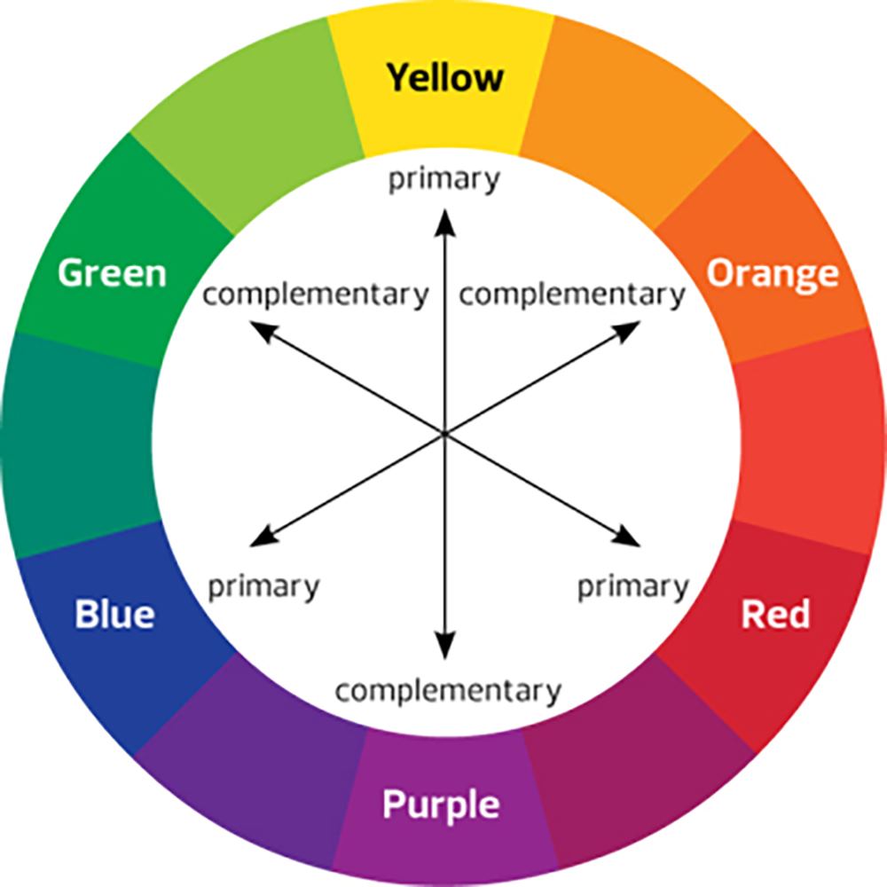 Image: Peachpit
Not to be confused with a colour wheel, a colour swatch is essentially a palette that shows a variety of shades of the same colour. Utilising a colour swatch will allow you a full view of what colours to choose from and their different hues and depths in each colour palette.
Colour swatches are ideal as a guide for you to mix up different ombres and gradients, which may help lead you to your perfect match.
There’s nothing quite like nature herself when it comes to inspiration. Why else would the greatest tip for any kind of block (mental, spiritual, creative, etc) involve taking some time to appreciate and be around nature?
Nature is the one area where each combination of colours are perfect complementaries of one another. So, the next time you’re feeling a little uninspired, look no further than your surroundings and get inspired by the wonders of nature!
As mentioned in our previous article on understanding colour symbolism, colours are significant in defining a brand or visual personality. In other words, colours have the power to change how people feel about your brand or business.
As colours possess different meanings in design and art (from a literal sense to a connotative sense of what it implies), it’s worth taking some to understand what emotions or words are associated with them so you can align your next project with the end goal of what it’s meant to convey.
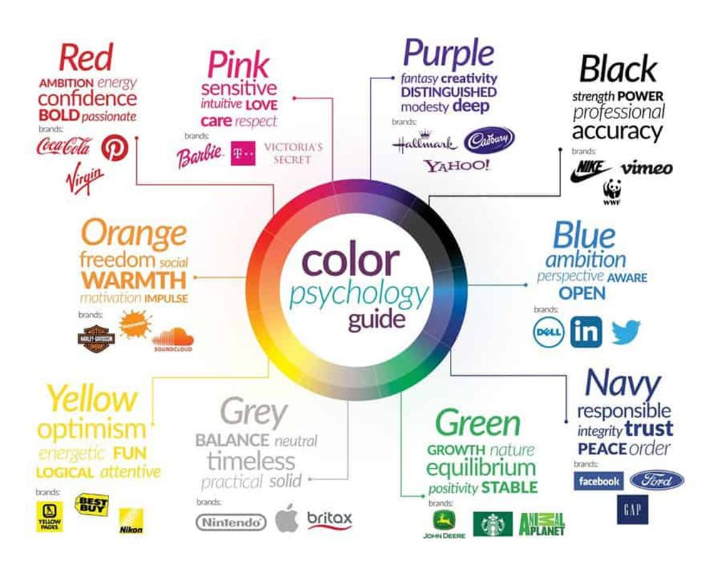 Image: The Influence Agency
A colour theory studies different hues and how to use them in harmony. It’s a page out of an interior designer’s playbook as it informs of a palette that works well together to create an overall ambience of a home because, as you know, colour can influence moods and feelings.
Here are a couple of examples:
Your piece of visual should not be an eyesore or is something that ‘attacks’ the audience – seek colours that create a harmonious blend and sets the tone to boost your message.
There are a couple of examples that you can experiment with, but you can always refer to our article on three of the best types of colour combinations and how to apply them to your designs.
Secondary colours such as green, orange and purple are colours formed by mixing primary colours, while tertiary colours like blends of yellow-orange, red-orange, red-purple, blue-purple, blue-green and yellow-green are the result of mixing a primary and a secondary colour to form these colours.
Instead of focusing only on primary colours, create attention-grabbing visuals by playing with secondary and tertiary colours – you’d be surprised at how they might turn out!
Many designers use online generators like Pigment by Shapefactory. The generator has an easy user interface that you can access without any fuss and gives you the creative flexibility to choose your preferred colour palette and modify the palette directly from the browser by adjusting the pigment and the lighting.
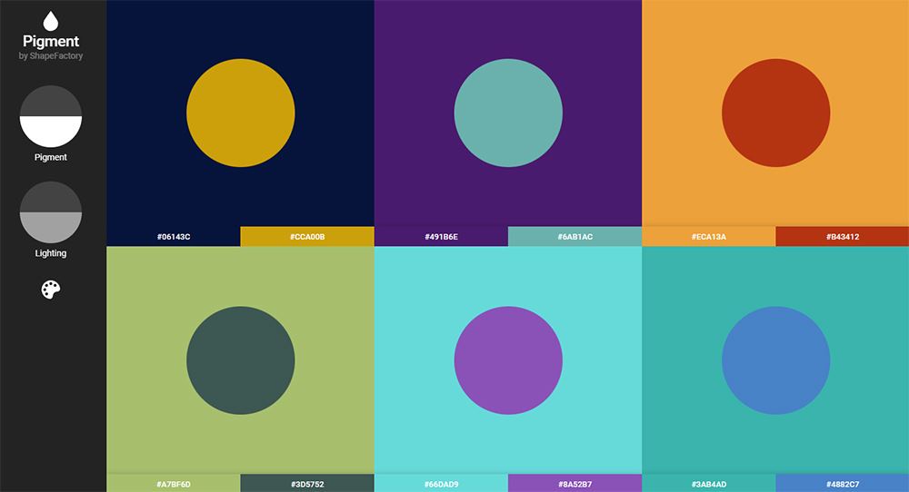 Image: Pigment by Shapefactory
A colour mood board helps you manifest the mood you're hoping to create. It is used to inspire you as you work towards the vision and styling you wish to achieve.
In graphic design, having a mood board for your brand is crucial in ensuring a seamless blend of brand identity across any type of visual or materials you may create so that there will be no room for any mismatch or deviation.
A hidden gem, Adobe Colour is a web app and creative community where you can create and share colour themes and inspiration. Not only is it free to use, but you can also experiment with various tools for creating your own colour palettes and colour themes.
This app is especially a favourite amongst photographers to play around with complementary, analogous, triadic, and various other colour rules.
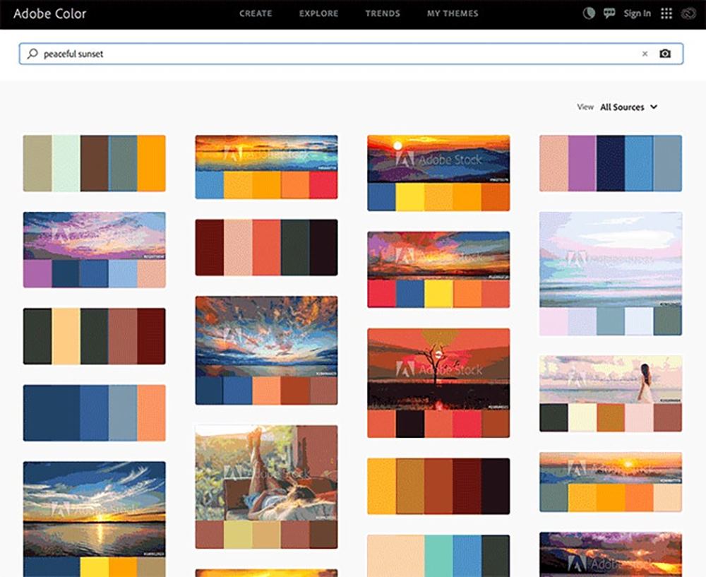 Image: Adobe Blog
Color Hunt is essentially an open collection of colour palettes. What’s great about this tool is that you can derive inspiration from various trending themes such as seasonal palettes or even get on the bandwagon of what’s trending.
Favoured by designers, Color Hunt is incredibly convenient with colour codes available on the copy so you can get on with your creation immediately without the hassle of finding each code.
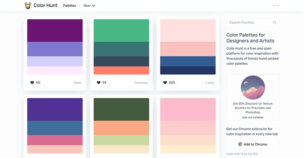 Image: UI Garage
We may have let the cat out of the bag and given you the knowledge to apply these tips and tricks to your next design, but just remember that the team at Brandripe is ever-ready to help out whenever you need assistance in using the right colours and combination for your next design project.
From RM1,695 a month, you can get almost anything designed by us such as:
Logos & Branding
Web & Mobile
Arts & Illustrations
Social Media, Email & Ads
Promotions & Print
Business
No matter what type of content or visual designs you’re looking for, our team of expert graphic designers are able to take your brief and deliver results within 24 to 48 hours – all this complete with unlimited requests and revisions.
We’ve been trusted partners to some of the most prominent brands in South East Asia, delivering quality content in various formats; from infographics to promotional posters, food ads, web banners or logos – so rest assured that you and your design ideas are in expert hands.
Find out more about the process, or simply sign up to have our team contact you for a VIP demo on how it works and what we can tailor to your needs. Click here to schedule a demo tour that best suits your time.
Alternatively, you can email us at hi@brandripe.com or drop us a note via the chat toggle on the main website, and we’ll get back to you as soon as we can.
