Launching Soon
Join our VIP list to receive early access and a LIFE-TIME discount on your Graphic
Design subscription.


Print is dead. Do you agree or disagree?
As people who are obsessed with technology and our devices, we might say that. But that’s what we’ve been saying for the past few years, and believe it or not, print is still alive and kicking.
In fact, it became quite the commodity in the world of advertising, especially since:
That being said, these advantages are just the tip of the iceberg. You do still need to cut through all that clutter and stand out from other brands looking to take advantage of the power of print.
How do you do this exactly? First and foremost, you’ll need to nail your concept. Make sure it’s solid and strong before you attempt to design ideas around it.
A print that captures the attention in a unique, creative way without compromising the concept or message is a surefire way to make sure it stays memorable.
Take a leaf out of these print ads that are brilliant and memorable in their own way, and can even go perfectly with posters, brochures and other ads that you may have in mind.
Notice these two different advertisements:
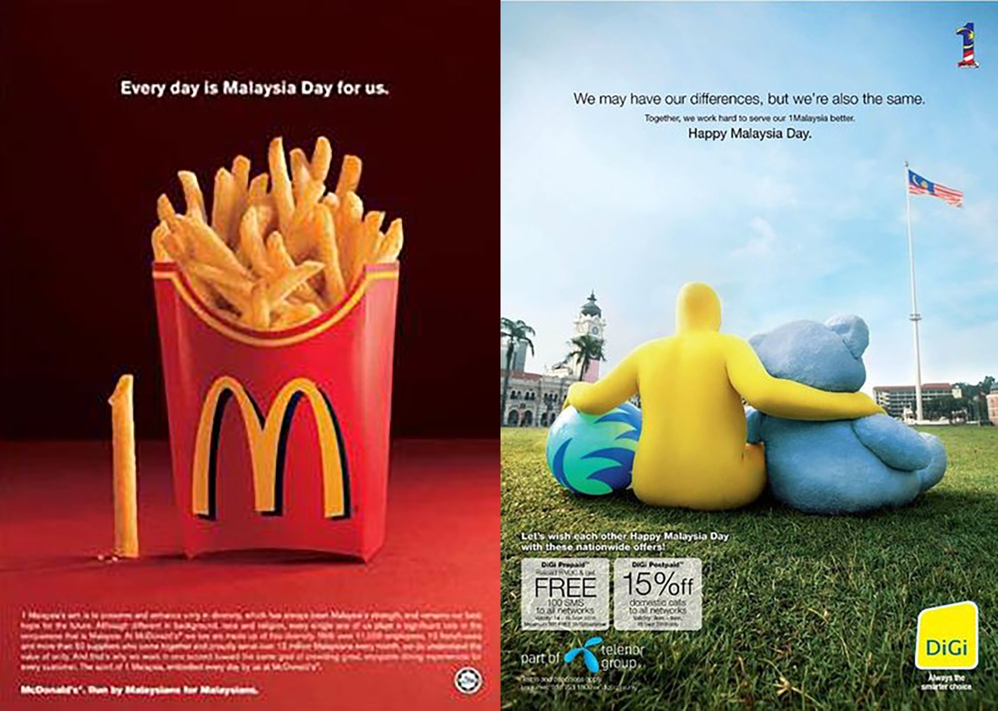 Image by McDonald’s and DiGi
These two ads (by brands McDonald’s and DiGi) took advantage of one of the biggest events in Malaysia – Malaysia Day. They each had their own way of interpreting the oft-cited tagline behind the huge holiday, which is 1Malaysia or in other words, unity.
McDonald’s worked with what they had, quite literally, by picking out a single fry and positioning it next to the box with the logo facing the viewer. The visual of “1M” is hard to miss, especially against such a simple background.
DiGi, on the other hand, opted for a heartwarming yet tongue-in-cheek version of a Malaysia Day ad, depicting the famous yellow mascot with his hands around a blue bear (which is Celcom’s mascot), and a green and blue ball (which represents the Maxis logo).
Malaysians are aware of how these telco companies are always competing with each other, but embrace their differences (and similarities) on Malaysia Day. This belief is, of course, practised by Malaysians who are unified despite differences in race and religion.
.jpg) Image left and right by Jamie Toh
Image left and right by Jamie Toh
Back in 2014, Malaysia Airlines ran a series of print advertisements for their year-end sale. The campaign was named “End the year with a new perspective”, which beckoned travellers to take a look at different fares that would suit every budget and taste.
To illustrate this, the designers behind the artworks featured two locations per ad, seen from different perspectives.
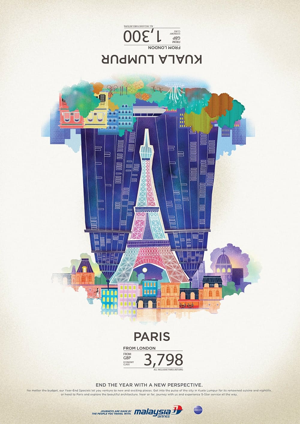 Image above courtesy of Jamie Toh
This series of ads did indeed change the perception of those who happen to be flipping through the magazine – prompting them to take a longer look, decode the visuals and even flip it upside down to take a look at it properly (which, in essence, makes it interactive too).
But challenging the reader’s perception doesn’t need to be elaborate. Sometimes, it can be as simple as this other advertisement by Malaysia Airlines:
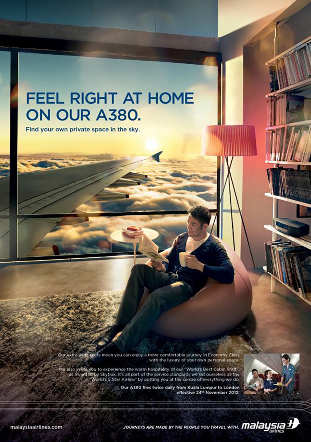 Photo courtesy of Jamie Toh
We Malaysians love all things local and are never afraid to localise things if and when needed. Here’s an example of actor Omar Sy’s experience with Malaysian fans following the launch of Season 2 of the “Lupin” series:
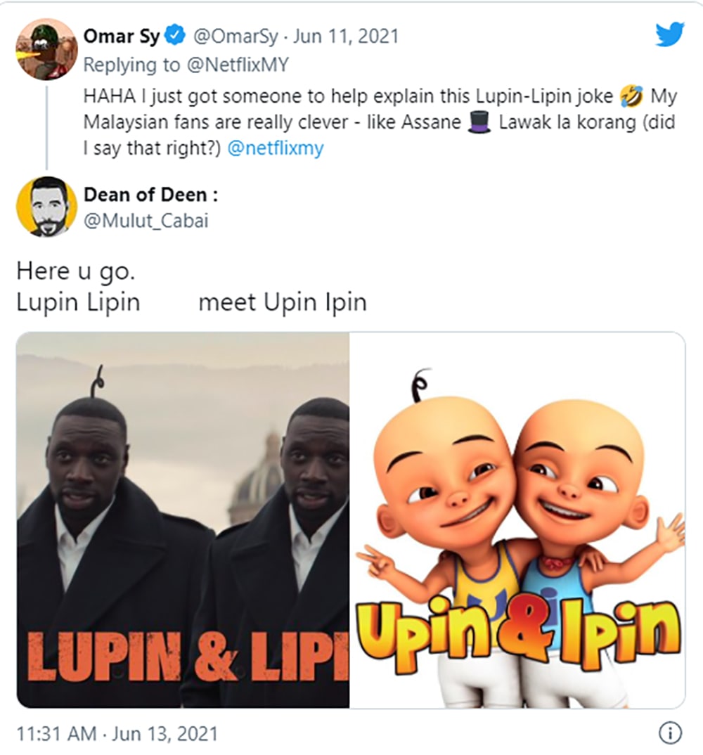 Screenshot from here
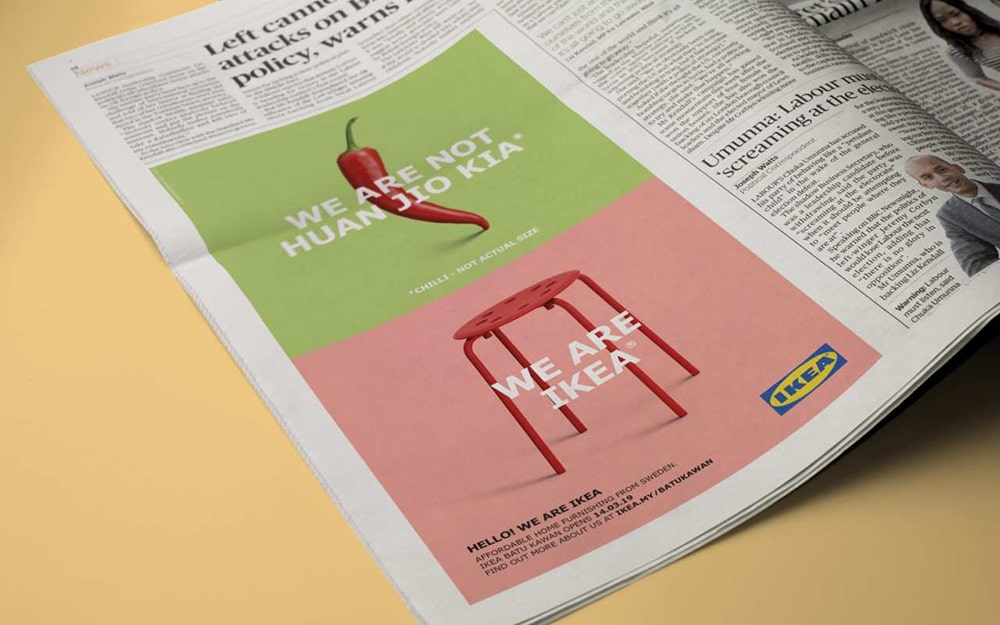
Armed with the knowledge that Malaysians love all things local, IKEA Malaysia cleverly launched its new store in Penang in 2019 with a local Hokkien dialect that immediately captured the attention of Malaysians – and won their hearts too.
Here’s what they did:
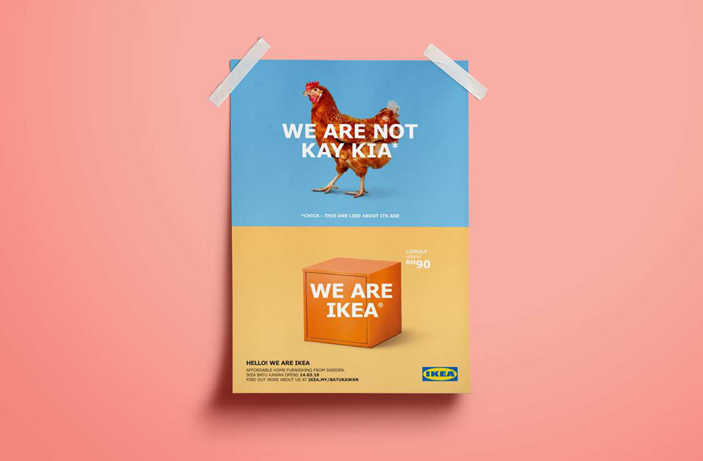 Image from BBH Singapore
Though Malay, English, Chinese and Tamil are more widely spoken in Malaysia, most Penangites are known for their Hokkien dialect (otherwise known as Penang Hokkien).
The example above featured the words “We are not Kay Kia” which roughly translates to “We are not a chick”.
They did several renditions using this same concept, featuring Kang Hu Kia (anchovy) and Lo Kha Kia (tall guy).
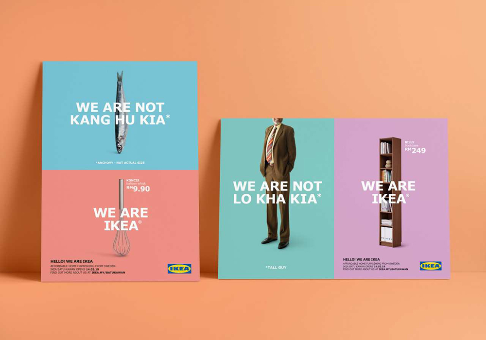 Image from BBH Singapore
You might argue that it would be hard to advertise evaporated milk… until you come across this ad:
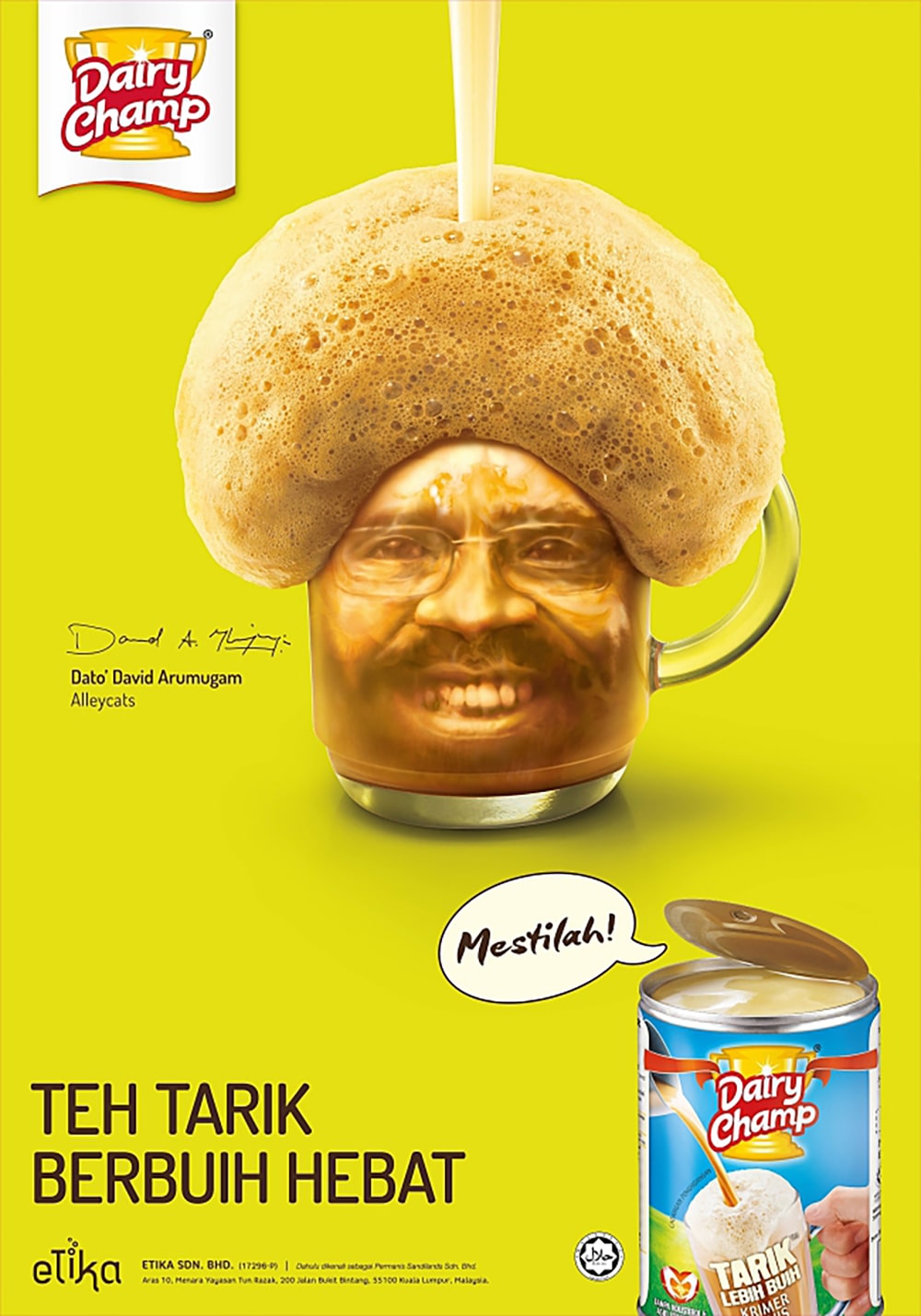 Image here
Yes, this is one of the most popular ads back in 2017 that was launched by Dairy Champ. Celebrities like legendary musician Dato’ David Arumugam and cosmetics tycoon Dato’ Vida were “featured” in these advertisements, effectively capturing attention and evoking laughter from those who happen to catch sight of them on print, billboards and more.
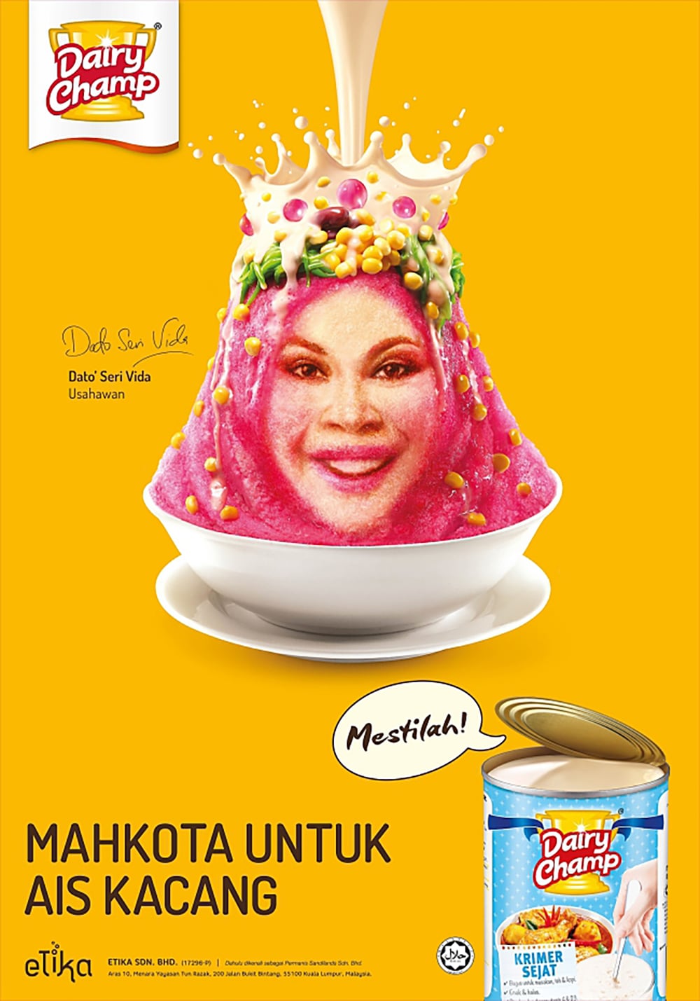 Image here
The concept of these ads centred on the launch of Dairy Champ’s extra foamy sweetened creamer (as showcased by Dato’ David Arumugam’s faux ‘fro) and their evaporated creamer (illustrated through Dato’ Vida’s creamy crown).
These advertisements were not only funny, but also allude to the celebrities’ signature looks – making them all the more clever and effective.
Here’s a literal award-winning advertisement campaign that was done by Ogilvy Malaysia in 2012.
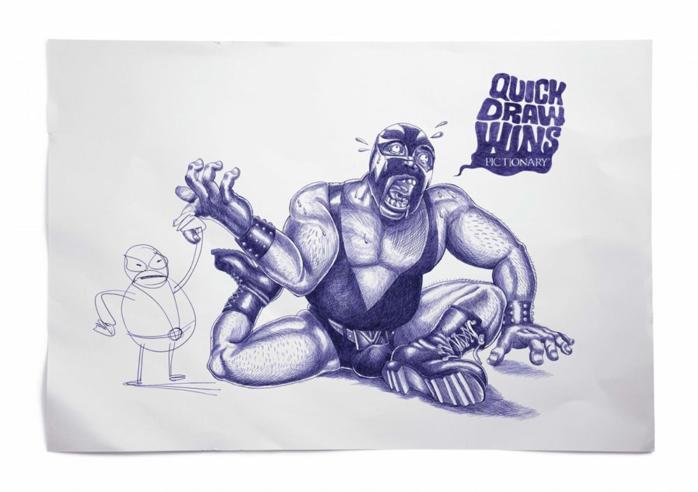 Image here
The print ads, which featured illustrations that profiled Pictionary based on the idea “Quick Draw Wins” won two CLIO awards due to their genius way of showing a jet fighter, wrestler and T-rex dinosaur outdone by a more simply-drawn character.
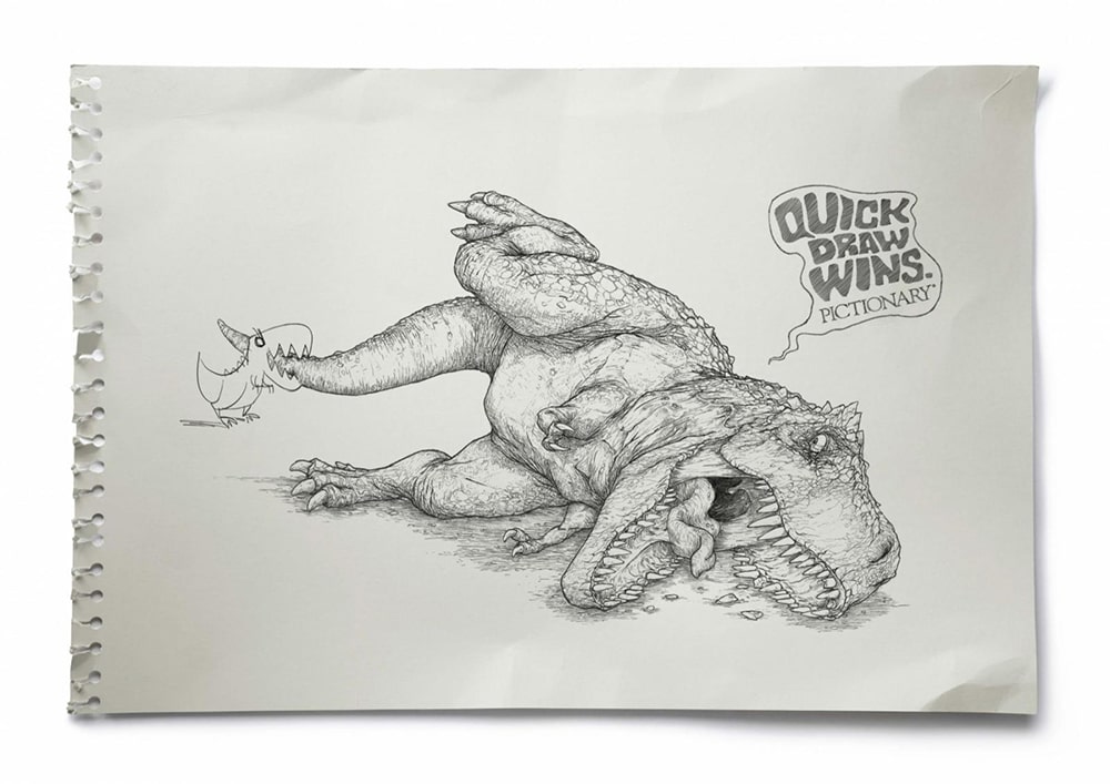 Image here
The concept is straightforward yet effective. Aside from showing the two parallels between a simple drawing and a more complicated one, it also hints at the rules of a Pictionary game.
A more recent example of an advertisement that truly pops is like this one by Shopee to promote their 11.11 campaign in November 2021:
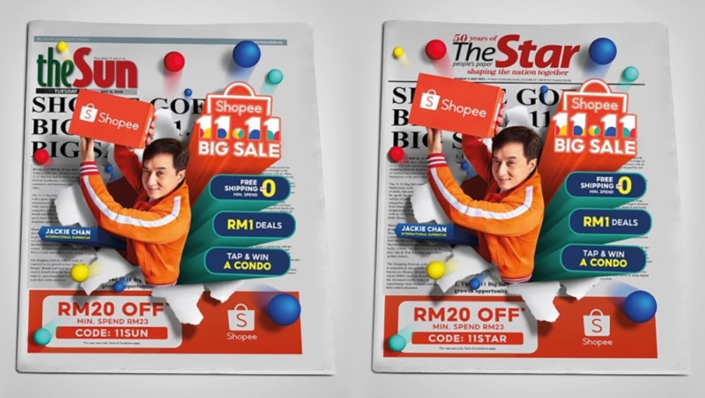 Image from Marketing Interactive
These advertisements are the true epitome of thinking out of the box, as Shopee Malaysia created a 3D optical illusion on the cover page of national newspapers The Star and The Sun.
Shopee’s creative lead had mentioned in a LinkedIn post that the company was “determined to create a print ad that creates an impact visually that justifies the size of the 11.11 mega campaign.”
Safe to say, the message was loud and clear and considering that this type of advertisement is quite rare in newspapers, it really captured people’s attention.
A Shopee spokesperson mentioned, “We wanted to do something eye-catching on a big scale, even on a print level where no one would miss it.”
Well, thanks to a collaboration with an experienced retoucher who worked on an infallible concept, we bet that nobody missed that striking ad on the front cover.
As you can clearly see, print advertisements still capture the interest of many – if not millions – despite the rapid development of the digital age.
The examples we’ve listed above showcase the best concepts and ideas using brilliant graphic designing skills and techniques.
Your print ads have the power to be as impactful, whether in a speciality magazine or spread across the pages of a Sunday morning newspaper. All you need is an uncrackable concept, combined with an experienced team of graphic designers that will help you achieve this, like Brandripe!
Have a concept that you can’t exactly put onto paper? Talk to us. Have a rough idea but no clear concept yet? Doesn’t matter, you can still talk to us. We can help you put your vision forward and on paper for millions of Malaysians to see, admire and remember.
On top of that, we promise to deliver your designs between 24 to 48 hours, complete with unlimited requests and revisions on your part. This is on top of all the other benefits of working with Brandripe, which you can find out more about when you schedule a 15-minute VIP Demo Call with us.
Don’t worry, there are no hidden costs, fees or any contracts involved. Let us talk you through the entire process and what it’s like to work with us and then see how we fare from there.
Otherwise, feel free to drop us a line at hi@brandripe.com, or text us via the Chat toggle on our main page.

