


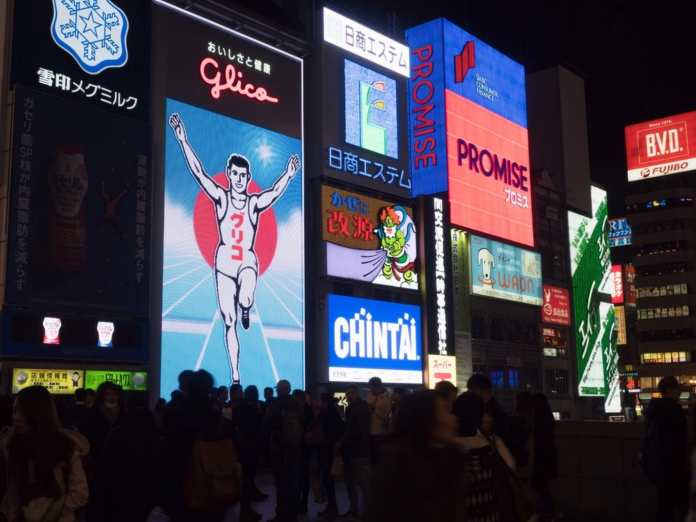
In a rapidly digitising world, web banners are the new billboards. This is the main reason why marketers, business owners or simply anybody with a service, product or idea to sell should make use of this highly effective tool.
They have the power to attract attention, bring in more traffic, funnel conversions or even attract advertisers. They also create brand awareness, inviting the visitor to find out more about what’s on offer, which leads to more clicks.
However, even if it does seem obvious that every website needs a good web banner design, getting it right is not as easy as you might think.
After all, a poorly-designed web banner can turn people off and stop them from further browsing your website -- no matter how good the other elements may be.
A&T may have gotten away with it when they put up the first web banner ad in 1994, but now, you’ll need more than just a simple design to stand out.
So, here are some tips to set you on the right path. Remember, you only have 3 seconds to capture and retain interest!
The effectiveness of whatever campaign or message you may have in mind rests on how big or small your banner is, so it’s important that you choose wisely.
Here’s a list of the common sizes chosen by advertisers:
But if you really want to narrow things down, the most effective ones by far are the Leaderboard, Half-page, Medium Banner and Large Rectangle -- according to Google Adsense.
When choosing the perfect spot to display your banner, be sure to stay above the fold and close to the main content of a page. These placements make it easy for your visitors to spot your message.

Just like everything in life, your web banner design needs to be balanced, so it should comprise a balance of these four components:
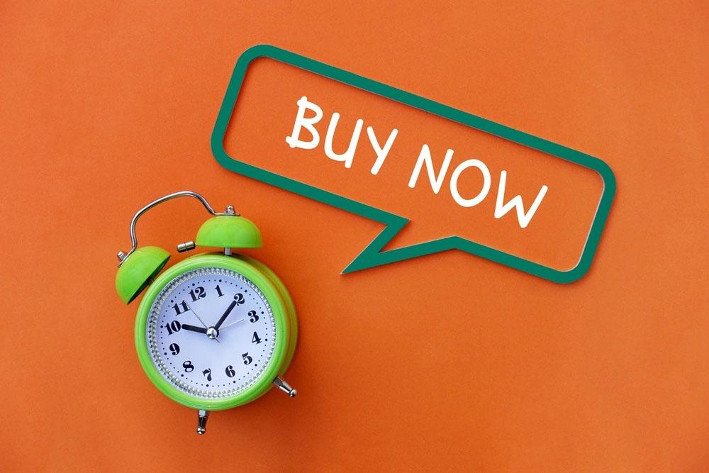
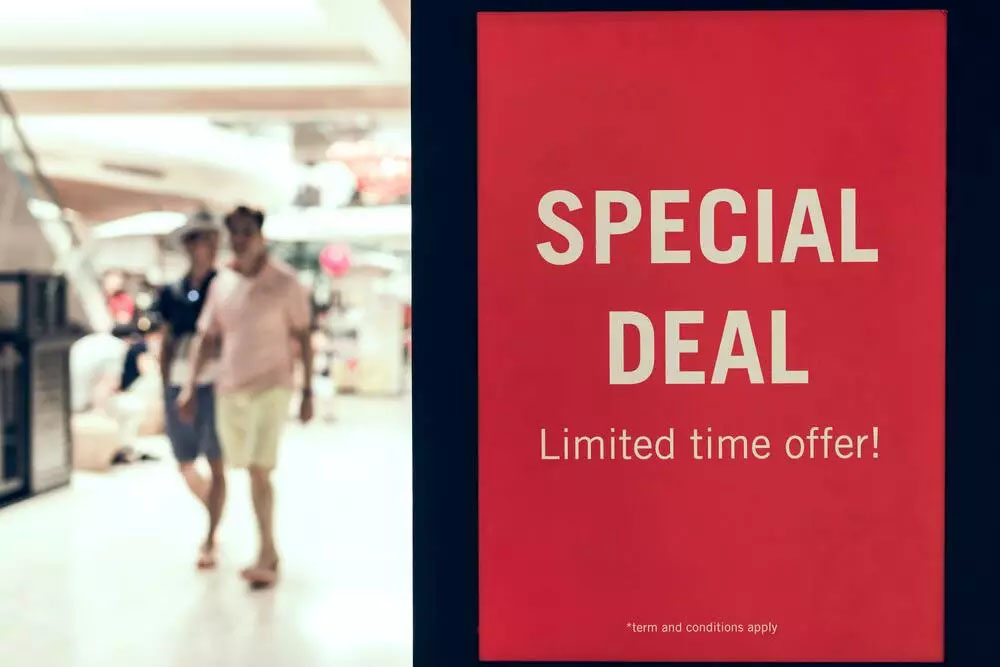
Incentives, offers, discounts, sale -- all these keywords should be emphasised in your web banner design. Words such as “50% off”, or “Limited time only” are guaranteed to get attention, if not clicks (though the aim is for you to achieve both).
Think hard about the purpose of your web banner. Is it to increase brand awareness, highlight a new product or service or call attention to a sale or promotion? Once you figure this out, list down a couple of keywords that are related to your goal.
The call to action (CTA) prompts visitors to find out more about what you have to offer, so it should directly support your value proposition. Persuasive phrases like “Learn more”, “Get started now” or “Order now” invite the reader or visitor to click on your web banner.
Brand awareness is one of the reasons why web banner designs are created in the first place. Hence, it is important that your company logo stays visually dominant but not so much that it overpowers your main message.
If you have a certain product or service on offer, be sure to keep it simple and straightforward. It shouldn’t take more than a few seconds for the reader or visitor to grasp the message based on the image.
Most importantly, it shouldn’t overpower any or all of the previous three elements.
You might also want to take this opportunity to experiment with animations such as GIFs. These types of banners naturally draw the eye, and at times, out-perform static ones -- though static banners with appropriate and high-quality images are still amazingly effective.
Just make sure that they don’t distract from your message, and one way to do this is to make the last frame a clear call to action.
Colour is the first thing the audience notices about your web banner. If your brand or company has a preferred colour palette, now would be a good time to incorporate them. If not, choose colours that complement your logo.
Remember to always imagine yourself in your audience’s shoes before deciding on a colour to go with for your web banner design.
You already know that colours have the ability to evoke certain emotions from people, so study your audience before making a selection and tie it to the promise that your brand or business is offering.
For example, red is associated with excitement, love and passion and is the most powerful colour used in advertisements. If you’re a mature, classic or serious brand, however, it’s best to avoid red.
Other popular colours include:
As web banners only have less than three seconds to make an impression, both your message and CTA must be readable.
Do make sure that your headline and body copy are of different sizes but no smaller than 10pt unless it’s for a disclaimer. However, the overall copy should be four lines or less, otherwise, your web banner can get a little too crowded.
Avoid using cursive, script or extremely thin fonts as this can be hard to read. Gotham, Myriad Pro, and Helvetica Neue LT Std are some of the most used fonts in web banner advertisement designs, so consider using those.
Of course, this doesn’t mean that you can’t experiment. If your brand has its own typeface or style, you may use them in web banners -- as long as the text remains readable and clear.
Loading time is easily one of the biggest factors of any website’s success. Anything that takes longer than 3 seconds will increase the bounce rate, meaning that visitors will be quick to abandon a page if it doesn’t load within 1-2 seconds.
This is why your web banner design file should be kept under 150kb, according to Google AdWords, so that your visitors won’t scroll down and miss it.
Lastly, your files should follow the JPG, PNG, GIF or HTML5 formats.
Getting creative with a web banner design can be tempting, but straying too far from your business or brand’s main message will confuse the audience.
Your web banner should complement your brand, site or service. Imagine clicking on a colourful web banner just to end up on a website that’s lacklustre or boring!
Your audience will no doubt be picking up on the inconsistency, or worse, thinking that they landed on the wrong page before completely abandoning your site.
Again, you can experiment with your web banners, but keep in mind that it needs to tie back to your goal.
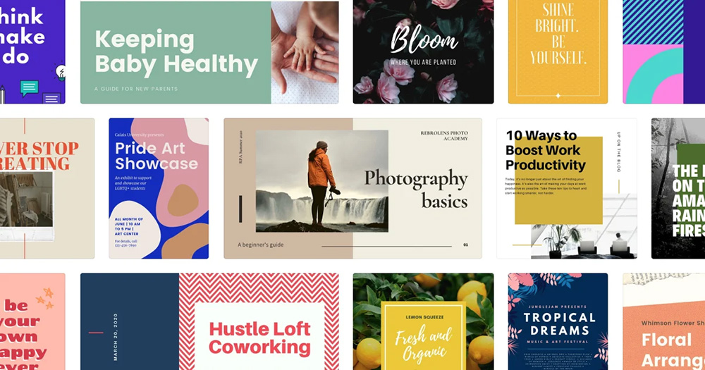
Here are some web banner designs which will hopefully serve as inspiration for you:
Could we possibly get some designs that were done by Brandripe here? With a little bit of commentary about why they work and why they’re successful, Abby? Eg. the colour/pic choice, why it’s striking
These are just some of the basic rules to guide you in your web banner-designing journey, which in theory may sound simple, but can prove to be quite taxing and challenging.
Creating a good web design is more than just piling a bunch of text and images together, after all.
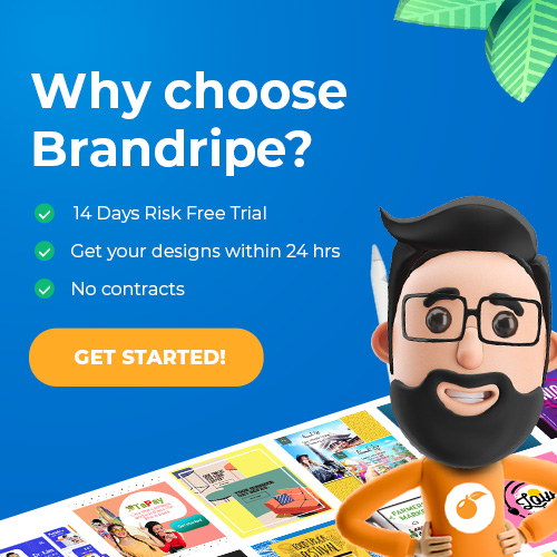
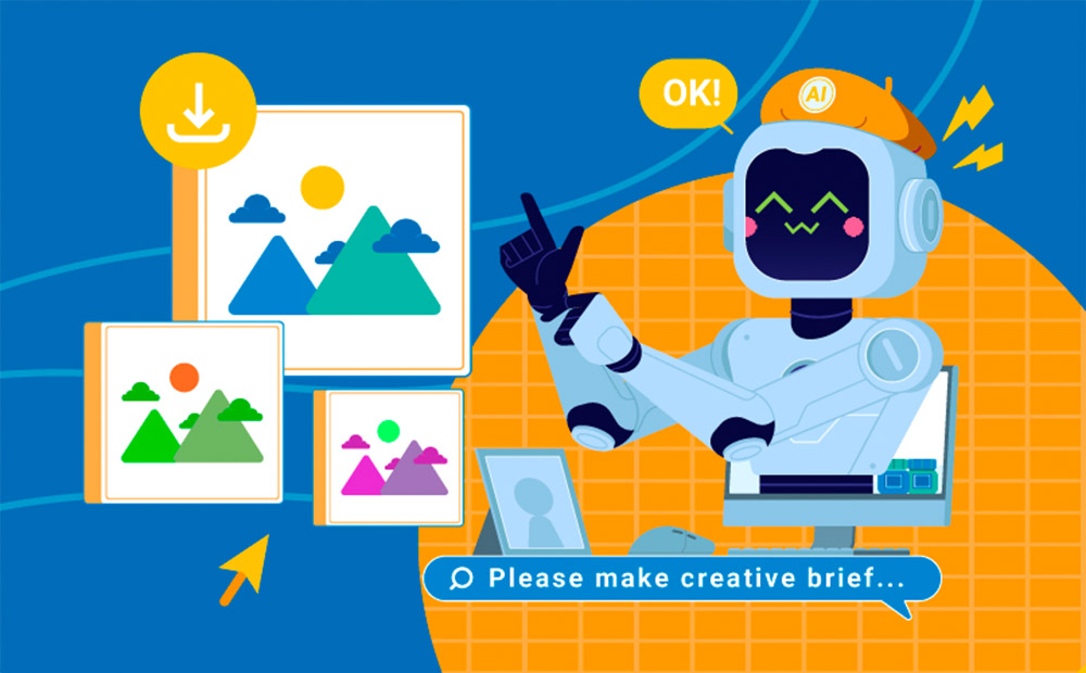
If you’re not a graphic designer yourself or can’t find the time to design as you’re busy running a business or agency, consider working with the talented team at Brandripe, who can help you create stunning and irresistibly clickable web banners.
At Brandripe, we have the right tools and expertise to help you get your web banner design ideas up and running on the front page and ensure that the end product will be one that you’ll be proud to see on display.
But first, it would be a good idea to familiarise yourself with how things work at Brandripe.
Take a tour of both our platform and our dashboard, and if you prefer, you can submit a web banner design request today via our portal to get started with our 14-day trial. Then, you’ll receive your first web banner design within 24 hours.
There’s nothing at stake here because it’s a risk-free trial that also guarantees that you get unlimited revisions until you’re truly happy with your banner.
Book a 15-minute VIP Demo Call with us here now, and ask us anything!