


Image: Pexels
Have you ever wondered why a particular painting leaves you breathless while another one does nothing for you? Or why a certain brand logo feels instantly trustworthy while another seems off-putting?
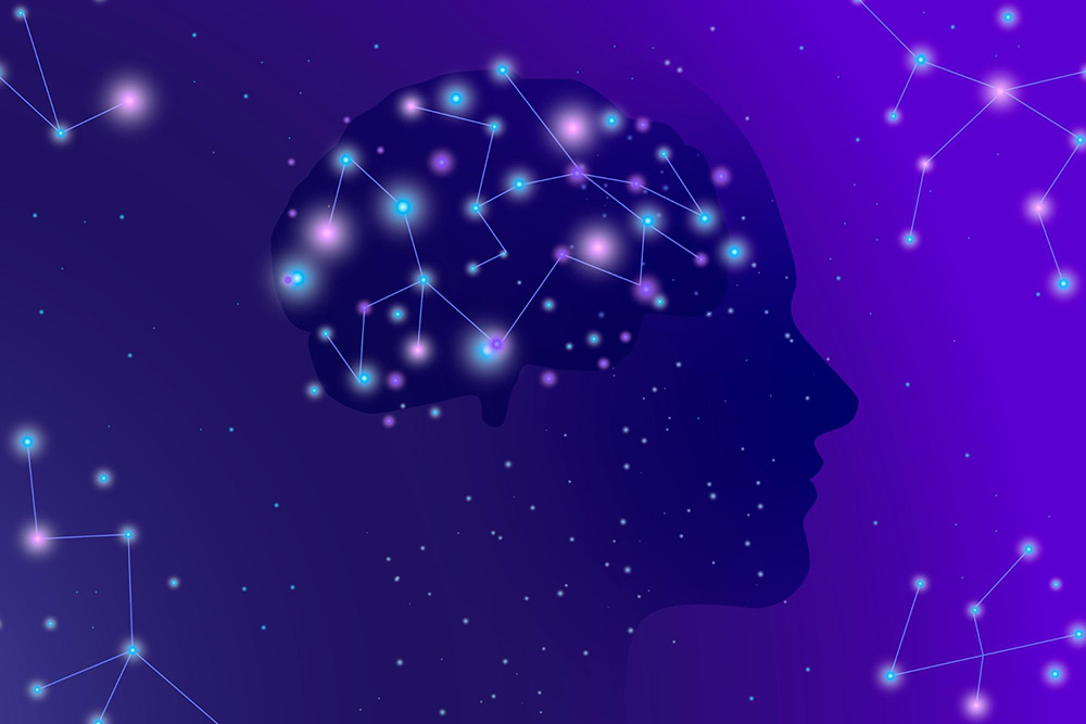
The answer might lie in a fascinating field called neuroaesthetics. Neuroaesthetics bridges the gap between science and art, delving into the neurological underpinnings of our experience of beauty.
While the saying goes that "beauty is in the eye of the beholder," there's more to the story.
Neuroaesthetics reveals that our brains do play a significant role in how we perceive and respond to aesthetics. It explores the biological mechanisms behind our perception of beauty, uncovering the common threads that weave together what we find visually pleasing or emotionally resonant.
I know what you’re thinking – good design is meeting the personal preferences of your target audience. But what if we told you that the studies in the neuroaesthetics industry says the opposite is true?
In fact, it has been proven humans share more common ground in design preferences than we realise. Imagine the possibilities! This newfound understanding unlocks a powerful tool for businesses. By harnessing the principles of neuroaesthetics, companies can craft designs that resonate on a deeper level, subconsciously influencing emotions and driving engagement.
Here's the kicker: Brands that leverage this knowledge gain a significant edge. And we here at Brandripe can tell you exactly why and how. Want to be one of those smart companies? Stay tuned as we delve into the fascinating world of neuroaesthetics, revealing the universal design principles that make your brand irresistible.
Neuroaesthetics play a huge part in our daily lives. Image: Freepik
So what is the universal language of beauty (known as neuroaesthetics) that resonates deep within us?
Here are some key principles to keep in mind:
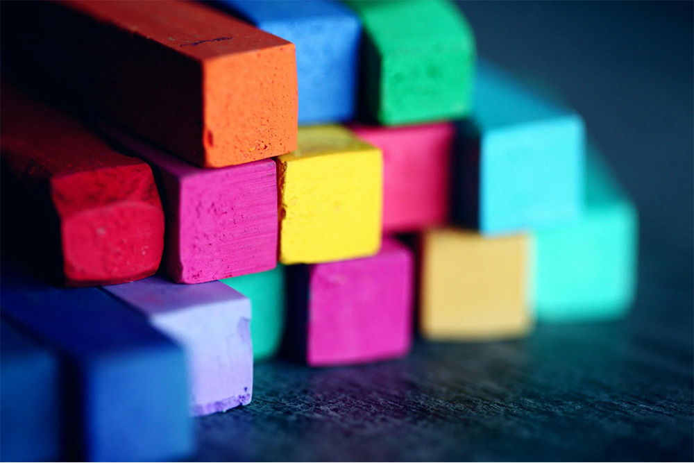
There is science behind colour. Image: Pexels
Neuroaesthetics bridges the gap between neuroscience and design, revealing the fascinating interplay between colour and our emotional responses (Di Dio, C., & Gallese, V., 2015).
By harnessing these insights, designers can create impactful experiences that not only foster a sense of visual appeal but also evoke desired emotions and drive engagement. Imagine a healthcare website bathed in calming blues and greens, promoting a sense of trust and well-being, or a retail space bursting with vibrant oranges and reds that stimulate excitement and encourage exploration.
The following sections will delve into the formal exploration of colour selection within neuroaesthetics. We will explore the established principles of colour psychology, analysing how specific hues speak to the brain, influencing everything from mood and perception to brand recognition.
Ultimately, this exploration aims to equip designers with the knowledge to not simply choose aesthetically pleasing colours, but to leverage colour as a powerful tool for strategic design communication.
Different colours evoke distinct emotional responses. Warm colours like red and orange tend to energise and stimulate, while cool colours like blue and green promote feelings of calmness and peace. Imagine a fast-food restaurant using bold reds and yellows to create a sense of excitement, while a spa utilises calming blues and greens to evoke relaxation.
Colour meanings can vary across cultures. Red might symbolise love in the West but signifies good luck in China. Understanding your target audience's cultural background is crucial for effective colour choices.
Beyond basic emotions, colours can also influence our perception of size, weight, and even brand trustworthiness. For example, a dark blue website might convey a sense of authority, while a light yellow can make a product appear lighter and more affordable.
Don’t just take our word for it. Let’s take a look at global brands who are using the neuroaesthetics principles to their advantage.
In this section, we will also explore the specific neuroaesthetic design principle applied by these brands.
Apple: Where minimalism meets trust

The Apple brand. Image: Unsplash
Apple's brand identity is synonymous with clean lines, negative space and a minimalist aesthetic. This is beyond visual appeal; it taps into our inherent preference for order and simplicity. These elements trigger feelings of trust and calmness, perfectly aligning with Apple's image of reliability and innovation.
Patagonia: Creating connection through nature

A Patagonia poster. Image: LinkedIn
Patagonia is a brand built on a love for the outdoors. Their logo features a stylised mountain silhouette, and their marketing materials are filled with breathtaking natural landscapes. It leverages the biophilic principle in neuroaesthetics.
According to various research, elements of nature can evoke feelings of well-being and connection – a perfect emotional fit for Patagonia's adventurous and environmentally conscious audience.
Tiffany & Co: The power of blue
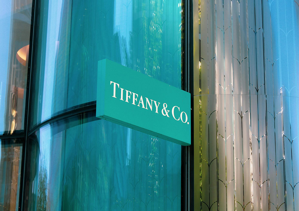
Tiffany & Co, famous for its own shade of blue. Image: Unsplash
Step into a Tiffany & Co. store, and you're instantly enveloped in their signature shade of blue. This isn't an arbitrary choice; it's a strategic use of colour psychology. Blue is associated with feelings of luxury, sophistication and trust – which perfectly aligns with Tiffany's brand image of timeless elegance and quality.
Smart companies understand the power of a trusted design partner. At Brandripe, that's exactly what we strive to be. With over 500 partnerships with SMEs, global businesses and marketing teams, we've honed our expertise in neuroaesthetics across hundreds of thousands of projects.
But what truly sets Brandripe apart?
Plus, here are more reasons to work with us!
Contact Brandripe today for a free 15-minute Demo Call, and let's discuss how we can help you craft a brand identity that resonates with your audience and fuels your business growth!


