

Image: Unsplash
Cracking into a year of business events and conferences in The Land Down Under? Ready to impress potential clients and collaborators? Don't let your business card get lost in the shuffle!
This year, make it a conversation starter, a networking tool and a reflection of your brand's unique personality. After all, a captivating card can boost your image, generate more leads and open doors to exciting opportunities.
So, if you want your business card to be a fair dinkum legend, you are on the right page. We here at Brandripe have years of expertise crafting unforgettable business cards that leave a lasting impression. We can even do that for you, no problem, but we’ll get to that later.
Now, before we dive into the elements of a captivating business card, let’s look into the top business card design trends from Australia. Hopefully, you’ll be able to draw some inspiration to apply in your next card design.
High contrast, simple hues
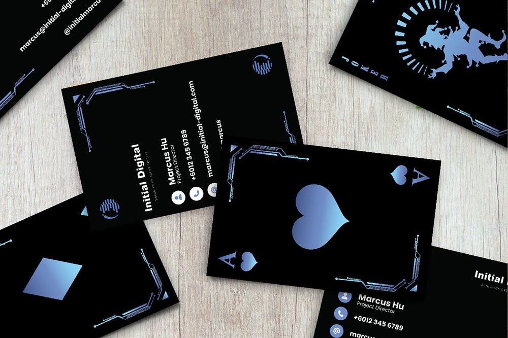 An example of a high-contrast and simple card design. Image: Behance
This business card design masterfully utilises design principles to grab attention and leave a lasting impression. The bold "Initial" logo acts as a central focal point, strategically placed according to the rule of thirds for optimal engagement.
Generous white space creates balance and emphasises key information, adhering to the figure-ground principle. This hierarchy is further reinforced by varying font sizes, ensuring the recipient grasps essential details like name, title, and company first. The high-contrast black, blue and white colour scheme leverages the Weber-Fechner Law, maximising visual impact while maintaining a clean and professional feel through its limited palette.
Bold, sans-serif fonts enhance legibility on a small scale, and careful alignment aligns elements with the rule of thirds for a balanced composition. A touch of asymmetry prevents visual stagnation, adding subtle intrigue.
Ultimately, this design thrives on its memorability and uniqueness. The combination of elements ensures it stands out, while clean lines, a limited colour palette, and modern fonts convey a professional image. Functionality remains paramount, with clear and concise information delivery adhering to the principle of usability. In sum, this business card design effectively balances aesthetics and communication, making it a standout success.
Dual Tone Geometry
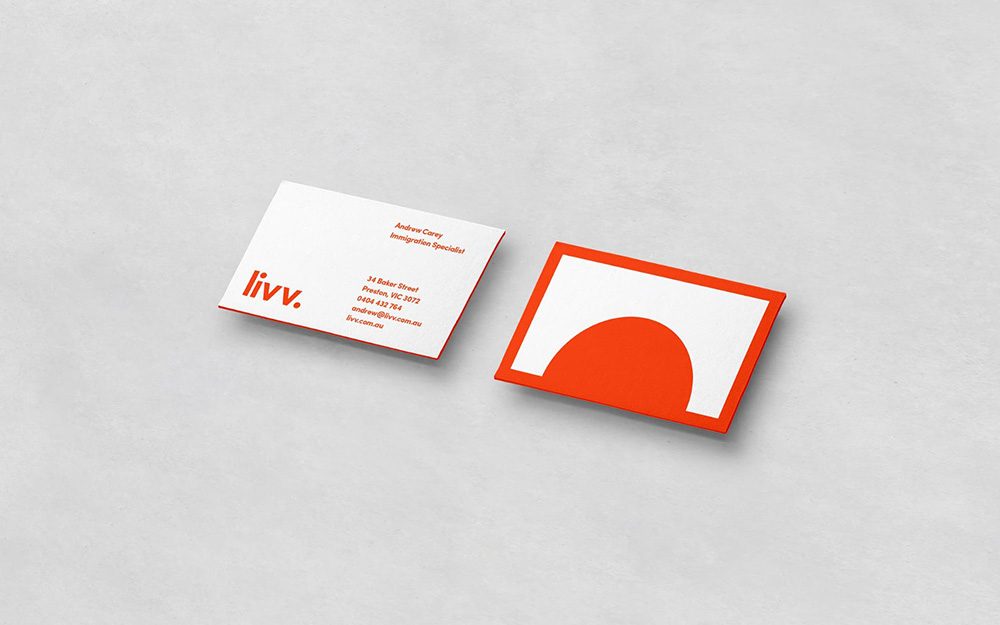 An example of dual-tone geometry. Image: Behance
This business card design strikes a perfect balance between professionalism and intrigue. The layout meticulously adheres to the rule of thirds, ensuring a balanced composition where elements are evenly distributed without feeling cramped. Generous white space allows the key information to breathe, drawing attention through the principle of figure-ground. Both text and logo align seamlessly, further emphasising the balanced composition.
The colour palette plays a strategic role, utilising a complementary scheme of white, and orange. This combination instantly grabs attention while maintaining a professional feel. Clean lines and limited colours solidify the professional stance, while the script font and pop of orange inject a touch of unique memorability.
Ultimately, this design excels in its ability to be both clear and functional, delivering essential information effortlessly, while simultaneously captivating the recipient through its unique and balanced composition. It stands out not just for its aesthetics, but for its ability to effectively communicate and leave a lasting impression.
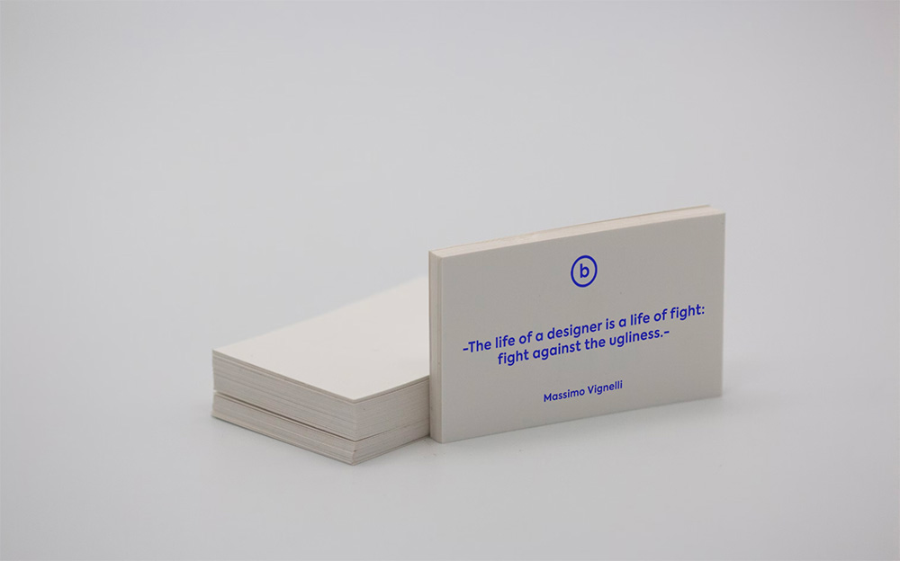
Minimalism
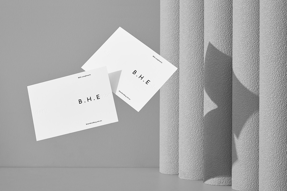 An example of a super minimalist business card. Image: Behance
This embroidery company's logo, crafted for its 20th anniversary, embodies its dedication to both heritage and innovation. The design starts with their initials, "B.H.," reflecting their long-standing family legacy. But here's the twist: these initials are rendered in a captivating combination of letterpress and blind letterpress techniques, giving them a subtle, textured depth that speaks to their forward-thinking approach.
It's a timeless choice, with the classic initials evoking trust and tradition. Yet, the modern execution through texture and technique hints at their commitment to pushing boundaries in the embroidery industry. It's like a handshake that combines a firm grip with a contemporary flourish.
This logo isn't just a symbol; it's a story. It tells the tale of a family business that values its past while embracing the future. It's a timeless identity with a modern edge, crafted to resonate with today's customers while honouring its rich history.
Now you get the idea, what’s next?
 Where and how to even begin when designing your business card? Image: Unsplash
Let's delve into the world of captivating business cards! Forget gatekeeping design secrets – at Brandripe, we believe in sharing knowledge to empower others.
With experience crafting hundreds of unique business cards for diverse businesses globally, we've unlocked some key design principles that can be adapted to create your own impactful card.
Use basic graphic design principles as your foundation
Tailor your business card for an Australian audience
While mastering design fundamentals like resolution and grid layouts is essential, truly captivating business cards require further customisation. Let's dive into how to personalise your design based on your audience and brand, keeping in mind the unique preferences of Australian audiences:
Location: Consider if your audience is in a major city like Melbourne or a regional area. What visual styles resonate with them? For example, a tech startup in Sydney might choose a minimalist design, while a coastal business could utilise beach-inspired imagery.
Age group: Adapt font size, colour choices and visuals to resonate with their preferences.
Tech savvy: Will they appreciate QR codes or interactive elements, or prefer a traditional card?
Keep it on brand
Instead of blending in, let your business card tell your brand's unique story. Use colours that instantly bring your audience to mind, like the calming blues and greens of an eco-conscious company or the vibrant hues of a creative agency.
Embrace fonts that reflect your personality, whether you seek a professional look with clean serifs or a playful touch with whimsical scripts. Let your visuals shine with images that capture your brand's essence, whether it's a photo of your handmade craft or a symbolic illustration of your values.
Consider unique paper stocks or finishes to add texture and intrigue, creating a sensory experience that reinforces your brand identity. Remember, your business card is a window to your brand, so let it showcase your story in a way that resonates with your audience.
Go beyond the basics
Don't settle for the ordinary! Push the boundaries and create a truly exceptional business card with these "beyond the basics" tips. Intrigue your audience with unique elements like a die-cut shape that reflects your brand, a hidden message that sparks curiosity, or even an interactive feature that engages them playfully.
For a personal touch, use variable data printing to customise specific elements for individual recipients, making them feel genuinely valued. Ditch the rectangle and explore unique shapes that stand out from the crowd, like a wave for a surf school or a paintbrush for an artist.
Most importantly, don't forget a clear call to action! Use your card to entice recipients to connect with your website, social media or a special offer, ensuring a lasting impression that extends beyond the card itself.
Too much to process? Brandripe is your one-stop shop!
 Let's be honest, your business is one-of-a-kind, and your card should be too. We don't just follow trends, we create cards that resonate with your audience and brand identity.
As you can see, design can be tricky. But that's where we come in!
Our team of passionate creators from around the world has crafted tens of thousands of designs for businesses of all sizes, from small startups to global organisations. We understand the challenges, and we're here to guide you through the process with expertise and a smile.
We take the time to understand your location and target age group, ensuring your card speaks its lingo. Think about it – a tech startup in Sydney might rock a sleek minimalist design, while a coastal business could bring the beach vibes with stunning imagery. It's all about finding the perfect fit.
Think of Brandripe as your creative partner. We can do so much more for you, all with our signature Aussie flair.
With our monthly subscription plans (starting at just AU$699), you get limitless revisions and designs, ensuring your card is perfect. Plus, our plans are contract-free, so you can explore our services with complete peace of mind.
Ready to create your dinkum card? Don't wait any longer, mate!
Contact Brandripe today for a free, 15-minute Demo Call. Let's chat about your vision, understand your brand, and turn it into a business card that truly stands out in the Aussie business jungle.
Remember, your card is your first impression, so make it count.