Launching Soon
Join our VIP list to receive early access and a LIFE-TIME discount on your Graphic
Design subscription.

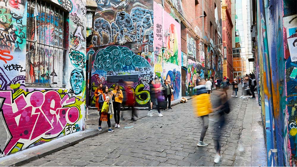
Image: TimeOut Melbourne
When we think of Melbourne, the vibrant capital of Victoria, Australia, a kaleidoscope of experiences unfolds before our mind's eye. The city is renowned for its globally acclaimed café culture, where every corner whispers aromatic tales of freshly brewed coffee.
Its culinary tapestry is a symphony of flavours, a testament to its multicultural heritage. A deep reverence for the past fills the streets, where heritage buildings stand as proud guardians of Melbourne's rich history.
And for the creative soul, Melbourne is an enchanted playground, a canvas where artists, musicians and performers bring their dreams to life. As the creative energy spreads through every nook and cranny of Melbourne’s streets, graphic design flourishes as a vibrant expression of the city’s spirit.
From bold typography and creative illustrations to innovative 3D designs, Melbourne’s graphic design scene is a dynamic melting pot of trends and styles.
But what’s in store for it in 2024? Let’s find out in this article.
Creative typography
Even since before the 19th century, Melbourne’s rich typography history is deeply intertwined with the city’s rich artistic heritage and its reputation as a creative hub for innovation.
In the early 20th century, Melbourne’s typography scene was elevated as the Art Deco typography became more popular. It was often used in advertising, signage and packaging.
Some of the most notable examples of Art Deco typography in Melbourne include the letting on the facade of the Mitchell House, the signage for the Capitol Theatre and the packaging for the Royal Doulton pottery.
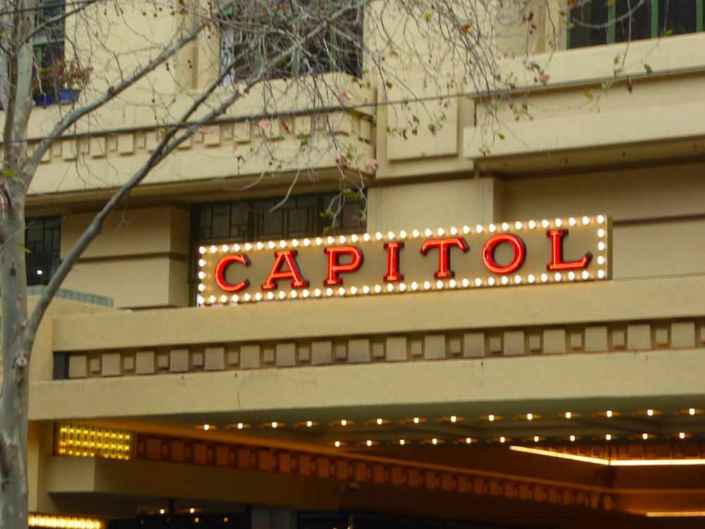 The signage of Capitol Theatre. Image: Vintage Victoria
Today, Melbourne’s graphic designers take creative typography to new heights. As seen with the examples below, Melbourne’s graphic designers are creating typographic experiences that go beyond the traditional typographic design.
Check them out!
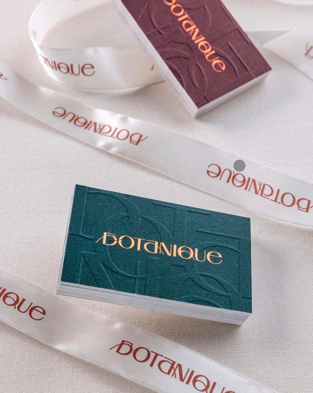 Botanique typography. Image: Behance
Melbourne-based design firm, Hue Studio developed a bespoke logotype paired with typographic arrangement and flower illustration for a flower lounge located in Abu Dhabi.
We can appreciate the elegant typography that uses negative space, colour and texture to be versatile and legible across a variety of print collaterals.
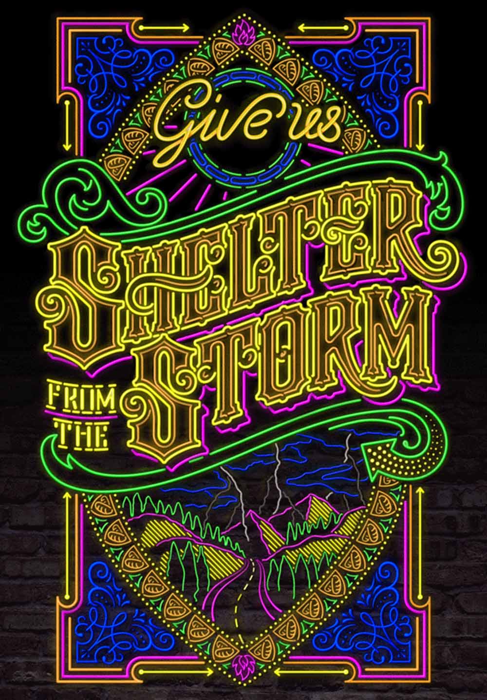 The “Shelter from the Storm” poster. Image: Bobsta
Melbourne-based veteran letterer Bobby Haiqalsyah's innovative poster design titled "Shelter from the Storm" poignantly interprets the concept of 'Hope' while raising funds for STREAT, an organisation dedicated to combating homelessness in Australia.
Inspired by the Bob Dylan song of the same name, the poster's title aptly captures the essence of Haiqalsyah's creation, which employs neon lights to symbolise the perspective of an individual seeking refuge from the harsh realities of homelessness.
The handcrafted lettering draws the viewer into the scene, evoking a sense of empathy and understanding for those experiencing homelessness.
Unbranding or anti-brand
It sounds counterintuitive but anti-brand are widely popular, especially in the skincare industry. An anti-brand is a visual strategy for brands to remain recognisable and exude classiness by keeping the branding and packaging minimalistic and concise.
The concept of anti-branding refers to barely noticeable logos, monochrome packaging and minimal messaging on all the brand’s collateral.
However, just because it’s simple, it doesn’t mean it lacks expressiveness. When done right, it can be a great way to stand out against the competition.
It takes a large amount of skill to come up with designs that are devoid of pattern, ornaments and decoration while effectively using the space effectively though!
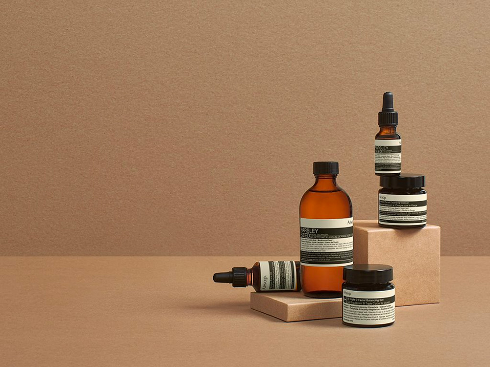 Aesop famous minimalist brand identity. Image: Men’s Folio
Take the Australian-founded skincare brand, Aesop, for example. The brand invested in brand design from the beginning and it paid off. With a presence in over 30 countries, its successful anti-brand approach has helped the brand create a strong brand identity and attract a loyal customer base who appreciates the company’s focus on quality and simplicity.
Here are some key elements of Aesop’s anti-brand approach to graphic design:
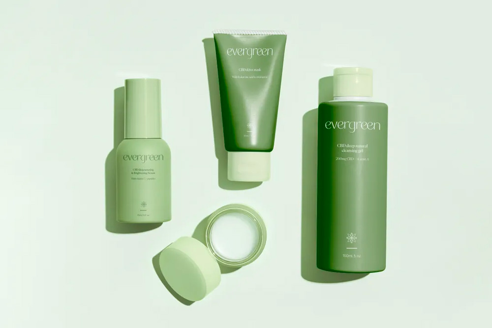 The CBD skincare brand style. Image: Courtney Kim Studio
Another good example is of Australian branding agency, Courtney Kim Studio, that created the identity design, style guide and print stationery, and skincare packaging mockup for CBD skincare brand, Evergreen.
Using the anti-brand concept, the focus of the brand was to showcase the soothing and calm nature of the brand through minimalist packaging design, elegant typography and soft green tones to bring tranquillity to your bathroom counter.
Animated graphic design
With technology becoming more innovative by the minute, so does the need for graphic design to develop to meet these changes.
Animated graphic design used to be reserved for those who could afford to get a designer with such unique skill sets. Today, animated graphics are crucial to any marketing strategy whether it's for an app, a website or even for social media content.
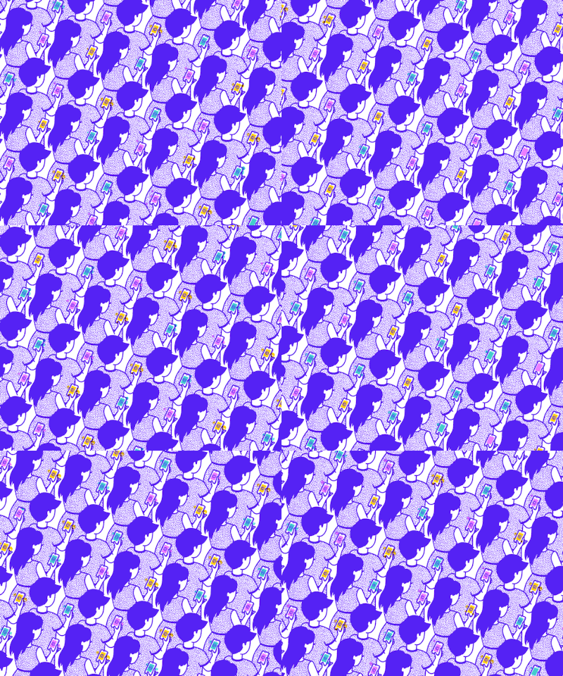 An example of an animated GIF. Image: Behance.net
In the case of Melbourne-based designer Ellen Porteus who created the above GIF for Medium’s tech website Backchannel – although the animation is a simple loop, it breathes life into the illustration to drive home the project theme which was how brands use Snapchat. The GIF seamlessly integrates into the article, further enhancing its impact.
Neon
A key trend that is a reflection of Melbourne’s thriving nightlife scene, is the usage of Neon in graphic design. Neon can be overly jarring in the wrong hands, that’s why only highly experienced designers who have a strong understanding of colour matching and balance should attempt a neon graphic design concept.
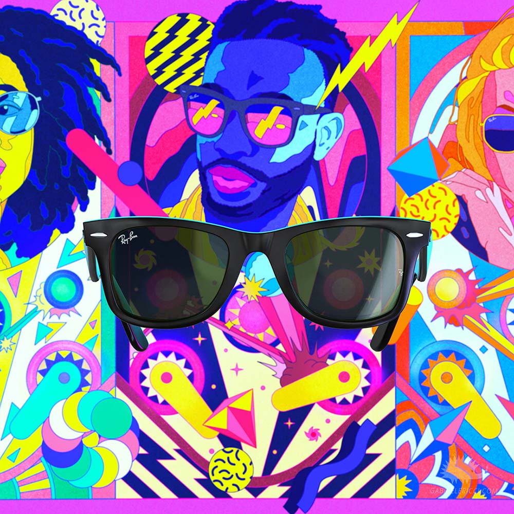 A screen grab from Ray-Ban’s “You Are On” Project. Image: Behance
The Ray-Ban "You Are On" project, spearheaded by Richi - Design in Motion, brought together a team of creative experts to produce a captivating 3D video animation for the renowned eyewear brand Ray-Ban.
The team comprised an illustrator, 3D motion designers, a CG director, and music and sound designers. Their collective efforts resulted in a mesmerising neon-themed animated video that showcases Ray-Ban's iconic Wayfarer sunglasses in a vibrant and dynamic manner.
Inclusive character illustrations
Breaking away from the traditional representation that often excluded or misrepresented certain groups, Melbourne’s graphic design scene blossoms to reflect the city’s diverse and multicultural population.
This trend shift is a testament to the importance of a designer’s role beyond just good design.
Graphic designers play a pivotal role in how people perceive and interact with the world around them. By creating inclusive illustrations, they are actively contributing to a more equitable and welcoming society.
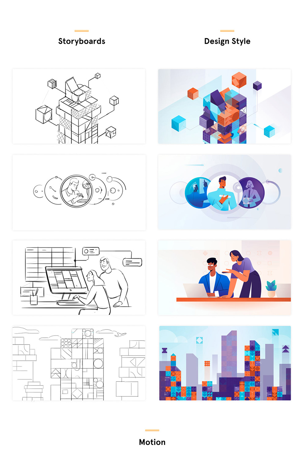 An example of Vidico’s work. Image: Behance
Award-winning video production company, Vidico, was tasked to create an engaging and educational brand animation where users can discover the depth and breadth of their work to advance the science and practice of project management by the Project Management Institute (PMI).
The 2D animation was produced using Illustrator and Adobe AfterEffects, with storyboards all drawn by hand.
Best practices to stay ahead of the curve?
We’ve named numerous Melbourne-based design firms here and they’re great if you only want to focus your marketing efforts in Melbourne and have an unlimited budget (and workload) to hire these designers.
But, what if we told you that you could have it all with us here at Brandripe? Here are some things to consider:
It’s not too early to start planning for 2024 on the right foot with the right design partner.
Before you decide, let’s set a demo call and you can speak to our sales representative to answer any questions you might have and take a behind-the-scenes look at how it is we are able to deliver high-quality designs at a fixed monthly price tag!

