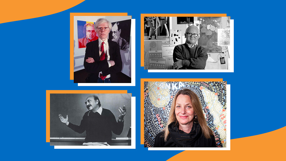
Even if you are just shopping around to hire a graphic designer, this list will give you an insight into the names and accomplishments of the most impactful graphic designers that made history.
This can be a great way to kickstart a conversation with whichever graphic designer you choose to hire (we’ll talk about how you can access industry-leading experts with a convenient monthly subscription at the end of this article).
- Paul Rand (1914-1996)
The Pioneer of American Graphic Design

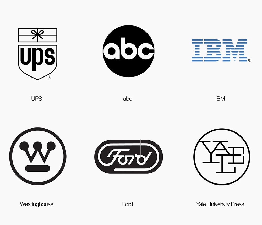
These are some of the most popular designs in history, created by Paul Rand. Image: adsumny.com
- Are IBM, UPS and ABC familiar names to you? Paul Rand had something to do with that. He was well-known for his finesse in corporate identity. As a thought leader in the design world, Paul Rand published several books titled ‘Thoughts on Design’ and ‘ABC of Color’ and more.
His works have also been exhibited in galleries and museums around the world. Rand was known as a master of typography and was known to utilise geometric shapes and bold colors in his designs.
His designs are recognisable for its simplicity, clarity and elegance. Among all of Paul Rand’s designs, the IBM logo stood out in making its place in graphic design history.
The logo is simple, yet the effective use of the company’s initials, “IBM”, in a sans-serif font made the logo one of the most timeless graphic designs in history.
- Saul Bass (1920-1996)
The Innovator of American Graphic Design

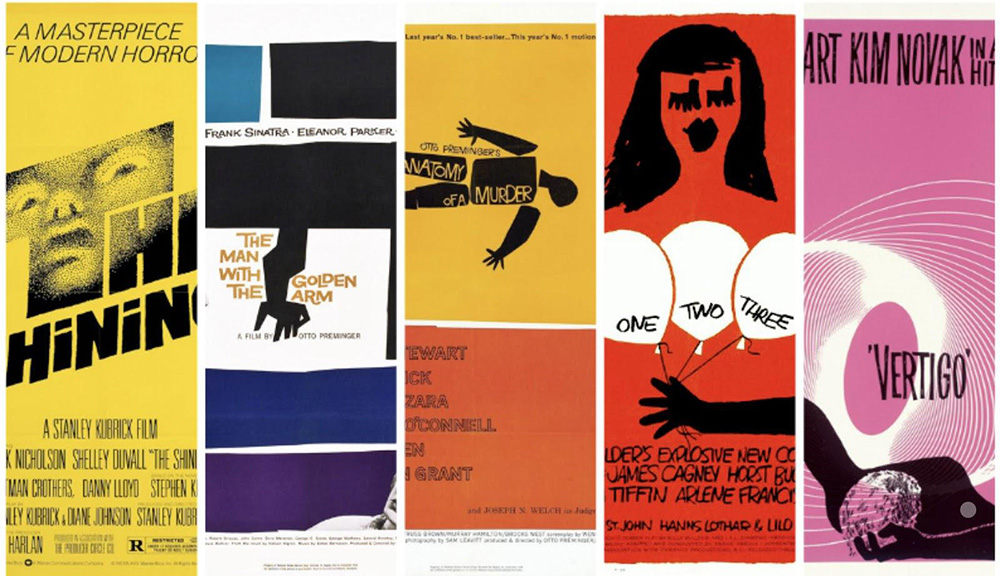
Some popular films whose posters made them even more famous thanks to Saul Bass. Image: Indiewire.com
- Saul Bass’s claim to fame was from the success of the film Carmen Jones. He designed the title sequence for the film and following its success, Bass went on to design title sequences for some of the most iconic films from the 1950s to the 1970s.
His title sequences were recognised by his use of simple, geometric shapes, symbolism, and animation. As an industry innovator, Bass didn’t limit himself as a title sequence specialist, he also designed a number of corporate logos, notably AT&T, United Airlines and Minolta.
His portfolio included posters for films, magazines and other publications. Bass constantly pushed the envelope in his use of typography and abstract shapes that have profoundly inspired designers for generations.
- Herb Lubalin (1918-1981)
The Avant-Gardist of the 20th Century Graphic Design Industry

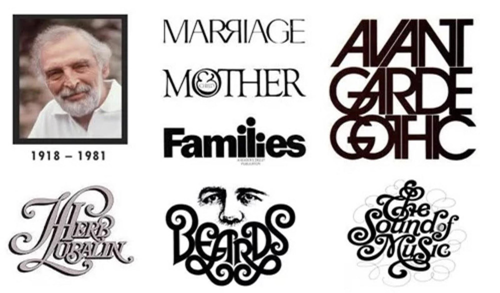
Designs created by Herb Lubalin. Image: Designbeep.com
- The impact of Herb Lubalin’s graphic design goes beyond just good design. His designs were used to challenge the status quo and raise awareness of social issues. This was evident in his prolific works in magazines such as Avant Garde and EYE.
With the use of bold and expressive typography, Lubalin masterfully made his designs visually striking and memorable. Let’s look into the specifics of what makes his works so impressionable:
- The logo for Avant Garde magazine was a typographic pun. The letters "A" and "V" were combined to create a shape that looked like a forward-facing arrow. This was a bold and visually striking logo that perfectly captured the magazine's forward-thinking attitude.
- The cover for the book Eros was a collage of typographic elements. The letters of the word "EROS" were arranged in a variety of different ways, creating a visually stimulating and provocative design.
- The typeface ITC Avant Garde Gothic was a new and innovative typeface that was designed specifically for Avant Garde magazine. The typeface was characterised by its bold, angular letters and its distinctive "futuristic" look.
Lubalin’s use of bold typography, expert colour management and expressive designs was far ahead of his time. His work has transformed the way magazines were designed and directly impacted a shift in the graphic design industry between the 1960s and 1970s.
- Milton Glaser (1929-2020)
The Prolific 20th Century Graphic Designer

The I <3 NY logo has been one of the most recognisable in the world until today. Image: Dezeen.com
- Back in 1976, Milton Glaser masterfully designed the “I ❤ NY” logo, which was designed at the back of a taxi with the use of red crayon on scrap paper. The logo was part of an advertising campaign developed by the marketing firm of Well, Rich, Greene to promote tourism in the state of New York.
Little did he know at the time, the logo would be used for over 40 years and be featured across a wide range of products, including T-shirts, mugs and posters. This has helped raise awareness of New York City as a tourist destination and has helped to attract visitors from all over the world.
It is estimated that over 100 million I ❤ NY items have been sold worldwide. It could even be said that the logo played a large role in making New York City one of the most popular tourist destinations in the world.
- Paula Scher (1979-2006)
The Bold and Creative Graphic Designer

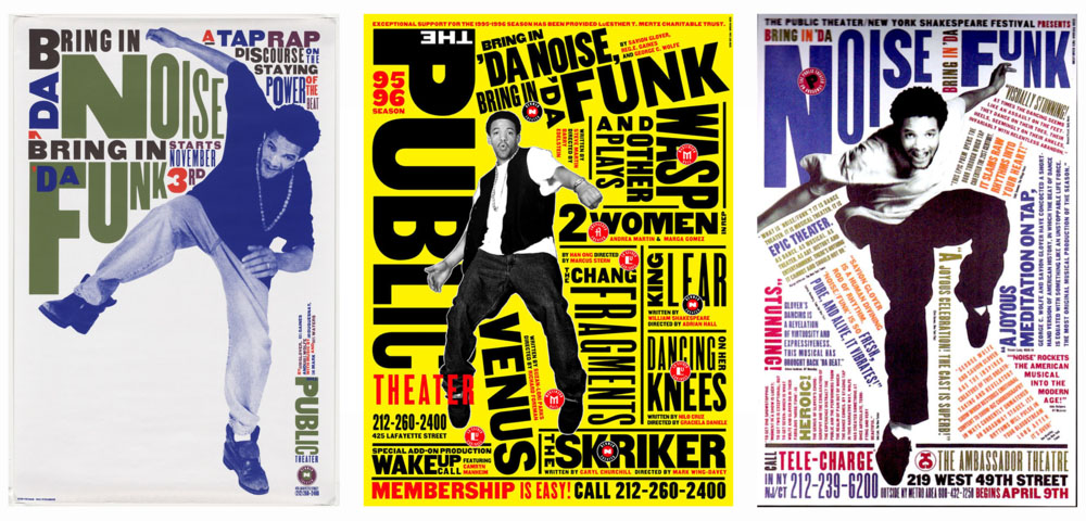
Popular designs by Paula Scher. Image: Amrit.Art
-
For over 50 years, Paula Scher built her repertoire in corporate identity, branding and environmental graphics. With accolades from the Cooper-Hewitt National Design Award and the AIGA Medal, Scher single-handedly propelled the graphic design industry into new heights leaving an impact to inspire generations to come.
In 1979, she was commissioned to design a logo for FedEx which is still used today. Her speciality is using negative spaces to make her designs impressionable and memorable.
Specifically for the FedEx logo, the negative space can be seen between “E” and the “X” to create an arrow. The arrow represents the speed and efficiency of FedEx. Her clientele included the Metropolitan Opera, the Public Theater and the New York Public Library. Her other notable works include:
- The Best of Jazz poster (1979)
- The New York City subway map (1992)
- The Windows 8 logo (2012)
- The Public Theater logo (2005)
- The Metropolitan Opera logo (2006)
Scher will always be regarded in the graphic design industry as a trailblazer for the use of negative space to create powerful designs.
- Peter Saville (1979-1987)
The Minimalist Graphic Designer

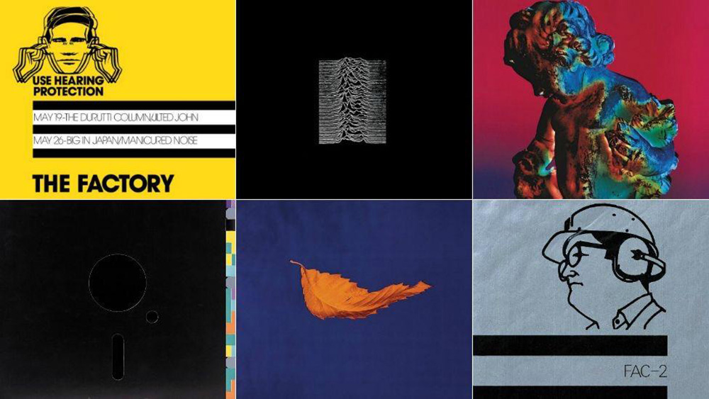
Notable works by Peter Saville. Image: bbc.co.uk
- The sentiment of ‘less is more’ is the best way to describe Saville’s graphic designs. His popularity soared from his successful album covers for Factory Record, a British independent record label. The minimalist designer was known for his masterful use of negative space to create cool and edgy designs.
Among his many accolades, the most notable is the Grammy Award for Best Recording Package. Peter Saville is a prolific designer whose work has been exhibited in various galleries and museums all around the world.
Beyond album covers, Saville also designed logos, posters and other graphic material. His clientele included Nike, Levi’s and the Metropolitan Opera.
- Massimo Vignelli (1931-2014)
The Modernist Graphic Designer

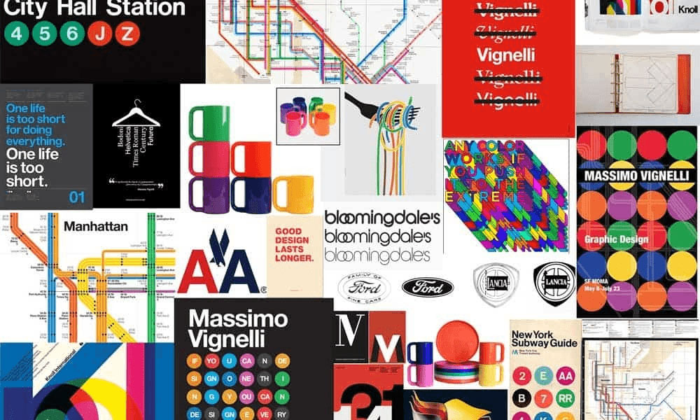
Artworks by modernist Massimo Vignelli. Image: EasyEdit.pro
- The Italian-American graphic designer built his reputation from his work in corporate identity, branding and environmental graphics. Vignelli’s work is distinguishable by its use of simple geometric forms, its attention to detail and its use of grids. His most well-known works are:
- The New York City subway map (1972)
- The logo for American Airlines (1967)
- The identity of the Knoll furniture company (1960)
- The identity of the IBM Corporation (1972)
- He immortalised his experience and knowledge in several graphic design books which are used as a main reference for many graphic designers today.
- Andy Warhol (1928-1987)
The American Pop Art Graphic Designer

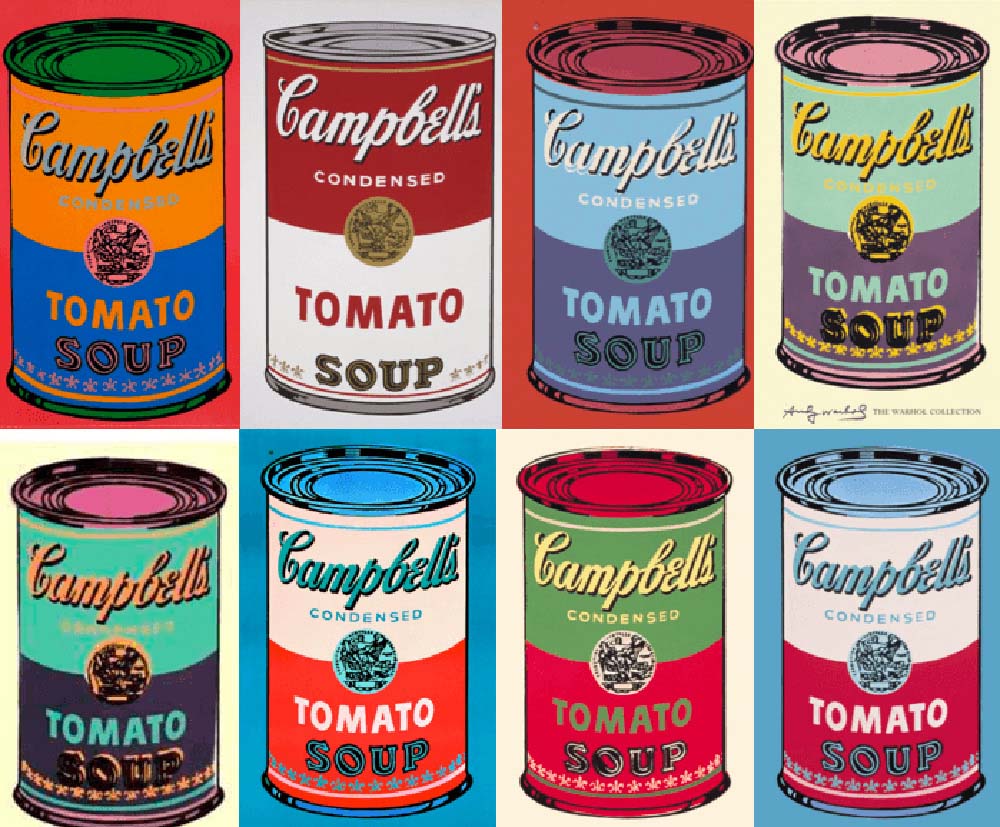
Andy Warhol was known for revolutionising art and design in the 1960s. Image: Revolverwarholgallery.com
- Known as the leading figure of the Pop Art movement in the 1960s, Andy Warhol was a true icon of the 20th century. He worked on a variety of media including painting, sculptures, film and photography.
His work explored themes of consumerism, celebrity and mass media. The Pittsburgh-born artist was often fascinated by how images could be reproduced and distributed.
Although his work was often thought of as controversial because of its commercial nature and was thought to be shallow and materialistic, it actually challenged the traditional notions of what art could be. This paved the way for new forms of art to be accessible to a wider audience.
Andy Warhol’s most famous and even most controversial works include:
- Campbell's Soup Cans (1962): This work, which features a grid of 32 Campbell's soup cans, was seen by some as a trivialisation of art. Warhol's defenders argued that the work was a commentary on the power of mass media and the way that it can commodify even the most mundane objects.
- Marilyn Diptych (1962): This work, which features a grid of 25 images of Marilyn Monroe, was seen by some as being exploitative of Monroe's image. Warhol's defenders argued that the work was a celebration of Monroe's beauty and her status as a cultural icon.
Final thoughts
Just like the designers on this list, we aspire to revolutionise the design industry. We do it by creating a bridge between our partners and their customers through innovative designs.
Brandripe is an on-demand graphic design subscription service that has helped hundreds of start-ups, agencies, marketing teams, GLC and more to meet their business needs with timely and high-quality designs on a single price tag. (Click on these links for more information on our pricing and how it works)
We believe in transforming the burgeoning design industry as we adopt new and innovative technology to reach a wider audience and built deeper connections.
If this sounds like something you need for your business or brand, schedule a 15-minute VIP Demo call with us right now and we will give you a preview on how we can make history together!


