

Image: Fabrik Brands
Are you in the middle of doing a market survey on the price point of making a logo? You’re in luck!
In today’s post, we will be reviewing the top 7 logos that cost a pretty penny and explore the process of designing such high-value logos.
Before we dive in, let’s consider the value a logo brings to an organisation’s brand.
What does a logo do for a brand?
Some logos are so iconic that they will be recognised even in different iterations. Image: Unsplash
A logo is often the first thing that people see when they encounter a brand, so it’s crucial that it is visually impressionable and memorable.
One of the purposes of a well-designed logo is to create a strong visual identity for a brand to increase brand recall among consumers.
A logo may look simple to most, but it is in that simplicity you are able to tell the level of expertise of the designer. A well-made logo will reflect the brand’s values to consumers while keeping the design simple.
Another significant function of a logo is to set your brand apart from your competitors. It’s essential that your logo reflects the unique selling point (USP) of your brand or how your values differentiate you from your competitors.
Essentially, a logo gives your customer a visual imprint to set itself apart from the information overload we face today.
However, it’s important to note that a logo doesn’t fully serve the entire branding function. What you’ll be reading about below is the cost of a logo with other brand identity collaterals to support the branding goals of the business.
Other brand identity collaterals include:
Based on the brand values, it’s important to select suitable colours based to effectively impact your consumer’s impression of your brand. Expert designers deploy the use of colour psychology to evoke the desired emotions in their target audience.
For instance, red is often associated with passion, excitement and danger which you might find on a soda can. On the other hand, blue is associated with trust, security and calmness which is often used by banks.
Fonts and types are crucial ways for a brand to directly communicate with its consumers. It’s important for a brand to select a relevant font and type to align with its chosen industry.
For example, a financial service brand may use a more traditional font, while a tech brand uses a modern and less cursive font.
This aspect of branding allows for businesses to connect with their consumers through scenarios or images that resonate with the brand’s values and personality.
For example, when you see a group of people gathering and having a good time, this brings Coca-Cola to mind as the brand consistently uses this image to convey its happy and fun personality.
A brand value must be relevant to its target audience. They help build brand loyalty as customers are more likely to remain loyal to that brand if they have shared values. It also helps create differentiation between brands.
Let’s compare two major coffee chains – Starbucks and Coffee Bean. Starbucks' brand value focuses on sustainability and innovation which resonates with their upscale target audience. On the other hand, Coffee Bean’s brand focuses on locality and community which encourages regulars to frequently visit their local store.
A brand personality humanises the brand. This allows the brand to create a deep connection with its target audience. Brand personality can be described using words like sincere, exciting, elegant, open-minded and what have you.
The tone of voice is the way a brand communicates with its target audience. The personality of the brand is expressed through words or phrases across all its marketing collaterals, internal and external communication.
Take, for example, a brand that focuses on stability and security. The tone of voice will, understandably, be more serious.
Now that you have a clear picture of a logo's role in the overall branding guide for a particular brand and understand other branding identity elements, let’s review the most expensive logos ever made.
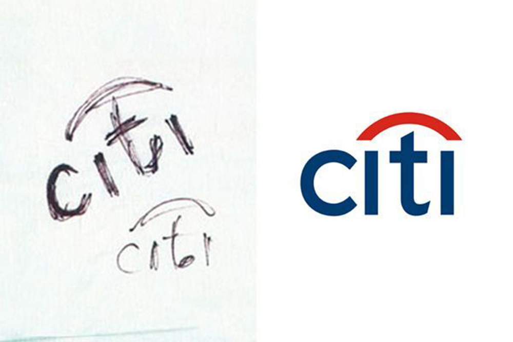
A sketch of the Citibank logo, and the actual logo. Image: Ebaqdesign
CitiBank - $1,500,000 / RM6,978,000
During the Citicorp-Travelers Group merger in 1998, Citibank hired a New York-based design agency, Pentagram, which was led by Paula Scher. Scher was known for her work with Microsoft, the Museum of Modern Art and Bloomberg.
One of the most surprising facts about how the $1.5 million logo was made is that it was sketched on a napkin by Paula Scher and her team during their meeting with Citibank officials.
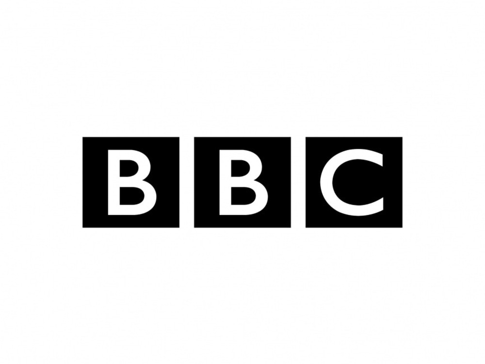 The iconic BBC logo. Image: Wikipedia
BBC Logo Redesigns - $1,800,000 / RM 8,373,600
As one of the most prominent media outlets worldwide, the British Broadcasting Corporation (BBC) has gone through its fair share of logo revisions throughout time.
The last change was made in 1997 where the white light typography in contrast with black bold squares features a font that moved away from italic letters and a clearer design. Although the changes from the past logo are subtle, the latest logo was focused to reflect the brand’s value of unambiguity and reliability.
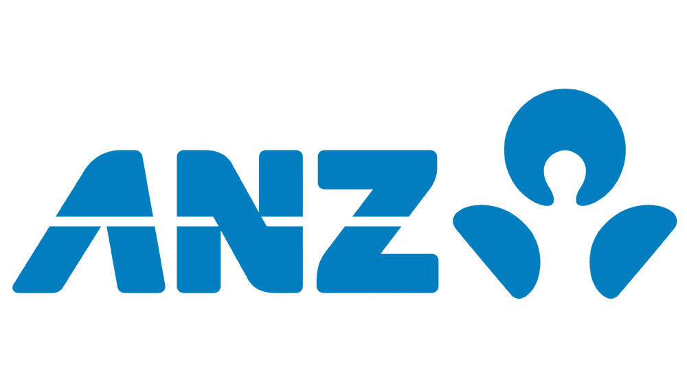
The logo for ANZ. Image: 1000logos.net
Australia & New Zealand Banking Group (ANZ) Logo - $15,000,000 / RM 69,780,000
Known to be New Zealand's largest bank, it’s no wonder the company invested a hefty amount into its new logo design. This was also following the momentous occasion of the merger between the Bank of Australasia and the Union Bank of Australia in 1951.
The use of ANZ letters is an abbreviation for their name. The logo focuses on a single colour, blue to signify the company’s stability, security and safety.
![]()
The logo for Posten Norge. Image: PostandParcel.info
Posten Norge Rebrand - $55,000,000 / RM 255,860,000
Back in 2016, the famed Norwegian company, Posten Norge invested a whopping $55,000,000 on a rebranding initiative by the company.
To reflect the way the letters are delivered from the sender to the recipient, the brand went with a simple design featuring the name of the company that was enhanced with a circle consisting of halves.

The Accenture logo. Image: ciab.com
Accenture Logo Design - $100,000,000 / RM 465,200,000
With its worldwide recognition as specialised information technology (IT) services and consulting, the Irish-American company did not hesitate to break out $ 100,000,000 for its logo update. The new logo is meant to communicate the company’s passion for innovation and growth.
According to some sources, the sum was paid for the name of the organisation, its qualities and the numerical image on top.
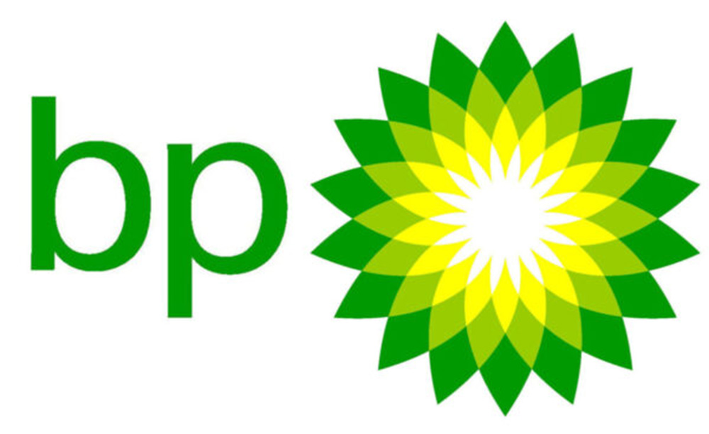
The BP logo. Image: sjrgas.com
British Petroleum Logo & Marketing - $210,000,000 / RM 976,920,000
Known as one of the world’s seven oil and gas ‘supermajors’. British Petroleum underwent a revamp in 2000 after a 70-year hiatus. The usage of green and yellow as the primary colors and the shape of the logo resembling a growing flower was the company’s attempt to reflect its commitment and care for the environment.
This was met with much criticism especially given the company sustained the worse oil spill in history in the Gulf of Mexico in 2010.
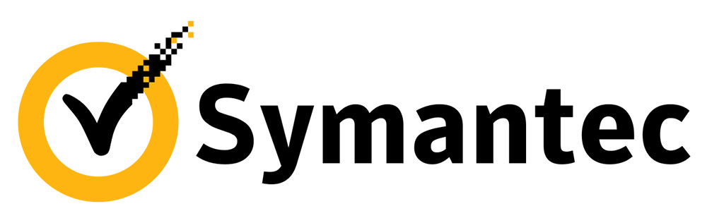
The Symantec logo. Image: Wikipedia
Symantec Brand & Acquisitions - $1,280,000,000 / RM 5,954,560,000.00
It might be inconceivable to understand why a brand would spend a billion on a logo. In all fairness, this cost was accounting for the purchase cost by Symantec when they acquired the VeriSign company. The cost also included some branding designs.
As an anti-virus protection company, the key theme in the brand personality was providing safety to their customers. In the world wide web, the checkmark indicates that website security is provided by confirming the authenticity of security certificates (SSL) for websites.
So, it is a smart move to include the checkmark as part of the logo to signify a sense of protection and continuity of security. It was also part of VeriSign’s trademark logo which makes sense why it should be included in Symantec’s revamped logo design.
Adding to this, the brand also used colour psychology by using yellow to further invoke the sense of “safety”.
Was it worth it?
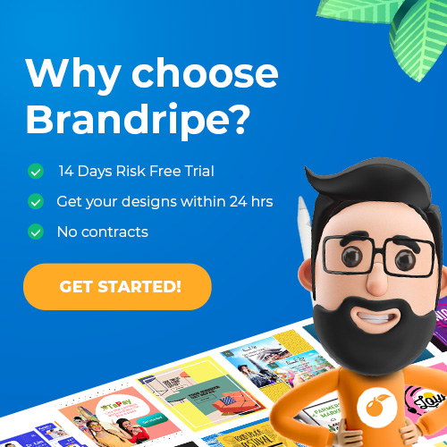
Get your logo designed or redesigned with Brandripe! Image: Brandripe
As an on-demand graphic design subscription service, we believe in helping businesses get good design affordably. If these brands knew about Brandripe sooner, they could have channeled 80-95% of what they spent on their logo designs to become more operationally efficient and increase their profits!
You are just in time to make the best investment choice for your business by working with us. We provide our clients the timeline efficiency and expertise of a design agency with the convenience of our transparent workflow that helps your business get more mileage with as little as RM 1,899 per month.
Schedule a 15-minute VIP demo call with us now and our team will demonstrate how our direct and effective approach will save your business millions over the long term. We look forward to helping you create a logo that will help your business succeed!