
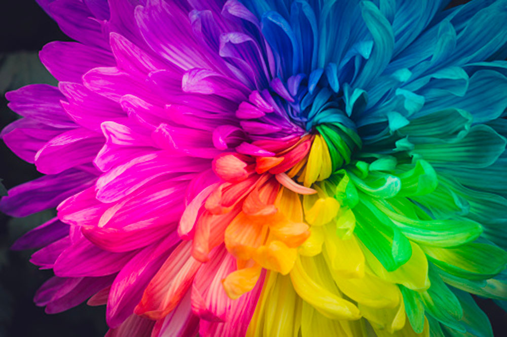
Image: Unsplash
How many times have you used a colour to describe something or pinpoint a brand? From pointing out the “golden arches” logo to visualising an object as Ferrari red, colours are one of the most powerful cognitive tools in communication.
There’s a whole science behind this: colours do more than help us describe something, it also plays a psychological role that maps out or evokes specific emotions towards an object or image. This then translates to how we perceive the overall object and our connection to it.
A study on colour psychology explores how different colours can influence emotional responses, as well as how responses to colour are affected by factors such as age and cultural background.
It is worth noting as well that we all grow up with a perpetuated idea or perception of colours and what they represent. You’ll find the following table very familiar in the variations of colour and the connotative emotions that they stand for:
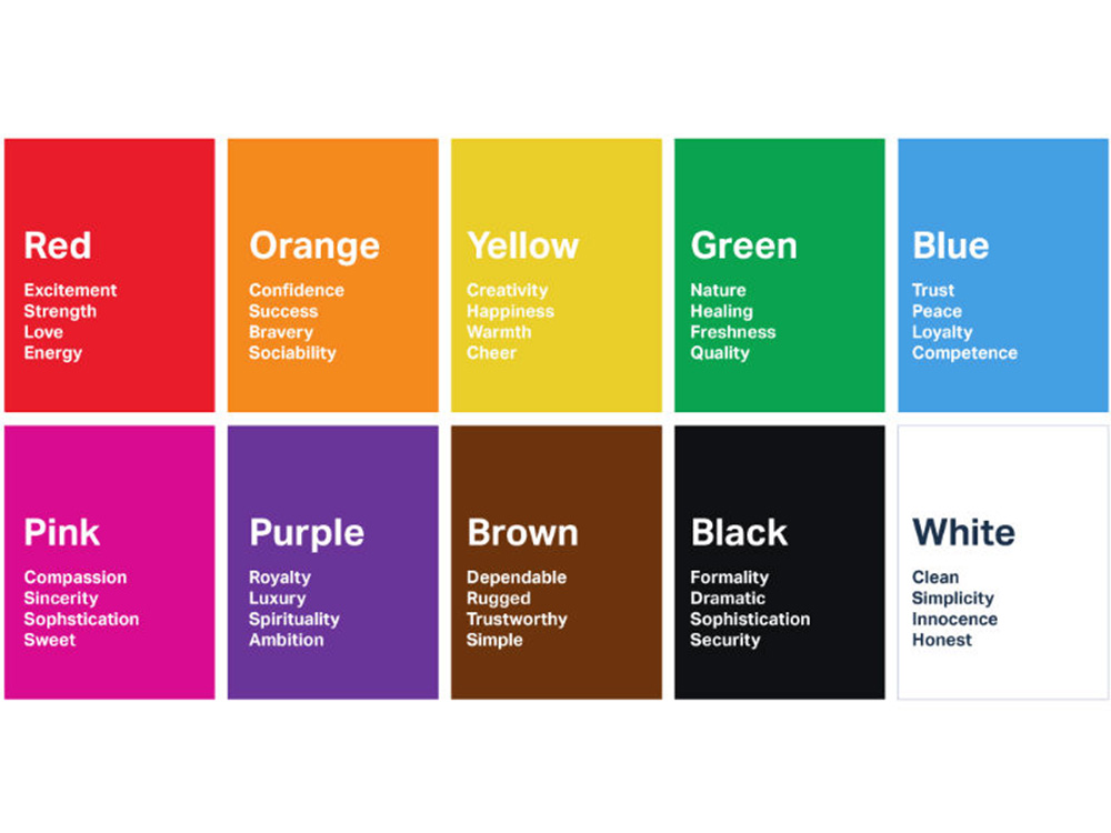 Familiar colours and equally familiar feelings that come up when we see them. Image: Mountain Vista Psychology
Colour plays a powerful role in shaping our emotions and perceptions. Research has shown that different colours can evoke specific responses in the brain, such as feelings of calmness or excitement. For example, the colour blue is often associated with feelings of tranquility and serenity, while the colour red can evoke feelings of energy and passion.
The psychology of colour also extends to the way we perceive and respond to different hues in our environment. Bright, bold colours can be energising, while muted tones can create a sense of calm and relaxation.
Understanding the psychology of colour can be useful in fields such as marketing, design, and art, where it is used to create specific emotional responses in the viewer.
In marketing and advertising, choosing the right colour for your brand is extremely important. With an idea of how different colours represent a certain trait or value, you can build an understanding of how colours that you use in brand and marketing collateral will land with your target audience.
For instance, it is no coincidence that brands that represent natural or vegan products would choose green as a primary colour. It is the colour we see when we think of nature, or something that is fresh and clean.
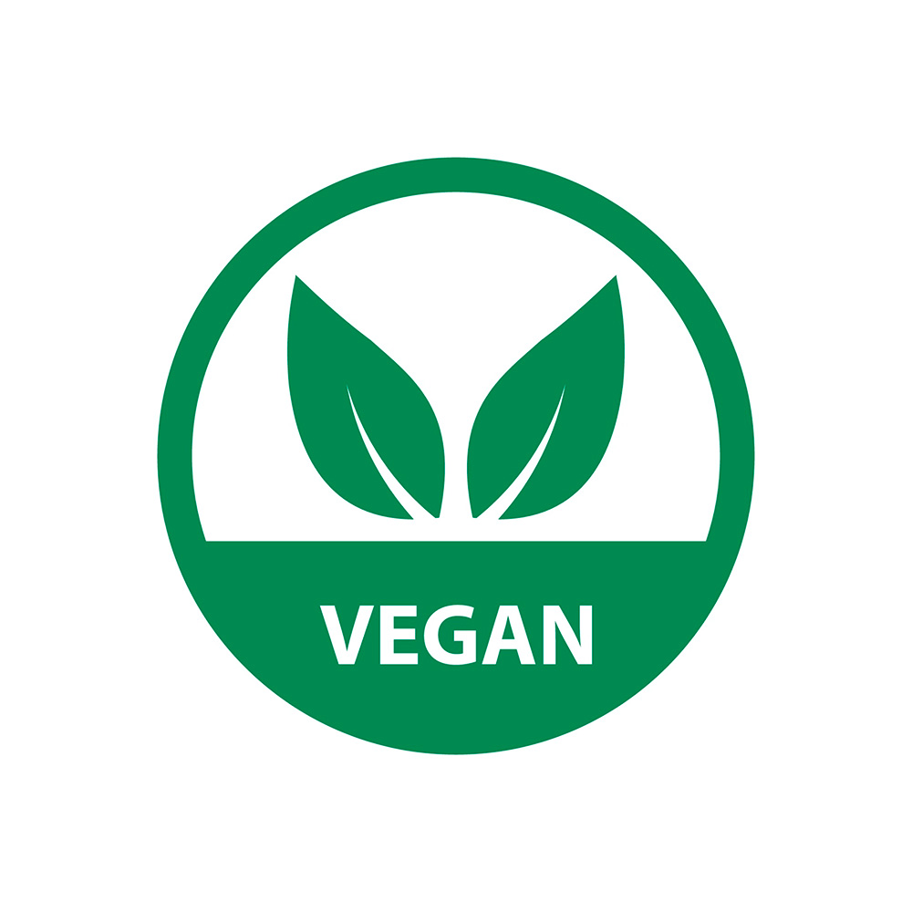 An example of a vegan logo that chooses green as its primary colour.
Image: Vecteezy
For this reason, it is likely that if you decide to use primary colours like red, for example, to represent natural and vegan products it will come across as a bit jarring for the audience. Red is bold and passionate; it is also commonly associated with red meat in the food industry – which makes it less suitable to be used for a brand whose value lies in its natural identity.
Furthermore, colours can also be used to target specific demographics. For example, using colours associated with luxury like gold and black for high-end products work extremely well with affluent crowds. Overall, understanding the psychology of color can be an effective tool for creating effective advertising campaigns that resonate with viewers.
Not only do different colours evoke certain feelings or perceptions towards a product or brand, but they also work as a tool to build brand recognition and can boost your standing among the competition.
Here are some tips on how to strategically select colours to use in your graphics design and amplify your message and contribute to building the desired brand perception.
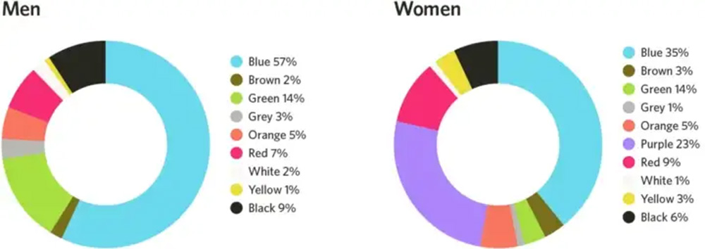
Most liked colours according to men and women. Image: UX Planet
Getting a good idea of colours and the different emotions and perceptions it builds in our subconscious is a good start, but the success of your marketing and advertising also relies on the memorability of your overall design. This includes brand assets like the colours used for the logo and even the actual design of the product itself.
For major decisions like this, it’s always good to have a partner that knows the science behind colour psychology and how to apply it to graphic design.
Brandripe isn’t just an expert on cognitive elements like colours in graphics design. We are a team of creatives with extensive market knowledge and experience in design services. We help clients (from small and medium enterprises to established corporates) approach graphics design with an eye on strategy.
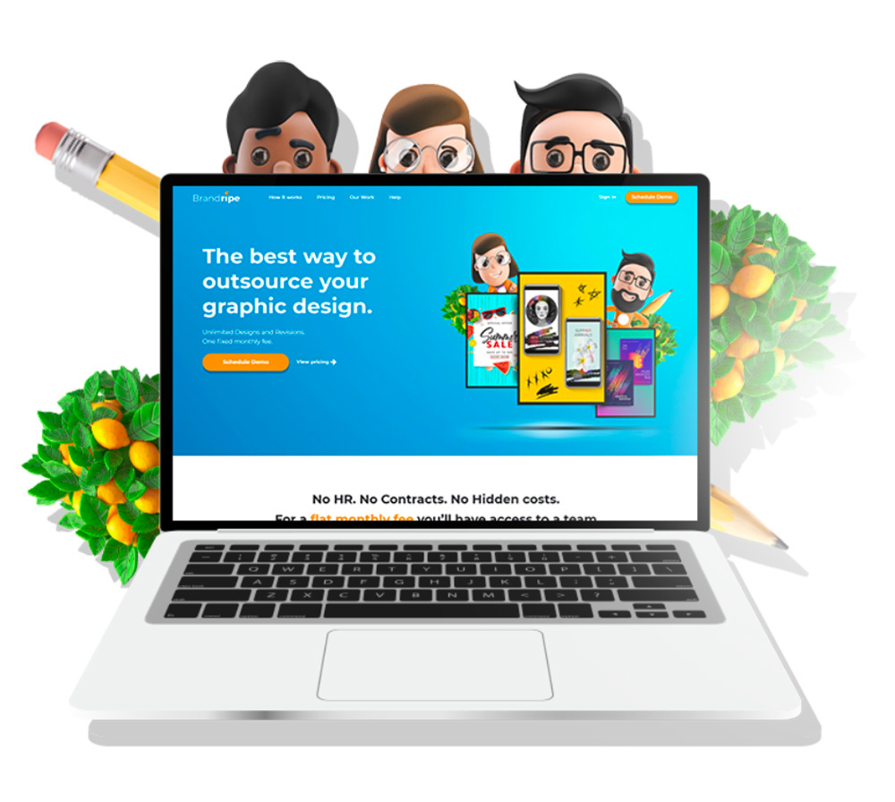 Image: Brandripe
Our work ranges from social media and print designs to even product packaging – which means that we literally cover all your branding needs.
Find out more about how our flexible subscription models work (fuss-free subscriptions at affordable rates with no strings attached!) and how we can tailor the best partnership for your business.
Oh, did we also mention our guaranteed 24- to 48-hour turnaround time on top of unlimited revisions and requests? We’re not kidding – let us help you scale your brand to greater heights! Schedule a 15-minute VIP Demo Call with our team today and let’s get talking!