Image: Unsplash
In our previous article, we spilled the beans on where you can draw inspiration from when picking out the best colours for your next design piece.
From basics such as understanding primary and secondary colours to looking at swatches, there are plenty of ways that you can come up with a unique blend that will truly help your brand or graphic design stand out.
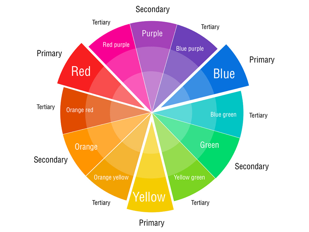
The colour wheel is commonly used in art and design as a reference.
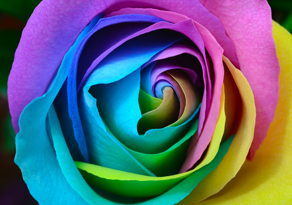
Image: Pinterest
When it comes to choosing the set of colours to use though, it helps to rely on a bit of science before you decide on something. Oftentimes, designers look at picking the best colours with reference to the colour theory, which is a set of rules that communicates or tells a story to the intended audience through appealing colour schemes in visual interfaces.
Colours elicit emotions, perceptions and reactions. Hence, in any thought process of selecting colours for a design, you’ll need to also consider the common connotations tied to that colour.
A good example of this is the usage of yellow, green and orange for all things with a citrus influence.
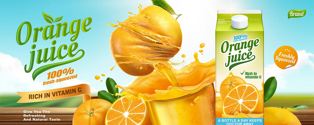 A dummy ad for an orange juice brand. Image: Dreamstime
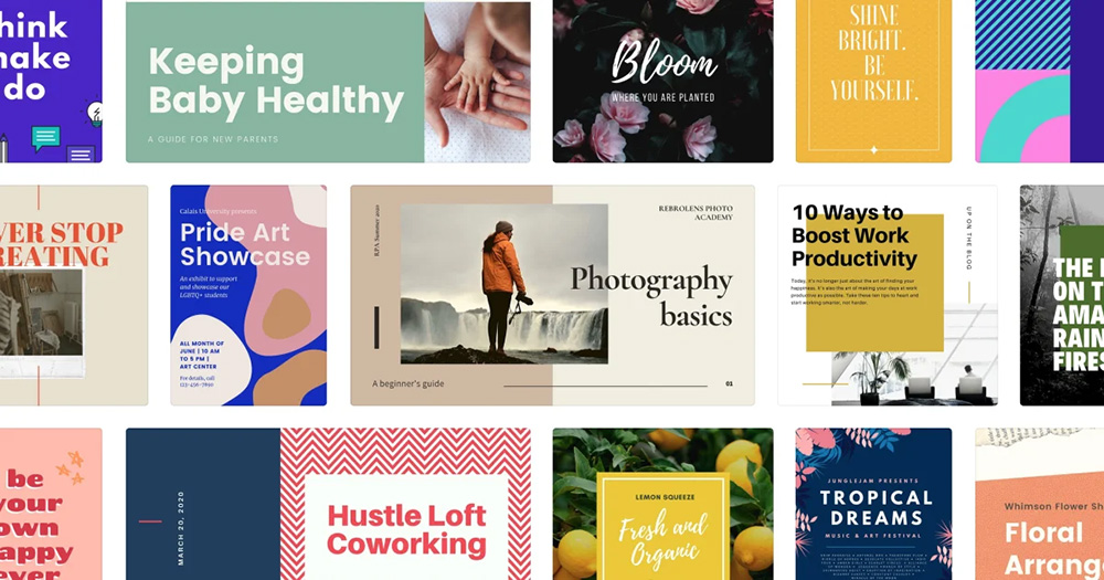
Stand out with these colour combinations
In today’s competitive content (and design) landscape, it takes more than just good copywriting (and a really good product or service) to stand out.
Colours play an integral part in your design, and while it is good to have a grasp of the typical connotations we assign to certain colours, there’s also an opportunity here to play it to your strengths.
Our team at Brandripe has supported clients from all sorts of industries, be it emerging SMEs to well-known and loved brands. One thing we endeavour to do for our clients is to analyse how content is designed and communicated to the target audience so that we can help our clients stand out.
We’ve looked at some interesting brand and design colour choices and picked out these top five trending colour combinations that’ll make your design pop!
Aside from the re-emergence of Y2K trends in the fashion scene (think Paris Hilton’s Barbie-esque outfits), various combinations of hot pink and cyan are trending in a major way on social media platforms these days.
This is no surprise, of course, considering that these two colours are great for that bubbly, loud youthfulness that’s also playfully innocent at the same time.
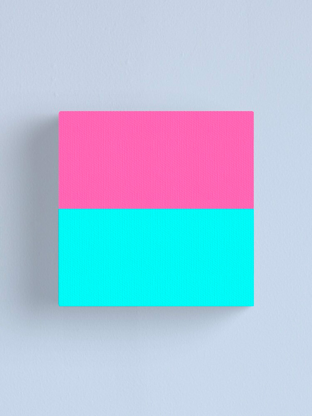 An example of the hot pink and cyan combo. Image: Redbubble
We’re also seeing this colour combo used a shade darker across content and communications by digital start-ups and pop culture brands. Check out this deck design from Behance user, Inga:
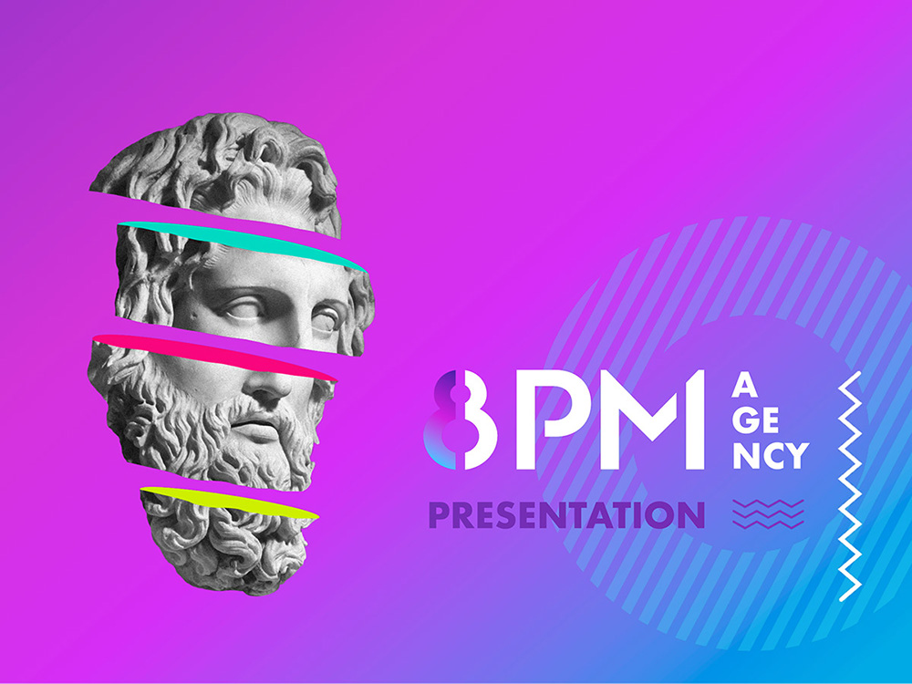 A colourful design by artist Inga. Image: Behance
Industrial palettes are very much in. From interior design to UX aesthetics, this colour combination exudes sophistication, a welcome interpretation from the usual “drab and boring” feel that we may have previously and commonly associated these colours with.
Mixing shades of grey with accents of brown brings an earthy feel to a concept and works well for designs centred on minimalism and modern industrialism.
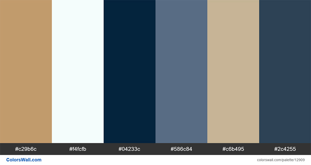 An example of a colour combination that exudes modern industrialism. Image: ColorsWall
Cyberpunk is all the rage these days, and if you’re into computer games, you might notice that it is a recurring theme. Back then, cyberpunk-themed colours or even visuals were favoured mostly for digital-based designs, or to allude to a more sci-fi concept (think of the box-office hit, “Ready Player One”).
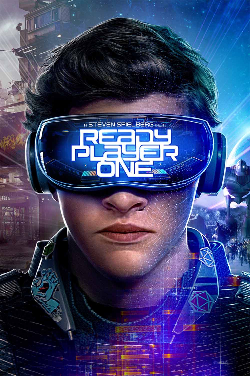 A poster of the movie “Ready Player One”. Image: MoviesAnywhere
With a recently re-ignited interest in the genre as a whole, a number of brands are adopting the concept to speak more persuasively to their target audience and stand out. This guide by DepositPhotos compiles some great palette examples to inspire you:
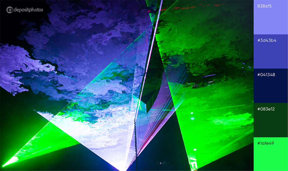 DepositPhotos has put together an entire page that alludes to Cyberpunk and its associated colours. Image: DepositPhotos
There is a lot of emphasis on minimalism in content, especially for brands trying to cut through the noise.
If you’re thinking of doing the same for your business or brand, go no-nonsense and use brown as the primary colour for your palette, add hints and touches of strong reds or green to complement the earthy tone and highlight key parts that you want to emphasise.
 An example of neutral colour combinations in design. Image: Creatopy
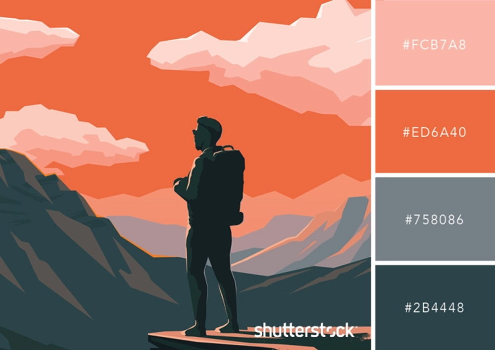 A retro-inspired design made with primary colours. Image: Shutterstock
Trends definitely come and go, and we’re seeing more popular content and design out there embracing retro design concepts and colour combinations.
The muted blend of primary colours creates a sense of nostalgia in the design, and is often juxtaposed with a strong hue in order to add contrast and point of focus. Playing with this type of colour combination is pretty limitless so go ahead and mix and match any primary colours to create the perfect warm, muted blend.
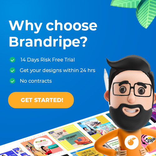
Create unique designs with even more unique colour combinations with Brandripe
Need help bringing your design dreams to life? Brandripe can be the perfect partner for you!
We’re not just experts on everything colour, but also a team of creatives that has helped brands and individuals fulfill their design needs. Our work ranges from social media to print designs and even product packaging. Check out some of our latest work here.
On top of that, getting started with Brandripe is completely hassle-free with a no-strings-attached subscription model. This means no contracts, just straight-up design outsourcing at rates that fit your needs.
And did we mention that every subscription comes with unlimited requests and revisions? Yes, this means that you can experiment with us until you’re completely happy with the design!
Find out more about the subscription process, or simply schedule a quick, 15-minute VIP Demo Call with us so we can show you how it works and what we can do to ensure that you get the design of your dreams!